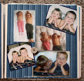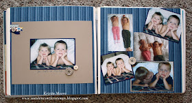
Have you seen the new Parker's Patterns Designer Series Papers in the Spring Catalog? They include many great, masculine patterns and colors which I thought were perfect for these pictures. You can get a glimpse of a few of the other patterns at the top left corner. I did those with the Bitty Banners Framelits. I rarely do a page with just a single picture, even though I love the look, but I always have so many pictures I want to include. This time I just put all the rest of them on the opposite page. Works for me!
Gotta love pictures of your kiddos when they are getting along! Especially now that they are 13 & 11.
So does anyone else that scrapbooks chronologically leave a blank page in the front and back of the album? I seem to rarely remember to go back and add that title page... so recently I did two, one for 2004 and one for my 2005 album. I'm planning to keep them simple so I am more likely to get them done from now on. For this one I used an old Simply Scrappin' Kit called At Home.
And this one uses the Tickets and Tags Simply Scrappin' Kit. Love these kits!! Saw a page similar to this on Pinterest and HAD to put my spin on it. I added a few little embellishments and some giant chipboard numbers which I stamped with a large background stamp.
So tell me, how do you wrap up an album on the last page? One time I typed up a summary of the entire album and an expectation for the year to come. I really enjoy going back to read it so maybe I'll try that again. Let me know what you do!


No comments:
Post a Comment
Thanks so much- your comments make my day! (if you are a spammer- GO AWAY! I will not publish your comment or your link to your crappy website! You are the reason I no longer allow anonymous comments. Jerks!)