Thursday, April 30, 2009

If I only knew then what I know now....

You know I love a good challenge!! The other day I was reading Lisa's blog and she happened to show her very first card she ever made and the first card she ever posted on-line (she was participating in another challenge).

Well, it cracked me up to think of the first card I ever posted so I went to check it out... then I got to thinking it would be fun to try and redo that card knowing what I know now! So that's what I did, and that's our (mine & Lisa's) challenge to you!
  1. Go find the first card you ever made, first card you ever posted in an on-line gallery or at least the oldest thing you can find.
  2. Remake it- do something to bring it up to your current standards... but we want to know what you decided to change. You may change the stamps, colors, layout... whatever you want, but we want to see the resemblance to that orignal.
  3. Tell us how you've updated your look!
  4. Adding: please put keyword REDO101 so we can find it, and be sure to link your original for us to see too!
You will thoroughly enjoy seeing how far you've come in your stampin' endeavors- I promise!


So, here is my sample to get you inspired! Don't be afraid- share that first card no matter how hideous (I AM!).


I first posted this card in February 2005- I actually did this at one of my very first workshops!
Here is how I've redone it.


In a nutshell here's what I changed:

  • Sentiment and background stamps (sentiment is embossed on the new version)

  • Moved the brads

  • Changed from tearing to distressing for the focal image (straight not tilted too)

  • Added the black scalloped edge

Here's the longer version: I actually used nearly the same colors: Creamy Caramel, Basic Black and well... I used Ruby Red in the first one and Riding Hood Red in the redo, and some Very Vanilla. For the main image I used the same stamp from All I Have Seen- a 2005 Sell-a-Bration stamp set. To update my look I changed the horizontal strip of paper from Vanilla to Riding Hood Red- I like the contrast better.

The sentiment I changed from Wonderful Words (which I still have and love) to the Thank you from Fresh Cuts, which is embossed in black. The background is one of the biggest changes I think since that is the part I dislike the most on my original card (and the part I think I was most proud of back in the day!). For my older version I stamped Canvas background in Chocolate Chip I think, then stamped that leaf image randomly over that in Creamy Caramel- UGH! For my new look I simply stamped the grass from Inspired by Nature with Versamark for a very subtle toned-down look.

The brads were changed in location and to black from metallic.

So, wasn't that fun? A blast from the past. Now I want YOU to PLAY along with us! Be sure to check out Lisa's blog soon too, because she'll be posting her redo!

Thanks for visiting!

~Kristin


SUO Supplies (card 2)

Stamps: All I Have Seen (circa 2005), Fresh Cuts (sentiment), Inspired by Nature (background)

Cardstock: creamy caramel, riding hood red, basic black, very vanilla

Ink: riding hood red, versamark, black craft

Accessories: Black brads, clear EP, distressing tool, scallop edge punch

Smile Awards Round Two!


Hello! And welcome to my Smile Awards Round Two! In case you missed my first round, I decided to start posting links to card favorites that really made me smile. I will compile them until I have a good number to share then post them. I am not doing this at any specific interval because I have committment issues. LOL! So here are the cards that just made me smile recently! And don't worry, if you got awarded you don't need to do anything, you already have!

Happy Earth Day by Vera Schoeters
Darling Dots & Doodles Too by Cindy Beach
These two by Natasha Trupp - love them both!
Hip Hop Hangover by Lisa Henke- love both of these also!
Flower Pot Suckers by Jamie Hurley- these are stinkin' adorable and I'm so gonna CASE them!

Thanks for the smiles ladies... and thanks for visiting today! Be sure to stop back- Lisa and I have a challenge for you all and it's a fun one!
~Kristin

Wednesday, April 29, 2009

It's Diva Day!


I'm running late so I'll have to post details later... here is my take on the sketch for today's Diva Challenge! Be sure to check out the Diva blog for many more cards using this sketch!

I hope you play along too! Thanks for stopping by!

~Kristin

OK, I'm back with some details. First off I want to mention that my color scheme came from the Tuesday Color Challenge on Splitcoast. At first I wondered how on earth I could make these colors happy and fun as opposed to Christmasy or too dark (Real Red, Old Olive, Basic Black and either white or vanilla). Well, I quickly realized these colors are fabulous together and red and green do NOT have to be always associated with Christmas!!!

I've kind of had something like this in mind, with the die cut daisies lining both edges of a sentiment panel- glad I finally got to put my vision to the test. I love that part of it, but I think in trying to keep with the sketch I ruined it. Well, ruined might be a strong word, but I was just thrilled with this until I added that circle on top of the last daisy. The image goes well with the die cut daisies though. What do you think? If I had been able to make it smaller I think it would work better for me. Maybe!?

Do you know how it feels to have a card that you think is really good then you go and add that last detail and it goes from great to "oh crud" in a hurry?! It did take me quite a while to get those flowers just the way I wanted so I couldn't redo it yesterday, but I just might... we'll see. Whenever I say that some other idea comes to mind and I move on.

Anyway, be sure to check out all the other Diva's and their wonderful creations! Then don't forget to play along and link to the Diva blog so we can all come visit you! Thanks for stopping by!

SUO Supplies
Stamps: Happy Everything, A Flower for All Seasons
Cardstock: Old Olive, Basic Black, Very Vanilla, Real Red
Ink: Old Olive, Real Red, Black Staz-On, markers, Going Gray
Accessories: Big Shot, Daisies die, 1 3/4" circle punch, scallop border punch, black gingham ribbon

Tuesday, April 28, 2009

Happy Little Strawberries all in a row!

I decided to play along with the Fall-to Layout #29 on the CAS Stamping blog yesterday so am sharing today (since I'll be volunteering at school all day). I am just so thrilled with how this turned out. I hadn't used the Tart & Tangy stamp set in a long time and am glad I thought of it. THe strawberries are inked up with the Old Olive & Ruby Red markers then stamped twice before reinking.

I started out looking at this sketch and, although we didn't have to, I chose to go ahead and make a long card. I still ahve these Long Notes from maybe 2 years ago(?) complete with envelopes so I pulled one out. The red checked paper was already laying on my desk (from the retired Christmas paper pack Holiday Treasures believe-it-or-not!) so used it. The Old Olive twill ribbon is from SU but hasn't been available for quite some time as well (sorry for all the teasers of retired stuff!). You'll be happy to know that all the stamps I used are CURRENT! Think Happy Thoughts, All Holidays and Tart & Tangy.

The eyelet scallop punch and button from the button bouquet are also currently available!!
Thanks for a great sketch- I really enjoyed putting this one together!

~Kristin

SUO Supplies
Stamps: Tart & Tangy, Think Happy Thoughts, All Holidays
Cardstock: So Saffron Long Note (retired), Very Vanilla, Riding Hood Red, Holiday Treasures DSP (retired)
Accessories: markers, circle punches, eyelet border punch, Crafter's Tool Kit, Button Bouquet

Monday, April 27, 2009

Got your MOJO on??

For today's Mojo Monday sketch! OK, well I took a few creative liberties with this sketch, but that's the point, isn't it?! To be creative! I'm not sure what drove me to the patriotic color scheme but those colors do work well together, don't they? One thing I just noticed though, is that my red paper is Riding Hood Red and I mistakenly grabbed my Real Red ink pad- can you tell?? Easily fixed though!

I think I might just take a second stab at this sketch because I love the idea of those three brads in a row at the center of the mail panel! I hope you'll consider playing along with this challenge- it is a great way to stretch yourself as a stamper!
TFL! If I do make another I'll post it right away.
~Kristin
SUO Supplies
Stamps: Say it With Scallops
Paper: Night of Navy, Shimmery White, Bordering Blue, Riding Hood Red
Accessories: Big Shot, Texturz Plate, small star punch, riding hood red taffeta ribbon, scallop square punch

Little bit of ribbon...

For today's CAS challenge we were to use a little bit of ribbon. I am in need of a few sympathy cards so here is one I made for this challenge.

I embossed the tree and sentiment in black. Tried to keep this very simple, that seems appropriate for a sympathy card I think. Red may seem an unusual choice for this type of card but it is for the family of a former boss of my husband's (he's a teacher). Red is one of the school colors so I thought it would be a nice touch since he worked in our local school system for so long and had such a big impact on students for many years.

Thanks for stopping by!
~Kristin
SUO Supplies
Stamps: Thoughts & Prayers, Frames & Flourishes
Cardstock: Kraft, Riding Hood Red
Ink: Basic Black
Accessories: Riding Hood Red Taffeta Ribbon, black EP, Wide Oval punch

Sunday, April 26, 2009

Mother's Day Roses

I did this on Friday for the Ways To Use It challenge on SCS. The challenge was to use only white cardstock, which I did, I swear! I had read somewhere about applying ink to the inside of an embossing folder before rolling it through the Big Shot so thought I'd try that out as a way to add color and dimension to cardstock at the same time.

I used the brayer and rolled Pacific Point ink on one side of the Manhattan Flower Impressions folder then added the white paper and this is what came out! It was then punched with the new Eyelet border punch and layered on a white card base. I added the Mother's Day sentiment from All Holidays and some white taffeta ribbon and was done in less than 10 minutes!

This Manhattan Flower Impressions folder is part of my exclusive April special! I am offering it FREE (no shipping or tax either) with the purchase of the Big Shot machine this month! You won't believe how beautiful the impression it makes is until you see it in person!

Saturday, April 25, 2009

Another Birthday RAK !!

This is from my great pal Lisa Henke! Isn't it adorable? This uses the Big Bold Cupcake Sizzlits 4-pack on page 201 and guess what she cut out with them?! FELT! That's right- she found some awesome felt and ran it through the big shot and this is how it turns out! It is even better in person because you can feel the texture too. And she actually sewed on here too- for real! I gotta get my machine out of the closet and do this!


Thanks so much Lisa for parting with this gem and sending it my way. You made my birthday extra special!


Thanks Lisa!

In other news, did you see THIS thread on SCS? It is in the demo only forum so if you're not an SU demonstrator you won't be able to see it (sorry!!) but you can all see the projects HERE. This lists the TOP 100 SUO projects in the entire SCS gallery based on views and # of times it was favorited. Guess what!! I'm listed twice and one of them is the #2 project listed! I am in complete shock! How exciting!! I hope you click on the link and check it out because there are so many cool things to see!

~Kristin

Friday, April 24, 2009

Spring Tree

Last up: here's the third card we did at my Stamp Camp last night. It is a very clean and simple design based on a sketch from the Clean and Simple Stamping blog which has challenges each week based on the CAS style. You ought to check them out if you're looking for a good challenge! I love how this sketch showcases a single button, in this case corduroy! The Rose Red "thread" in the button is simple a tiny sliver of Rose Red cardstock- I had to do this because my ribbon wouldn't fit through the holes and my embroidery floss didn't match.


I just love this tree and the leaves that can be stamped over and over with the same color ink to get such a depth of color! If you check my blog regularly and live in NW Ohio I'd love to have you for my next Stamp Camp! This one only cost $10- a very good deal I think- and here are the three projects we did. If you are interested just leave me a message here or send me a PM on Splitcoast (my username is Kristin Moore).

Glad you decided to visit me today! Would love to hear that you were here.
~Kristin

SUO Supplies
Stamps: Branch Out, Sweet Little Sentiments
Cardstock: Kraft, Chocolate Chip, Very Vanilla, Rose Red
Ink: Rose Red, CHocolate CHip
Accessories: Kraft Corduroy button

Accordion Fold AKA Stair Step Card coming right up...

As promised, here is my specially designed Accordion Fold card we did at my Stamp Camp last night. I first saw this card when LeeAnn Greff did one for a GSG Swap at Convention last year (yeah LeeAnn!!). I tried it and loved it and so did my friend Nancy. This time I decided to see how it worked out with my Beautiful Butterflies Die for the Big Shot and I think it worked pretty well. You can get 4 different sized butterflies with this die so it worked great!

Each step on the card has a different size and a different pattern of paper from the Urban Garden DSP. Finished it off with some Kiwi satin ribbon and the sentiment from Oval All punched with the new scallop oval punch (both in the Occasions Mini right now!) and called it done! I love how it turned out.


Here is a side view of the card with the ribbon slipped off. It sits nicely on a table or shelf when open. Dimensional and interactive cards like these are always so fun to make and a special treat to the recipient. Why don't you try one??

I have seen various directions on scoring but this uses exactly 1/2 a sheet of cardstock cut lengthwise so as to get 2 from one piece of paper. It is scored every 1 3/8". Somehow my folds don't always work out perfectly but really you probably wouldn't even notice. Once you have the scoring done you are ready to decorate however you wish- your imagination is the limit! I'd love to see what you do with this fold- please link your card here if you decide to try it! I'll definitely visit.

Thanks for stopping by!
~Kristin
SUO Supplies
Stamps: Oval All
Paper: Baha Breeze, Urban Garden DSP
Accessories: Beautiful Butterflies Big Shot Die, Big Shot, Rhinestone brad, Large oval punch, Scalloped oval punch, Kiwi Satin Ribbon

Thursday, April 23, 2009

Simple Bunny

Here is a clean & simple, fairly quick card that we'll be doing at my stamp camp tonight! I just adore the sweetness of the images in this Forest Friends set (availab e now in the Occasions Mini Catalog) and love how the chipboard frame helps with the scale of the bunny with the rest of the card (KWIM?). Some sets with multiple small images need a little extra "umph" to help with that scale issue.

I LOVED the color combo of this Basic Gray and the Saffron print from Parisian Summer DSP (Designer Series Paper). However, I really wanted to add that one extra color for a touch of bold and whimsy. Naturally I looked at the color wheel to see what I like with Saffron and that led me to Old Olive which I handily switched out for Kiwi Kiss- a favorite! The chipboard frame has a dabbing of Going Gray ink on it and a bit of Kiwi ribbon attached with a new 5/16" brad. The sentiment is the level one Hostess set called Sweet Little Sentiments which are all a nice size for a CAS card!

Thanks for looking! I've got 2 more cards we are doing tonight that I'll share over the next few days. One I designed especially for one of my dearest customers, Nancy who is coming over tonight! She requested an accordion-fold card, or as I've now learned they are called "Stair step" card so that's what I'll show you tomorrow.

Glad you were here!
~Kristin
SUO Supplies
Stamps: Forest Friends, Sweet Little Sentiments
Paper: Basic Gray, Very Vanilla, Kiwi Kiss, Parisian Summer DSP
Accessories: Word Window Punch, Chipboard, Kiwi Kiss grosgrain, 5/16" jumbo brad, Crafter's Tool Kit

Birthday RAK!!

This is from my good pal Vera Schoeters whom I had the pleasure of hanging out with at SU's convention last year! I just love the colors and how she cut out the glass and layered it on the textured cardstock and metal edge tag! Thanks so much Vera- you helped make my day great. So did all of you with your birthday wishes- what a great day! I topped it off with a little shopping trip (hey, I had money in my pocket and some extra time on my hands)- picked up a new pair of jeans, a wallet, shirt, ring and necklace all for ME!

Thanks for stopping by! Hopefully I'll have something I've stamped myself later today, we'll see... sun is shining.
~Kristin

Wednesday, April 22, 2009

Diva Day! {DCBD124}

Yes! There's a new DCBD Challenge today! It is a color challenge based on inspiration from these pillows. The colors to use are a combination of Whisper White, Very Vanilla, Going Gray or Basic Gray and Basic Black. I think I got 4 of the 5 in there- no white on this, although now that I think about it I could've achieved a neat look making the bottom layer of each of the flowers white. There are other things I regret about this card, but I won't obsess over them here (eta: OK, I guess I did obsess a bit).

I love the natural, very chic and of course modern look of these pillows so I decided to let that inspire me as well! I started out by embossing the branch from Eastern Blooms in clear on the vanilla paper. Then I sponged over it in a swiping motion (as opposed to blotting)- I was going for a little motion- maybe stormy skies kind of look (I don't know what I'm trying to say either). Anyway, then I stamped the same branch in going gray (so far so good) and again in black (ick!). Basic black has undertones of purple so I never should have gone there, but I just couldn't bring myself to redo it... I kept thinking "I can fix this".

The idea for a square card came from the pillows as well- that's twice in two days for doing square cards- yeah me! The flowers are all double layers which I cut by hand then distressed by crumbling as much as possible. Each has a metallic brad in the center.

For the sentiment I overlapped the "Heartfelt Thanks" from set of the same name. Enter next mistake- I like the idea, don't get me wrong, but the colors just are too muted. Actually, I think they were fine before I decided to sponge another layer of Basic Gray to help hide the black/purple (could be considered mistake #3?!).

Oh well, maybe if you get in a dreamy state with your eyes all squinty you can visualize something really glamourous and artistic. So what do you think? What should I have done differently? Go ahead, I'm a big girl!

Doing this card gave me another idea, so I might go work on that now... or maybe tomorrow.
Thanks for stopping by!
~Kristin

PS- PLEASE go play along with this challenge on our Diva blog! It is always fun and we'll leave you sweet comments and heck, it'll get you stampin'! Be sure to check out all the Diva's artwork while you are there, you won't regret it!
PPS- Hey guess what?! Today's my birthday! HB to me!

Tuesday, April 21, 2009

Mojo Monday

Yes I know it's Tuesday... sorry, I'm still catching up. But guess what- I've made two cards today and I have more ideas in mind!

Both of these designs were made with this week's Mojo sketch in mind! As always it is a nice unique sketch that was easy to work with and offers great flexibility of design.

First up is this 4 1/4" square card which was done using the Beautiful Butterflies Big Shot Die (p. 196) which is exclusive to SU, as well as the papers from the Urban Oasis designer series paper collection (p. 161).

Also in the center of the butterfly is a felt flower (Flower Fusion Too) with a pewter Build-a-Brad! The Basic Gray taffeta ribbon is wrapped around the top of the gray patterned paper which is only attached at the top so the bottom kind of floats like an awning!

This second card just proves you can take a sketch and go in a totally different direction! This doubles as my take on yesterday's Clean & Simple challenge on SCS to take inspiration from the kids' bedding on the JC Penney website.

Here is the bedding I selected (mostly because I had papers out in those colors). For my hunting/trapping family members' cards/albums I am always making my own camoflage paper by stamping a single image (usually an animal) over and over in various colors so they all overlap. That's what I did for the background on the top part of this card. I actually used the wolf that is cut out and popped up as the focal image. This was just a fun masculine birthday card.

Here's the Mojo sketch if you'd like to play along! I'd love to see what you come up with!

Thanks for stopping by!

~Kristin
SUO Supplies
Butterfly Card
Paper: Kiwi Kiss, Urban Oasis
Accessories: Beautiful Butterflies Die, Big Shot, Build-a-Brad, Felt Flowers, Basic Gray Taffeta ribbon, scallop edge punch
Masculine Birthday Card
Stamps: Nature Silhouettes, All Holidays
Paper: Pacific Point, Tempting Turquoise, Basic Black, Whisper White
Accessories: spiral punch

Monday, April 20, 2009

Phew!!


What a weekend! I'm afraid I have no stamping for you right now (maybe later this morning) but I did promise I'd show one First Communion picture from this weekend. We had a wonderful weekend- full of family, friends, fun and food! We enjoyed beautiful weather and even had a belated Easter egg hunt on Sunday and a walk in the rain through a nature preserve close to home. Everything was so nice and we are so grateful to our loving families who shared this special day with us!
I'm exhausted! My house is a wreck and I have a class to prepare for (this Thursday if you are interested please let me know ASAP!).
I hope you had a wonderful weekend as well! Thanks for stopping by... I have a much slower week (I hope) so I will surely be posting a bit more regularly once I get back in the swing of things!
~Kristin

Friday, April 17, 2009

New Challenge!


I should really be doing something, anything other than sitting here at my desk on the computer... but in order to avoid the inevitable I went in search of a challenge to try to complete quickly so I'd have SOMETHING to post here today!

I've joined a new stamping community website called Stampin' Addicts and there are lots of fun new challenges over there. This card I did quickly in less than 10 minutes and it is my very first gallery upload over at SA. The color challenge was to use Chocolate Chip, Summer Sun and Tango Tangerine.
OK, gotta run. Have a great weekend everyone and I hope you are getting some beautiful weather like we are expecting!
~Kristin

Thursday, April 16, 2009

Dual First Communion

I've probably already mentioned it a few times, but this Saturday both our children are having their First Communion. They are two years apart but our church is small so they combine classes (only 9 children ages 7-10). Anyway, I've been so focused on outfits, food, guests and house cleaning that it didn't really occur to me until today that I really should make them extra special cards for the occasion! Duh- I am a "card lady"!

Anyway, I knew right away I wanted to make different cards for them so they are unique and special. I just didn't know they'd end up THIS different! I am happy with both and think they will be too. I started out searching SCS with the words "First Communion" and gathered ideas then went from there.

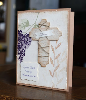
Here's my son's by itself. His is textured and natural and symbollic too with the grapes and wheat and cross. I used the Linen and Weathered backgrounds as well as sponging and distressing to add to the look. The sentiment "Your First Holy Communion" I typed on the computer, selected the best font and color then printed on typing paper first to check size and color. After adjustments I ran my nice SU Vanilla cardstock through the printer then punched it out with the Curly Label punch.

I have no religous themed stamps so I made the cross myself out of strips of paper. Sponged, stamped and used the ticket punch on the corners (tried rounding but that didn't look so good) then wrapped some linen thread around it. The cross and the sentiment are raised on pop dots (dimensionals).

Supplies are SUO:

Stamps: Blossoms Abound, The Art of Life, Fancy Flexible Phrases (for 'blessed'), Linen, Weathered

Cardstock: Creamy Caramel, Very Vanilla

Ink: Mellow Moss, Elegant Eggplant, Creamy Caramel

Accessories: Curly Label Punch, Distressing tool, sponge, word window punch, 3/4" square punch, ticket punch, linen thread


This is my daughter's card- obviously. Much more girly, swirly and sparkly! Just her style. I started out thinking I'd use my Pink Piriouette felt flowers to do this but decided I just didn't have the heart to use them ALL at once (at least all of what I have left!). So, I used one flower from the Spring Bouquet punch.

The white paper is shimmery white so it has a sparkle to it. I ran that through the Big Shot with a Texturz Plate for the dimension of embossing. There is a pink rhinestone brad in the center which she'll LOVE! The sentiment was typed again then printed on my last scrap of shimmery white paper and punched with the scallop square punch.

The pink ribbon is taffeta- which is behind the shimmery white layer but comes out behind the sentiment where I punched a vertical slot with the horizontal slot punch (go figure!). I'm not entirely sure about the bow placement but it tied so perfectly the first time, plus my sentiment is glued down and the hole is punched so it is either staying or completely gone, but it can't be moved!

SUO Supplies

Stamps: none!

Cardstock: Shimmery White, Pink Pirouette

Accessories: Big Shot, Texturz Plates, Spring Bouquet punch, Square rhinestone brad, Scallop square punch, pink taffeta ribbon

Wow, that is a long post! Thanks for sticking with me this far, if you have. Hopefully if you need a First Communion card I've got you covered as far as inspiration goes for a boy or a girl!

Thanks for stopping by!

~Kristin

Live With Passion!

Today (actually yesterday) I made this card for the Splitcoast Sketch Challenge (SC224). Not sure what made me think of it, but this card came to mind that I did back in 2006. It got a lot of attention (which I enjoyed!) but I never really did the technique again until today. I just wasn't sure I could recreate it with different stamps. Of course I had butterflies in mind because they are everywhere (in the stamp world, not outside yet!) and I've been using them a lot lately. So thought I'd go for it.

The shaded butterfly is the large one on the Beautiful Butterflies die from Stampin' Up! I cut it with the Big Shot on typing paper and used both the butterfly and it's outline to mask shading and stamping. The shading was done and the grass image was stamped while the outline of the buttefly was in place (TIP: use post-it notes to cover the inevitable holes the other butterflies leave behind). Remove that and temporarily adhere the butterfly itself (paper not real!) to the exact spot of the shading then stamp the background stamps (I used Linen and French Script- sorry both retired.)

Last I stamped the flowers and sentiment with Night of Navy craft ink and embossed with clear embossing powder.

I hope you like it! Enjoy your day!
~Kristin

SUO Supplies
Stamps: Inspired by Nature, Stem Silhouettes, French Script, Linen
Paper: Night of Navy, Sahara Sand, watercolor paper
Ink: Night of Navy, Sahara Sand
Accessories: Distressing tool, Navy Organdy ribbon, clear EP, Big Shot, Beautiful Butterflies Die, sponge

Wednesday, April 15, 2009

Diva Day!


That's right, it's Diva Day! We were given a fantastic sketch this week, and I've love for you to play along! I once again whipped out my new set Great Friends and decided to go monochromatic. Guess what- this week's CAS challanege on SCS was a monochromatic card so I've got that done too!! How's that for multitasking?!!

This one was tough to photo because I wanted to show the textured dots on teh background. I still didn't get a great shot, but hopefully you get the idea. It's a good idea to add texture when trying to keep the colors neutral. I also added texture by embossing the butterflies and sponging over them with some Sahara Sand ink. This is a fun technique to try! The leaves are my new embosslit for the Big Shot, and the hardware is from the Stylin' Silver Hodgepodge kit! Hope you like it, thanks for stopping by!

Don't forget to go check out the Diva blog and the other Diva's- they have a lot to show you!
~Kristin

Tuesday, April 14, 2009

Back in Blogland!

Yes, I'm finally back! I just got my taxes submitted today so I was able to stamp for a bit. I still have a BIG weekend ahead with my kids' First Communion and a house full of guests, but I had to get some stampin' in! This is for today's color challenge on SCS as well as this week's Mojo Monday sketch.

The color challenge was to use Pink Pirouette, Bording Blue and So Saffron. I really struggled with the Saffron- I just don't like that shade with the pink so I snuck it in with a tiny brad! The sketch was fun and makes a pretty clean & simple card if you want. I used vellum for my top layer as well as the bottom layer of scallops. Embossed the "LOVE" image with Bordering Blue craft ink and clear EP, then colored in with Watercolor Wonder Crayons and a blender pen. The background is stamped with white ink and the trio of hearts from this stamp set.

Thanks for hanging with me after such a long delay! I do like to post everyday but just couldn't get to it over the holiday weekend. Tomorrow I will have a new Diva challenge for you as well as this week's Clean & Simple challenge on SCS.

~Kristin

Thursday, April 9, 2009

Mojo Monday on a Thursday!

Guess what- I am finally feeling back to normal I think! I've been wanting to play along with the Mojo Monday sketch all week and finally got to it this evening! It helps that DH has my kiddos at a track meet right now.

As always I loved the sketch and was excited to play with it (this is my 10th Mojo sketch already!!). This stamp set is new to me. I hadn't planned to get it- not because I don't like it, but because I figured I could live without it (and admittedly I hadn't checked the gallery or I'd have caved a LONG time ago!) However, I stuck it on my last order thanks to a freebie from SU so here it is! Man do I love it now!

Anyway, I started with some Urban Oasis paper and just went from there. I used a blender pen with some ink picked up from the ink pad lids to color in the butterfly- love that look! To try to distinguish each layer I pierced one, roughed up one and lifted the sentiment layer with dimensionals. Don't ask me why I scalloped the top of one panel and the bottom of the other- kind of showing my quirky/funky side there I guess. I had to throw on the filigree brad for some bling- I have only 1 small one left and all big ones. And man am I getting my use out of those 5/16" jumbo brads- you can't accuse me of hoarding those babies!

Anyway, thanks for stopping by! I'm so glad to be back amongst my stamping friends!

~Kristin
SUO Supplies
Stamps: Great Friend
Paper: Basic Gray, Very Vanilla, Urban Oasis DSP
Accessories: Filigree brad, Kiwi Satin ribbon, paper piercing tools, 5/16" silver jumbo brads, scallop edge punch, blender pen, distressing tool
Ink: Kiwi Kiss, Baha Breeze

The Final Four!

I hope you aren't tired of seeing scrapbook pages, but if you are these are the Final Four for a while! This first spread is just some typical days at home with kiddos- painting and playing in laundry baskets. I still need to put something in the oval of the yellow tag... haven't gotten that done yet.

To Imagine is Everything

If this looks familiar, it is the same basic layout as in my son's album. I had to change colors for lack of paper, and the pics are more focused on my daughter. I don't like the colors as well, but still a fun and easy page!

Chick or Treat

One day I found my then 3-year old daughter playing dress-up with her babies... only they were all dressed in life-jackets instead of pretty little dresses! It was too funny to pass up! The poem was found in a book I have just for scrapbooking, of titles and poems and sayings. Very helpful!

Love my Dolls
Does anyone else just dread doing Christmas pages? I sure do- I don't like a given color scheme all the time (which I know I could be creative, but it seems all things related to Christmas come in red/green! Also, the pics are usually not so good due to family chaos! These are from my son's preschool Christmas program. I eliminated the crummy pics and only used the few good ones (there are a few tucked in the pocket I made on the right, along with the program and more journaling). The embellishments and title were made with the Cricut again. Felt snowflakes are from SU, as well as the papers. I intend to add red ribbon to the envelope and some flourishes on the right page since it is kind of boring. These were all things I didn't have with me when I made it.

Season's Greetings

Oops, just realized I hadn't shown the Halloween page from my son's album so here it is:

Don't Rot Your Teeth
I guess this should be called the Final Six then!


Well, thanks for looking. I hope I've inspired you to scrapbook a little today maybe!

~Kristin


Wednesday, April 8, 2009

DCBD #122- better late than never, right?!


Well, I did it! And on the due date, just a little late. I'm finally up for a bit of stampin', although I'm thinking I need to go lay down again. Anyway, here is my contribution for this week's Diva challenge to use the Big Shot in our design somehow. Good thing about me being late is that my SU order arrived today with these Big Shot dies and this white taffeta ribbon! I also included embossing with a Texturz Plate and the new scallop oval punch.

I hope you like it, and that you might consider playing along! Get out that Big Shot and work some magic! Hopefully I'll be up for more tomorrow, we'll see.

Thanks for visiting and all the well wishes!
~kristin
SUO Supplies
Stamps: All Holidays
Cardstock: Pale Plum, Perfect Plum, Mellow Moss, Vellum cardstock
Accessories: Big Shot, Little Leaves sizzlit, Flower Burst embosslit, scallop oval punch, large oval punch, white taffeta ribbon, Texturz Plates

Flu Bug!

Sorry for no DCBD card this morning. I helped out at school yesterday until noon and started feeling sick shortly after that. I was up doing you-know-what most of the night. I'm better this morning, but shaky and weak so not sure if I'll be able to make something to post or not.

Thanks for your patience and understanding! Now go get some anti-germ spray and spray your computer monitor just to be sure you don't get this. LOL.
~Kristin

PS- sure wish I had a laptop so I could lounge around on the couch with it today and at least do some blurfing!

EDITING TO ADD: Duh, in the mean time please go check out all the creativity of the other Divas! They would love to hear from you and you'll be sure to enjoy their creations! This week the challenge (DCBD122) is to use the Big Shot in some way- so go try it out and be sure to link your creation to the DCBD blog. Heck, you can link it here too so I'm sure to see it!

Tuesday, April 7, 2009

CAS09- Get Distressed!


For Monday's Clean & Simple challenge on Splitcoast we were to do some distressing on our card. No problem! I'm all about distressing. The other night I woke up in the middle of the night and had a very clear vision of a card in my mind that I really wanted to do. I didn't get up and sketch it like I should have so this is only slightly similar.

For the distressing I obviously roughed up the edges, but I also randomly wheeled around the stamped image with the Rough Texture Jumbo Wheel (retired I think) with some Creamy Caramel. The grass & flowers were stamped in Versamark and then chalked with a cotton ball. Colors are Old Olive, some Garden Green, Rose Red and Chocolate Chip. It is so nice to have the Stampin' Pastels come in SU's 48 colors! The sentiment, from Fifth Avenue Floral is stamped in Chocolate ink. Lastly I taped the ribbon on the backside of the paper and tied some linen thread in a knot for a neat new look.

That's it. I know I don't have a lot of white space, as most CAS cards do, but this is one layer, quick and a very simple technique used. For my definition this is pretty Clean & Simple.

Thanks for stopping by! I'd be interested to see what you've done lately! Link back here so I can take a look!
~Kristin

More scrapbook pages!

Hi! Here are a few more pages I completed this past weekend. These are all for my son's album. The first two have titles made with the Cricut, the last one is stamped. All of my pages are in plastic sleeves already since I am not using top-loading pages for my straphinge album! Sorry for the glare in some cases.

Yes, they are ice fishing on this first one. They are standing in the middle of the lake. See the houses in the background? That's the closest shoreline! It was cold but my son loved every minute of it- that is him with his bare hands stuck down in the ice hole! BRRR!!

Playing in the leaves with the neighbors. Here I used up some old stickers and embellishments from AGES ago!
My son's preschool class during their Halloween party. He is the football player at the top left. Lots of pictures on this layout!
Thanks for stopping by!
~Kristin


Monday, April 6, 2009

TWENTY-ONE Pages Done!!

I'm back from my awesome scrapbook retreat and am ready to share some scrapbook pages I got done. I am almost to my goal of 30 for the month, at 21 pages done! Over the next few days I'll share what I did; the good the bad and the ugly! Some of them I have a few extra details to add but forgot to do that before I photographed. Some aren't the best or most creative, some I am really happy with.


I should mention, as I have before, that I do not scrapbook in 100% Stampin' Up! Not that I don't LOVE SU for scrappin', it's just that I started scrappin' long before I knew about SU so I use whatever I've got! Oh, one more thing to mention, there are NO DEAD ANIMALS in these pictures anywhere- promise!


Thanks for looking!


For this page I used all SU stamps and ink, gel pen, chipboard, punch and rhinestone brads. The cardstock is all SU, the striped paper is not. Stamps: Snow Burst, Jumbo Outline Alphabet.

This page was done entirely with a neat kit I bought at Joann's for $5! It made 2 complete layouts plus I have most of a chipboard alphabet left. These are the annual daughter-in-wedding dress pictures. This time my son joined in with his dad's shirt & tie (normally, and since then, he refuses). The jounaling I did with an SU marker.

This page is also a mixture of products- the striped paper is SU and so are the jumbo brads, ink and stamps (Pick a Petal, Lovely Letters alpha, Rough Edges Alpha). I also have a picture of the detail. The Love stamp was made with the Cuttlebug and a die (these awesome CB dies will go in our Big Shot too- so versatile!).

These pages are all for my daughter's album... tomorrow I'll post some pages I did for my son's album. I finally made it into 2005 with my albums!! WOO HOO!

Thanks to Karen for letting us all use her Cricut this weekend (I used it a lot but surprisingly not on any of these first pages I've shown you), thanks to Linda for sharing her Cuttlebug and especially to Carol for planning the entire weekend!

Thanks also to Joan at Myeerah's Inn in Zanesfield, Ohio- the wonderfully charming Bed & Breakfast which was ideal for our group of 10 stampers and scrapbookers. Joan provided us 3 delicious gourmet meals which we look forward to evey year and a HUGE cropping room, plus cozy bedrooms to stay for the weekend! Zanesfield is a quaint little antiques town nestled in the hills of Ohio. If you are interested in holding a scrapbooking event (or any type of event) there I highly recommend it. You can reach Joan at 937-593-0000.

Glad you stopped by! If I get my Mojo Monday or CAS cards done for today I'll be back to post them later! Have a great Monday!

~Kristin

PS- anyone know why sometimes you can click on an image to enlarge and sometimes you can't? I've been noticing this lately. UGH! Sorry!