Wednesday, March 31, 2010

Feathered Flock- Part II

So here is the entire set of note cards I've made using Lynn Pratt's bird class as inspiration! Aren't they just lovely together?? Here are individual shots so you can see more details. I hope you like them and might just try one yourself. One key ingredient is the Extra-Large Two-Step Bird punch which is currently available from Stampin' Up! in the Occasions Mini Catalog through April 30th only. If you'd like to place an order through me just let me know and I'll be glad to take care of you!

Wood Thrush?

Blue Jay

Cardinal

Robin

Woodpecker

Gold Finch

and finally, the Oriole again.
Everything used is by Stampin' Up! Cardstock colors, stamps & punches used vary- but if you have any questions feel to ask.
~Kristin
ETA: Thanks for all the comments and questions. I thought I'd try to answer a few of the questions, but also want to point out that on my post below there is a link to Lynn Pratt's classes where you can purchase the pdf file for downloading to get excellent, complete and detailed instructions on how to make some of these cards. Many of the birds are pieced together with multiple punched birds, cut in various ways (for example: the cardinal uses at least 4 red punched birds and one black one). Details are added with markers, white gel pen, punches circles for eyes in many cases and ink sponged on for definition. Also, the punch used is called the Extra Large Two-Step bird punch and can only be purchased from Stampin' Up! Here is a link to the bird punch- be sure to order through your SU demonstrator for the best possible price. If you don't have a demonstrator I'd be glad to order it for you! I hope that helps!!

Feathered Flock- Part I {DCBD171}

Good morning! Are you ready for a new Diva Coffee Break Designs sketch challenge?? This week we've got a very simple, straight-forward sketch which leaves a lot of room for creativity and interpretation!


Just yesterday I found a blog with an absolutely lovely collection of punched birds done with the Extra Large Two-Step Bird punch that I couldn't wait to try. Literally I spent all morning making SEVEN different birds. I can't wait to put these into a collection as a gift for someone whom I know will appreciate them. (Not mentioning any names in case she reads this too soon!)

To see most recent collection and even order a very well done set of instructions go visit Lynn Pratt at Stamp-n-Design or click here to view her original set of bird cards. I am happy to say that I suggested the 3 types of birds in her most recent collection and not only did Lynn put that idea to work right away, she also sent me a copy of her instructions as a thank you! Thank YOU Lynn.

So stay tuned for the rest of my collection- I have even added two birds to Lynn's collection that are common in Ohio. Can't wait to share them with you!

Thanks for stopping by today and don't forget to go check out the rest of the Diva's creations for today's sketch then play along yourself and link your card to the Diva blog!

Have a wonderful sunshine-filled day!
~Kristin

SUO Supplies
Stamps: Whimsical Words (last day to get this is TODAY!!!)
Colors: Very Vanilla, Pumpkin Pie, Creamy Caramel, Basic Black, Old Olive, Chocolate Chip
Accessories: Extra Large Two-Step Bird punch, Pinking Hearts border punch, Jumbo Eyelet, 1.24" circle punch, tag corner punch, rope (retired)
Today's TIP:
  • Always give proper credit when borrowing an idea from another artist! It's the right thing to do.
  • Have fun with your punches- they are tools with endless possibilities!

Tuesday, March 30, 2010

Inspired Watercolored Sympathy

I rarely get to play along with the Inspiration Challenge on Saturdays at SCS. But this weekend I did. We were directed to find inspiration at Thymes.com which was no problem. I used the entire Lavendar collection to guide this card. Obviously I grabbed the soft shades of purple with a lot of white space, and added some texture with the embossing after the stamping and the pinking hearts border punch.

Since this is watercolor paper, after I stamped the images I gently went over them with a wet aquapainter just to let the ink bleed a bit. Lends to a softer more artistic look I think. This card ended up being 4.25x4.5" so it's not quite square.

Topped it off with the vanilla hodgepodge hardward and some wide vanilla organdy ribbon. Hope you like it!

Thanks for stopping by!
~Kristin
SUO Supplies
Stamps: Oldies but goodies: Art of Life, Easy Elegance, Stem Silhouettes
Colors: Elegant Eggplant, Almost Amethyst, Very Vanilla
Accessories: Wide Organdy vanilla ribbon, Vanilla hodgepodge hardware, Big Shot, Manhattan Flower Textured Impressions embossing folder, Pinking Hearts border punch

Monday, March 29, 2010

Creamy Pink Durangos?!!

Last week's color challenge on SCS was to use Creamy Caramel, Pretty in Pink and Dusty Durango. I had never considered these colors together but as soon as I pulled out scraps of each color I was instantly excited to try them! I'm not a huge Dusty Durango fan, so small doses is just the perfect use for my taste.

This layout is from a sketch on the Clean & Simple Stampin' Blog (FTL84)... always a great place to find a good sketch! It is a 4.25x4.25 square card.

I used the stamp set Happy Moments (again!) and watercolored the flowers with an aquapainter and ink from the lids of the ink pads. The Vanilla paper is watercolor paper which is why you can see some texture. This is my first use of this Pinking Hearts border punch (is that what it's called??) I'm glad I finally broke down and bought it because it definitely is a different look than anything else I've got.

So glad you stopped by today. Looking forward to some absolutely gorgeous weather by the end of this week- can't wait!!
~Kristin
SUO Supplies
Stamps: Happy Moments
Colors: Creamy Caramel, Vanilla, Pretty in Pink, Dusty Durango
Accessories: Aquapainter, Pink gingham ribbon, Pinking Hearts border punch, 3/4" circle punch, notch corner punch

Sunday, March 28, 2010

Cool Pool! {12x12 scrapbook layout}

Remember THIS CARD I shared with you last week? Well I mentioned that it was inspired by a scrapbook page which I'm showing you today. I found a very similar page in a magazine and just had to CASE it. Basically the layout is what I copied with the variety of ribbons, but my colors and paper are different. It is such a neat looking page in person, but man did I have trouble photo'ing it, which is why it has taken so long to post.
Here is the facing page, which I added some bits of ribbon scraps to the pictures to tie into the other page. I've left some room for journaling which I normally neglect, but then I drew a blank so haven't written anything yet.

Everything on these two pages are Stampin' Up! products including all the ribbons, although some are no longer available. This is a great layout for using a fun variety of scraps especially if you keep a scrap ribbon jar like I do!

Thanks again for visiting! I hope you'll come back soon.
~Kristin
SUO Supplies:
Stamps: Jumbo Outline Alphabet
Paper: Kraft, Bermuda Bay, Thoroughly Modern DSP
Accessories: Vintage brads, lots of ribbon!, Curly Label punch, circle punch

My first pleated ribbon!

Have you seen this Mojo Monday sketch from last week? I had a chance to stamp on Saturday so decided to try it out. It started out a horizontal card just like the sketch, but ended up being turned on it's side. I also really wanted to try my hand at this fun trendy technique of pleated ribbon. I know I'm a bit behind the times, and I really do like the look, but it was hard for me to use that much ribbon.

I also grabbed my color combo from the Color Throwdown challenge blog. I haven't been able to join them in a while so was happy to put these colors to use. I also added in black as an accent so I'm hoping that's OK.

Thanks for stopping by! I've got more to come, believe it or not!
~Kristin
SUO Supplies
Stamps: Medallion background, Oval All
Paper: Basic Black, Baha Breeze, Very Vanilla, Certainly Celery
Ink: Baha Breeze, Garden Green, Black Staz-on, Certainly Celery
Accessories: Large oval punh, scallop oval punch, black striped ribbon


Wednesday, March 24, 2010

Cherish

As I promised (warned), here's yet another 12x12 scrapbook spread. The left side was inspired by another magazine layout I found. It is missing the journaling which I'll add one of these days. I used some Razzleberry Lemonade DSP for each of them as well as some dimensional flowers that I've had for a year that just happened to match fairly well. I inked up my chipboard title with the Melon Mambo marker which works great because I was able to get the edges and all the nooks and crannies. Below are close-ups of the individual pages. Hope you like!

Thanks for stopping by!
~Kristin

Classic, almost vintage, whimsical Easter

This week's Diva Coffee Break Design challenge is a color challenge which I don't think you'll have any trouble with! Certainly Celery, Pretty in Pink and Close to Cocoa. Easter came to mind right away when I considered these colors... One of the scrapbook pages I did this weekend was inspired by a sketch and includes a LOT of ribbon. I loved this layout right away and Lisa mentioned she'd like to try it on a card. Well I'm trying to beat her to it. LOL! This isn't quite the same, but has the idea of a ribbon variety being showcased. Initially I had a bow on every ribbon but decided it was too messy looking on a card and the Easter image was being overshadowed. So, I trimmed them all except one, added the Latte button to the center and called it a day.

The main image from An Eggcelent Easter is watercolored with an aquapainter and Watercolor Wonder Crayons. Used the markers for the detail on the eggs. Sentiment is from Well Scripted stamp set.

Notice the texture on the Close to Cocoa background? That is a new-to-me textured impressions embossing folder called Finial Press. I think it goes perfectly with this classic, almost vintage, slightly whimsical style, don't you?!

Anyway, thanks for visiting with me today! Hope your day is great! Be sure to go check out the Diva blog for more ideas with this color combo and a chance to play along!
~Kristin

SUO Supplies
Stamps: An Eggcelent Easter, Well Scripted
Paper: Pretty in Pink, Whisper White, Close To Cocoa
Accessories: Latte designer button, Finial Press Textured Impressions folder, Big Shot, Top note, Watercolor Wonder Crayons, Aquapainter, ribbon: Pink & white taffeta, Pretty in Pink and Certainly Celery grosgrain, Pretty in Pink gingahm, wide pink organdy, wide celery twill

Tuesday, March 23, 2010

A few Fish Stories

Here's another layout I finished this weekend. Both layouts were inspired by sketches from various magazines. The papers I used were all from a retired SU collection called Playground (I believe). I can't say enough about how wonderful it is to work with Stampin' Up! collections of patterned papers when scrapbooking. The coordination and excellent design choices make pages a snap! The alphabet title on this page is an old alpha for my Sizzix that works in my Big Shot (woohoo!) and the little scribble detail is a sizzlit available through Stampin' Up! called
Swirls Scribbles. Did you notice the scribble detail here again? I used the throw-away part from cutting it out for the previous page as a stencil and sponged some white ink over it. Worked like a charm for making fun coordinating accents. The word "stories" is an alphabet I borrowed from Lisa and I'm not sure of the brand or name of it, sorry!

Here's the entire layout as it will be in my album. And I've got a Stampin' Tip for you that I've learned from experience!
Stampin' Tip:
  • If you are behind in your scrapbooks but work chronologically (as I do, these pages are from 2005) then take some time to save your thoughts behind the pictures when saving them on your computer. This will help tremendously when journaling and you will be SO GLAD you did 5 years down the road! Trust me! ;)

Thanks for stopping by! You know I'll be back tomorrow with my Diva card and challenge and maybe another scrapbook layout. Have a great day!

~Kristin

SUO Supplies

Stamps: Circle Circus (for circles on the chipboard "fish")
Papers: Playground DSP, Whisper White
Accessories: Swirls Scribbles Sizzlit, Big Shot, Chipboard, non-SU Sizzix alpha

Monday, March 22, 2010

Hair Today Gone Tomorrow- a Scrapbook Layout

First off, a big SHOUT OUT to my friend Lisa Henke for hosting a fabulous scrapbook weekend! We had a blast: I met some new friends and completed 10 pages in my albums!! What could be better?? Well, I got to hang out with my sister and her family for a night as well! Thanks to this fun productive weekend you will get to see some scrapbook pages over the next few days and I must say they are a notch better than my normal work so hopefully you won't mind.
Here is a fun page on which I HAD to squeeze NINE pictures on to tell the fun story (fun to my family at least). During a trip to visit my aunt and uncle at their lake house in Virginia we spent a beautiful afternoon on their dock, which included the guys all getting Buzz Cuts whether they wanted them or not. I got many fun pictures of my dad and his brother which I have very few of so this page will hold a fond memory for a long time.

Stampin' Tip: This type of layout full of 2" or 2x4.25" pictures is a great way to accommodate a BUNCH of pictures. It was hard for me to do that much major cropping but I love the result.
Here is the right side of the spread which includes the title on some key points for journaling. I used the retired Pina Colada Simply Scrappin' Kit for the designer papers (aren't they awesome?!). The layout on the right was inspired by one Lisa found in a magazine of hers. She taught me by example that using magazine layouts is a great way to get fabulous pages done!

My title is done with the Naturally Serif Decorative Strip alphabet die and the Big Shot. Yes I will be adding this to my next order! The "gone tomorrow" I just wrote with the white gel pen. I added the wide Old Olive ribbon with every intention to switch it to my Riding Hood Red when I got home, but now I've changed my mind and will keep the Olive.

Gotta run, but thanks so much for stopping by today! It's raining here but that's OK because I MUST spend some time getting my taxes ready by this afternoon so toodles!

~Kristin

SUO Supplies unless otherwise noted
Paper: Pina Colada Simply Scrappin' Kit, Old Olive, Basic Black, Real Rust
Accessories: Circle cutter, Naturally Serif Decorative Strip alphabet die , Big Shot, jumbo white brads, Playground designer buttons, butterfly punch, non-SU white number stickers

Friday, March 19, 2010

Spring Planting

I'm leaving today for a scrapbook weekend and since I haven't posted much lately I thought I'd show you a layout I did last week. Hopefully I'll have some great new layouts to show you starting on Monday... if not you'll know I did more socializing than scrapping!


These pages are for my family album and I'll do the same pictures with similar layouts for the kids' albums too. They are not the BEST pictures, but will bring happy memories down the road of the spring planting with dad. Somewhere I've also got pictures of the harvest, but I couldn't find them for this layout so they will have to be their own page someday!

As you know this is a mostly SUO (Stampin' Up! Only) blog. However, I do scrapbook with other products at times depending on what I have on hand. These pages were done with a kit by Creative Memories. And while the papers are lovely I couldn't help but be disappointed with the less than perfect color coordination (with the other products that I didn't use from this kit) and the relatively small number of items in the kit. Using other products almost always makes me once again appreciate the artists at Stampin' Up! and the quality of their products. But I paid for it, so I was darn well not going to let it go to waste!

Thanks for stopping by and have a super-fantastic-sunshine-filled weekend!
~Kristin

Wednesday, March 17, 2010

Cottage Wall Lattice Birthday

I'm back at ya with another Diva sketch today! Be sure to play along- and don't worry, you can flip it, stretch it, rotate it... just use it as your guide. We won't kick you out, I promise! At least I hope not because I've turned the main square in the sketch to make a more interesting lattice die diamond instead.

Today I just HAD to use this new set Vintage Labels- I've been meaning to but hadn't managed to use it yet. The color challenge on SCS this week is Rich Razzleberry, Orchid Opulance, Old Olive and neutrals of your choice. This is close- I think there's some Orchid in that striped paper somewhere.

Stampin' Tips:
  • Did you notice the Organdy ribbon is woven through the lattice die cut? There are so many things to do with that die- I highly recommend it if you don't have it already! Want some other ideas for this die?? See my list of labels on the right and scroll down until you see "lattice". There will be 7 other posts with ideas not including this one.

Gotta run, have a super great day!
~Kristin
SUO Supplies
Stamps: Vintage Labels (still available for FREE until the end of this month with any $50 order!!)
Accessories: Lattice Die, Big Shot, Wide Oval Punch, Scallop Trim punch, White Organdy ribbon, Cottage Wall DSP

Tuesday, March 16, 2010

Welcome Sunshine!!!

Boy am I thankful the sunshine is back today! In fact, it is expected to be fairly nice and warmer this whole week from what I understand. WOOHOO!! Today I decided to take a break from the stresses of tax preparation and actually stamp a little. I've got tomorrow's Diva challenge card done so be sure to stop back tomorrow for a great new sketch. For now I'm sharing this card with you. I used the Mojo Monday sketch challenge from yesterday. LOVE this sketch! It's got some great details that are specific, but can also be interpreted in so many ways. Love that!

I intended to make a sympathy card today since I am out of them, but decided I was too happy and just felt like making a happy card. This old set of textured papers is called Parisian Breeze Specialty papers. I'm so glad I have some left to play with- they are gorgeous and really the star of this card. I only added a bit of piercing and some kraft taffeta ribbon, then embossed the sentiment from Well Scripted (a favorite!) and that's it.

Thanks for stopping by! Hope you are enjoying sunshine in your neck of the woods today!
~Kristin

Stampin' Tips:
  • Short on time or inspiration?? Grab one of SU's wonderful packs of Designer Series Paper, ANY of them, and let the patterns and colors do all the work!
SUO Supplies
Stamps: Well Scripted
Papers: Kraft cardstock, Parisian Breeze Specialty papers
Accessories: Kraft Taffeta ribbon, Scallop Trim punch (yes I'm aware that I use it constantly!)

Sunday, March 14, 2010

Lisa's Challenge!

As I mentioned yesterday, Lisa and I challenged each other during our afternoon of virtual stamping together. Her challenge was a 1,2,3 LIST challenge in which we were to use:
1 piece of DP
2 embellishments
3 layers
and just to make it a little more challenging-NOT an A2 size card.

I did the best I could and at least it got me stamping again. My one piece of DP was the printed sheet music I used, 2 embellishments are the punched flowers and the punched bird. My three layers (use your imagination) are the Cheesecloth stamped background, the next layer is the stamped & embossed grass (Inspired by Nature), and finally, the third layer is the flower and bird punches. I know- it's a stretch! But it is 4.25" square card so I accomplished that part for sure!

I have a thank you note card from my sister that inspired this card- in fact I did my best to CASE it. From the colors, to the use of the grass, flowers and birds. It's not my favorite, but it was fun and got me stamping again!

Thanks for the fun Lisa!
~Kristin

SUO Supplies
Stamps: Inspired by Nature, Cheesecloth background, Picture This
Colors: Pumpkin Pie, Whisper White, Summer Sun, Ruby Red, Bermuda Bay
Accessories: Big Shot, Elegant Bouquet embossing folder, hole punches, Boho Blossoms punch, Modern Label punch, Word Window punch, Two-Step Bird Punch, white embossing powder, tiny flower punch is a very very old non-SU punch

Saturday, March 13, 2010

Daylight Savings Time- here I come!

Now don't get me wrong, I am NOT excited about setting my clock up and losing an hour of sleep... but my pal Lisa and I had some time to virtual stamp together today and decided to challenge each other. My challenge was to use products that start with D, S and T!

Here are the things I used to fit the challenge:

D- DSP (designer series paper), deckle edge scissor
S- Sahara Sand, Stitched felt flowers, Scallop Trim punch
T- try as I might I can't stretch anything to start with a T. Oh wait, this is a thank you note! There, that's my T!

This is my first use of the stitched felt flowers by SU. Aren't they fun?! And I used a sketch from my February Stampin' Success magazine that all SU demonstrators get each month. Are you wondering about my sheet music paper? I've always wanted some and today decided to photocopy piano music from one of my favorite songs I used to play called "Old Friend" onto Whisper White. I crumbled it up then smoothed it back out and swiped it with some Sahara Sand ink then trimmed the edges with the deckle edge scissor.

The sentiment is from the hostess set called Picture This, punched with the Modern Label punch. Do you like my scalloped corner? I used the photo corner punch to layer the Rose Red paper behind it. I really like how that looks!

Had a crazy busy week this past week so here's hoping for a little more normal pace this week! My stamps have been sorely neglected lately.

Stampin' Tip:
  • Can't find a particular pattern of paper you're looking for? Try scanning something or downloading from the internet then run some Whisper White cardstock through your printer! Works like a charm!

Thanks for stopping by!
~Kristin

SUO Supplies
Stamps: Picture This
Colors: Sahara Sand, Melon Mambo, Rose Red, CHocolate Chip, Old Olive, Pretty in Pink, Whisper White
Accessories: Stitched Felt Sweet Pea flowers, Scallop Trim edge and corner punches, Modern Label punch, deckle edge scissor

Tuesday, March 9, 2010

Long time no see!

Goodness, sorry it's been a while since I've posted! Honestly, it's been a while since I've stamped! I've had a number of things going on lately that have kept me super busy- don't worry, mostly good stuff. My hubby is finally getting a new truck (well, used but new to us)- he's been driving his current one for 15 years! And I have a new mattress coming today- finally! I don't even want to admit how old our current one is, but a clue would be that it is older than ME. No we didn't win the lottery, it is just long over due for both of these things. Let's just hope that all our major appliances continue chugging along for the foreseeable future!

OK, enough chatter, on to the card. Today is a Diva day- thank goodness for Diva days to get me stamping even when I'm not sure I've got time. This week we've got a color combo that might make you cringe... until you try it. It's fun, trust me! The first time I saw this color combo was on something amazing by Angie Tieman. When I find it I'll come back and link to hers- it is just beautiful!
Stampin' Tips:
  • When using Sweet Treat cups, be sure to plan ahead and consider how the recipient will retrieve the treats inside. I've punched a 3/4" circle in the paper covering the back and covered that hole with a Full Heart Punch that is adhered with a repositionable adhesive.
  • Don't be afraid of funky color combos. Remember, you don't have to use every color in cardstock form- you can add a hint of color with just ink or ribon.
  • For good color balance remember this rule: when using two colors your accent color should only be used about half as much as the primary color. When using three, the third color should be used a third, and so on. Make sense?
  • There are some excellent tips on SU's Color Coach color wheel!
I hope this Diva Day will get you stamping as well! Thanks for stopping by!
~Kristin
SUO Supplies
Stamps: Something Sweet
Colors: Soft Suede, Cameo Coral, Certainly Celery, Bermuda Bay
Accessories: Sweet Treat Cups, 1 3/4" circle punch, Modern Label punch, Celery twill ribbon (no longer available), small heart punch, Eyelet border punch, crimper

Friday, March 5, 2010

Stenciled Wonderful Friend

Today I noticed on SoShelli.com (Stampin' Up!'s CEO, Shelli Gardner's personal blog) that the challenge for March is to use a stencil for a project. Love that idea! I bought a pack of the Folk Flowers Decor Stencils from the Occasions Mini Catalog a while back and have only used them once or twice. In fact, I hadn't used this pattern at all yet. So I was excited to get it out and play! This time I sponged Whisper White ink onto only certain parts of the design to get this look.

I added a few extra touches with the Scallop Trim edge at the top and some piercing and dotted grosgrain at the bottom. I really wanted a Melon Mambo brad for the center of the top flower, but since there aren't any I decided to just punch out the center of the flower with my 1/8" hold punch so the paper shows through.

The one part I'm not sure about is the dots on the "friend" piece. I think that might be a little over the top for my simple design. What do you think? I may just make another one just like it but leave the dots off and glue it right on top. I'll wait to hear from all of you though!

Stampin' Tips:
  • Only want to use part of a design in a stencil? Block off the other areas with strategically placed sticky notes. Have a smaller area to block off? Either tear the sticky note, or try using one of those sticky note flags that are really small.
  • Have old In Colors and not sure what to do with them? Why not try combining them with a current In Color for a fabulously unique color combo! (Shown here are Marigold Morning and Melon Mambo)
  • Don't have a brad in the color you need? Try punching a hole instead and allowing the paper to show through from behind!
  • Want to see more Decor Stencils? Click HERE to see SU's entire collection!
I hope you like it! Thanks for stopping by today. Feel free to go play along with Shelli's challenge- I'm sure she'd love to have you!
~Kristin

PS- If you are ever in need of Stampin' Up! products I'd be glad to place an order to be shipped directly to your door. Feel free to contact me at stamp_for_smiles(at) embarqmail(dot)com

SUO Supplies
Stamps: Wonderful Favorites
Colors: Melon Mambo, Marigold Morning (retired In Color), Whisper White, Chocolate Chip
Accessories: Folk Flowers Decor Stencil, Paper Piercing tools, Small oval punch, Melon Mambo dotted grosgrain, Scallop Trim border punch, 1/8" hole punch, sponge

Thursday, March 4, 2010

Sweet Sunday on a Wednesday!

Have been procrastinating today- avoiding getting my taxes together. Should be some great cards coming out of me in the near future- I'm a top notch procrastinator!! Came across Karen Giron's Sweet Sunday Sketch challenge and decided to try it out. I managed to clean my desk off today and ran across this Melon Mambo scalloped square with the heart punched out from another project, and decided to use it. Did two more in Soft Suede and Crushed Curry too.

What a great sketch- I had fun with it! Thanks Karen!
Stampin' Tips:
  • When you find a favorite challenge site or blog that really appeals to you SAVE it in your faves! Go there often!
  • Use scraps! (Did I say that yesterday?? It is a recurring theme for me.)
  • Tired of your embellishment selection? Look to your punches, combine them, and see what you come up with!

Thanks for stopping by and have a great day!

~Kristin

SUO Supplies

Stamps: Picture This

Paper: Melon Mambo, Soft Suede, Crushed Curry, Sahara Sand

Accessories: Scallop trim punch, small heart punch, Soft Suede dotted grosgrain, Heart to Heart punch

Wednesday, March 3, 2010

Good Wednesday!

Hello everyone! So glad you decided to stop by today! I've got two cards for you today as well as a Diva Sketch challenge. This Barely Banana card I made first, and the funny thing is I like it better in person... but once I uploaded them I liked the second one best on the computer screen. I've made both of mine into square cards which was the Clean & Simple challenge this week on SCS. I tried to also use Tuesday's color challenge (Always Artichoke, Crushed Curry and Basic Gray) but just couldn't go with it. So this one is Barely Banana with strips of Kraft (all scraps, thank you!), a flower blossom die cut with Thoroughly Modern DSP in Bermuda Bay, and a simple white circle. That's it. Oh, well I should mention the decorative circle brad as well!

This one just reminds me of a little beach hut with slats for walls that you can see the ocean through. OK, I admit I have a vivid imagination! You should hear about my wild detailed dreams! The blossom is in Cameo Coral and of course the circle is the Bermuda Bay again. The blue is my favorite Ballet Blue!
I just love experimenting with color, especially when I have a given sketch! I often punch or cut out multiple pieces in different colors just to see what I like. In this case I was able to make 2 complete cards with all my options (and still have some pieces laying here). That leads me to my first TIP...
Stampin' Tips:
  • Want to experiment with fun new color combos? Don't be afraid! Cut out those pieces, grab a scrap of something random, close your eyes and pick if you have to... I often choose something that my brain screams NO to but it can end up being just right. Be open minded and keep trying!
  • Avoid wasting paper! Don't avoid cutting it, but if it doesn't work out, that's OK. Just pop it into a large ziplock bag for that color or even color family. Whatever works for you! Then be sure to check that ziplock EVERY TIME before you grab for a full sheet of cardstock. Trust me, it works! I have one ziplock for every color family, including for each set of In Colors. It can get to be a mess sometimes so every now and then I have to go through and throw away the really tiny stuff. If you have the room, use a separate bag for each color and label it. It all depends on how you use color. If you want, have a bag for reds, one for blues etc. I also keep all my neutrals in separate bags. Then each bag is in my filing cabinet where I keep files of all my colors (organized by color family). Sometimes when I want them to look really pretty I'll put them in order how they are listed in the catalog- a beautiful perfect rainbow!

That's all for now! Thanks for stopping by! Be sure to go visit the Diva blog to play along.

~Kristin

Monday, March 1, 2010

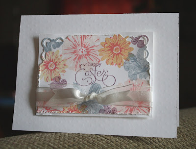
White on White Easter

Good Monday morning! I hope you all had a fabulous weekend! I've got a card for you that I did for one of the VSN challenges on Splitcoast this weekend. The challenge was to use all white cardstock, with only touches of color if necessary. Well, of course COLOR is necessary, but I tried to keep as much white space as possible.

I used the stamp set Greenhouse Garden to stamp the flowers, then added the Easter sentiment in the center. The edges are a bit distressed and the top corners punched with Scallop Trim corner punch, then layered on another piece of white paper. The card base is white also, but with a very subtle texture added with the dotted Texturz Plates and the Big Shot.

I'm so glad you stopped by today! Why don't you leave me a message so I know you've been here! Have a great day!
~Kristin

SUO Supplies
Stamps: Greenhouse Garden, Well Scripted
Colors: White, Blush Blossom, Cameo Coral, Apricot Appeal, Bordering Blue, Perfect Plum
Accessories: White organza ribbon, distressing tool, Scallop Trim corner punch