Wednesday, September 30, 2009

A Diva Sketch today! {DCBD147}

Hello everyone! Gotta make this quick today so I'm not late for a dentist appointment. My apologies for not having this up earlier- I just couldn't get my mojo going yesterday to work with this sketch. No idea why- it is a great sketch!

So I flipped it and reversed it, but it is still the sketch! This amazing dimensional flower was demonstrated on a video tutorial on Julie's blog which you can find HERE! It actually wasn't hard and does make a statement. However, this card will need to be slipped into a gift bag because it definitely won't get mailed!

Did you notice the touches of glitter on the petals and all the centers? I decided since I was so late that I should go all out today! Hope you like it, gotta run! Be sure to go visit the Diva's and check out what they have done then play along with us- we'd love to have ya!

Here's a closeup of the flower. Isn't it cool? I'm kind of proud of my first attempt!

Thanks for stopping by today,

~Kristin
SUO Supplies
Stamps: It's Your Birthday (sorry, retired), For All you Do
Colors: Soft Suede, Apricot Appeal, Ballet Blue, and a little pumpkin pie sponged on
Accessories: Piercing tools, dotted Soft Suede grosgrain, corner rounder, versamark, white EP, Dazzling Diamonds

Tuesday, September 29, 2009

It Just Figures!

Does this ever happen to you? I let a fellow SU demo borrow two things, just two things on Sunday, and guess which two things I wanted to reach for today?!! That's right. Is it a sickness, is it my mean sub-conscious playing with me?? I haven't used this particular Hodgepodge in ages and yet TODAY I decided I needed to even though I don't have my Designer Label punch at this very moment. No problem, trace the Hodgepodge and cut it out, really not a problem. Except I cut it a bit small and it wasn't enough to glue to the Hodgepodge so now you can see between the paper and the hardware which is NOT the look I was going for. Ah well, I'll just fix it when I get my punch back.

By the way, this color scheme is from today's Color Challenge on Splitcoast! To use Pretty In Pink, Going Gray and Sage Shadow. Also, the rope cording I used here is a retired SU product that I just got at a GREAT price because SU offered some serious discounts to us demos on retired stuff! (Hey, that sounds like a recruiting statement!) One more thing about the main image (a TIP), the dove is colored in with the white Watercolor Pencil in SU's set and to get the flowers Rose Red I first inked the entire thing with Basic Gray, then removed the ink on those flowers with a Blender Pen (yes this works great!) then added the Rose Red ink with my marker. Hope that helps!

Other item I lent out was my Top Note die thinking I've got so many new Big Shot items that I can play with I surely won't miss it. Well, it's like a member of my family is gone. I did manage this card without it... but my DCBD card for tomorrow... well, it just won't be the same. Maybe I've got a spare one cut out that I can trace. Yeah right!

Thanks for stopping by! I swear I am trying to work up some season appropriate fall cards and stop skipping an entire season, but my newest "stuff" is all Christmasy, or mostly. I think this is the last of my new stamp sets so I'll try to move on.

Have a great day,
~Kristin

SUO Supplies
Stamps: Gifts of Christmas (not in the Holiday Mini- surprise!)
Colors: Going Gray, Pretty In Pink, Rose Red, Sage Shadow, Very Vanilla, Basic Gray
Accessories: Vanilla Hodgepodge, Pretty in Pink brads, scallop border punch, sponge, Watercolor Pencils, rope twine, Designer Label punch (I wish)

Monday, September 28, 2009

Non-Traditional Christmas

This is for last week's CAS sketch on SCS and this week's CAS color challenge to use Pinks, blues, greens and optional chocolate chip. Well, my version includes Blush Blossom, Always Artichoke, Night of Navy and Bashful Blue. Non-traditional Christmas colors to say the least!

It's pretty simple- the main image is stamped in Artichoke then the center tree was cut out and raised on dimensionals. The sponging on the edges, the Medallion and the sentiment are all done with Blush Blossom ink. The build-a-brad was done with the corner stamp in this set colored with the marker to omit the other parts.

I hope you like it and consider playing along with these challenges!
~Kristin

SUO Supplies:
Stamps: Patterned Pines, Teeny Tiny Wishes, Medallion
Colors: Blush Blossom, Always Artichoke, Night of Navy, Bashful Blue
Accessories: Bashful Blue grosgrain, Build-a-Brad, 1/2" circle punch, markers in Night of Navy and Blush Blossom.

Sunday, September 27, 2009

Christmas Morning Layout

Does this page look at all familiar? The 8x8 in the center is the scrapbook page we made at Cincinnati Regionals recently. I almost never get those pages into my albums, but this time I have! The colors here drove the colors on the right side of the spread so they coordinate.

Did you noticed the little cut out birds that coordinate with the big bird on the DSP? I just got the matching sizzlit die on Friday that coordinates with the Berry Christmas stamp set and the Christmas Cocoa paper!

I've got to admit that these aren't the BEST pictures I have from Christmas that year (2004) but I wanted to do a quick layout in each of my kiddos' albums, plus our family album so I get the best shots in the family album, and they get what's left! I do have duplicates of some, but some are missing (probably used for school projects in the last 5 years or in frames somewhere). And I have the negatives also (yes I was only barely using digital by then, so switching cameras often) but that just slows me down worrying about all that. So between the three albums they will mostly all get in.

It is also helping me go faster by doing the layouts all at the same time rather than working on one album at a time. I've got the event in my mind and the journaling comes easier. Even though I don't do exact layouts usually.

So here's how the spread looks together.

Hope you like! and thanks for stopping by to visit. I'm not listing supplies, but be assured they are SUO and all current even (I believe). Feel free to ask questions if you aren't sure about something.

~Kristin

Saturday, September 26, 2009

Snow Happy

Well, I'm on a scrapbook roll this weekend! I've got 7 pages done now. It helps that I've gotten a lot of new goodies recently like the 4-pack of snowflake sizzlit dies for the Big Shot, the Billboard alphabet strip and the wide black striped ribbon as shown here. I typically do 2 page spreads, but this is the only single page spread I did this time.

Here's a spread of the snowy December day. Here I've used the Serene Snowflakes, that same snowflake die and black striped ribbon as well as the 12x12 textured Melon Mambo paper! My title is bugging me and I'm so tempted to redo it. The alphabet is the Big Deal set and I'm ashamed to admit I've used the 'T' several times including here, pondered why on earth the tail goes the wrong way, and FINALLY realized that I switched the 'F' and 'T' when I mounted them! Seriously! I've had this set for a long time and have always been irritated by that dumb 'T'!! Anyway, that title is done with the Silver Shimmer Paint from the Holiday Mini ctalog. I basically just made an inkpad out of a barely damp paper towel folded over several times. Then dabbed some shimmer paint onto the inkpad and smeared it around with a sponge. It isn't perfect here but wait until you see the next page- it worked much better!


These pages are going in two different albums so it's OK to use the same title (in case you were wondering). That snowflake and the title were both stamped with the Shimmer Paint! Isn't that sharp on the black?! I was at a loss how to work with all these white pictures and not many great shots but I like how this turned out considering.

I'll show you my last layout another day- it isn't photo'd yet.

Thanks for stopping by! 'Night.

~Kristin

PS- I've noticed that my double page spreads cannot be clicked on for a closer view and I'm not sure why. I did take photos of each page individually. What do you think, should I post those as well or instead of the 2 page spreads??

Friday, September 25, 2009

Mojo Cupcake!

Hey there- guess what?! No Christmas card today! Seriously! Remember a few days ago when I said my PJs inspired me? Well, this color combo came from them and the layout is from the Mojo Monday sketch from this week. I actually made this a few days ago but didn't have time to get it uploaded 'til now. Anyway, it might be a little over the top for me with all the texture and dots but it is fun and I'm glad I used my cupcake sizzlit set again (I forget the real name and am way too tired to look it up right now).

Anyway, colors are Basic Black, Rich Razzleberry, Orchid Opulance and Going Gray with some Whisper White in there. Have you used your crimper lately?? I think I say that everytime I use mine!

Guess what I did tonight (typing this late Friday night)!! I did FIVE pages in my scrapbooks! YES I DID- finally. I've had a table set up for weeks and just kept putting it off. Man it was fun- I wish I didn't get so tired. It helped that I used the same event and pictures for three different albums. I can't wait to show them to you- they use lots of new SU supplies that I just got TODAY!!

Thanks for stopping by! See ya'll soon!
~Kristin

SUO Supplies
Stamps: Short & Sweet
Colors: Basic Black, Rich Razzleberry, Orchid Opulance, Going Gray, Whisper White
Accessories: Cupcake die, Big Shot, Rhinestone brad, crimper, Rich Razzleberry grosgrain, 1 1/4" circle punch, dotted embossing folder (non-SU), wide oval punch

Simple Dimensional Christmas Tree

Have you ever been so excited to try a new technique that you didn't even think ahead to design or layout? Didn't consider anything beyond the technique? Well, that's what I did here. This folded tree idea was demonstrated at Stampin' Up! Regionals by Carrie Cudney (or was it Shannon West? I get them mixed up- they are both so adorable and sweet!)

Anyway, it is pretty easy. You just cut a rectangle piece of green cardstock (approx. 2.5" by 5" or so). Stamp or wheel on it if you don't want it plain like mine. Then score it the entire length by alternating between 1/2" and 1/4" (I took no notes at Regionals so this is just my experiment, but it worked for me). Then fold, decorate and attach. I adhered it with Mono Multi glue at each ridge that touches the paper and you wouldn't believe how strong this is!

My tree skirt is punched from the flocked DSP in the Christmas Cocoa pack- so it feels fuzzy on the white areas! The sentiment and packages are from Punch Pals and yes it is still current!! I just punched the sentiment with the Modern label punch then cut out the presents and glued them to the top. Nothing spectacular but at least you are seeing a fun new technique!

Hope you like it and will try it sometime! OMG, my barking puppies are driving me crazy! I'm so ready for them to find new homes!!

~Kristin

SUO Supplies:
Stamps: Punch Pals
Colors: Old Olive, Real Red, Summer Sun, Kraft, Whisper White
Accessories: Small star punch, 1/4" circle punch, wide oval punch, Modern label punch, scallop edge punch

Thursday, September 24, 2009

Little Envelope Pouch with Tags and Note Cards

This is a gift I gave my hostess the other night (along with a few other things). It is a tiny little pouch made with the Big Shot and the envelope die (x2). The envelopes fit nicely together to create this little pouch for 3x3 note cards or even a variety of gift tags. The only modification needed to the envelopes is cutting the bottom flap down to a 1/2". If there is interest I may be able to do a picture tutorial.
I used the Delightful Decorations stamp set as well as the coordinating Ornament punch to make very quick and simple note cards and some gift tags to easily add to gifts this holiday season. Each note card has a coordinating stamped envelope too! The Designer Series Paper used is from the Holiday Mini called Christmas Cocoa. I also added a bit of elastic gold cord and also some Real Red grosgrain ribbon. The band of paper that is around the little box is 8.5" long by 1.5" wide.
I also shared a little tip of mine with the gals at the workshop. While playing around with my ornament punch I decided it would be neat to make little tags that open. This one is done with a small piece of whisper white paper folded in half. Just line the top of the ornament barely beyond the fold of the paper and punch.

Now, I must say that even our whisper white is a bit too heavy for the punch to do 2 layers. It did work, but I don't think I'd do it many times. So, I showed them how to use plain typing paper that is much thinner, fold it in half and punch then just add a stamped/punched layer from the heavier Whisper White right on top for reinforcement. It's always fun to play around and experiment with these types of things.

The other way to get this tag look with the ornament shape is to use the new Holiday Windows dies that work with the magnetic Movers & Shapers die and Big Shot. This die set includes this very same ornament shape but in a slightly bigger size for easy layering with the punch. Dies can easily go through 2 or more pieces of paper (most, not all- please ask your demonstrator about which might not).

Please stop back tomorrow- I've got a fun fold technique that I learned at Stampin' Up!'s regional event!

Thanks for stoppin' in to say hello today!
~Kristin

***TUTORIAL HERE:  http://sunshinesmilesstamps.blogspot.com/2009/10/tutorial-scallop-envelope-die-note-card.html

SUO Supplies
Stamps: Delightful Decorations
Colors: Real Red, Soft Suede, Whisper White
Accessories: Big Shot, Envelope die, Ornament punch, gold elastic cord, Real Red grosgrain ribbon

Wednesday, September 23, 2009

A Diva Color Challenge! {DCBD146}


This week the Diva's are challenging you to try out this cool almost retro color combination! I love unique color combos- that is about my favorite part of stamping- so this one was fun! Unfortunately I didn't have a lot of time to stamp yesterday with my mom and sister and niece here from out of town.

When I finally remembered that I needed to take some time to make this card I only had about a 1/2 hour before having to leave to take my daughter to gymnastics. Of course from there I always go play volleyball and don't usually return until after 11pm.

Well, if you ever wonder how a card might turn out if I'm rushed, have a 2-year-old on my lap for some of the time and kiddos interupting while stressed, this is it: I'm not even sure I enjoyed making it- but I am happy with how it turned out. It is unique for me, I NEVER do strips of words like that on a card and not sure why I chose to this time. The stamping isn't perfect but I decided to go with it anyway! I do love the red button and also the touch of Bermuda Bay- like I said I adore color!

Well, I hope you'll go visit the other Diva's on our blog and their personal blogs then play along with us! We'd love to see what you create with this fun color combo. I was planning to try this again today but my PJ's have inspired me to try something else (a color combo) so I might just do that instead. And no I won't take a picture of my PJs- unless I cut off my head in the pic! ;)

OK, gotta run! I've got lots more to show you this week so I do hope you'll come back. And please stop in to say hi so I know you've been visiting!
~Kristin


SUO Supplies
Stamps: Autumn Days, sentiment from Of the Earth hostess set
Colors: Soft Suede (the best new neutral!), Bermuda Bay, Very Vanilla, Real Red
Accessories: Spiral punch, Vanilla EP, distressing tool, Playground buttons (I'm almost out!), linen thread

Tuesday, September 22, 2009

CAS Workshop cards

My workshop went well last night- I thoroughly enjoyed sharing my excitement over the Big Shot and other Stampin' Up! products and I think everyone had a nice time. Here are the projects everyone got to complete. The first is a simple Get Well card using Thoughts and Prayers stamp set. Very straight forward and quick to complete. The ink is Chocolate Chip, cardstock colors are Soft Suede, Dusty Durango and More Mustard and the DSP is Autumn Traditions. Accessories are the Modern Label punch and wide vanilla grosgrain ribbon.

Here's another version of one of my favorite designs of all time. I used it for this card with Lovely As a Tree way back in 2006 and it has been used again and again since then by lots of people. That card happened to be my most viewed most commented card EVER in my gallery that has 841 photos in it!! Here is another time I used it for a masculine retirement card. Here's another one using a butterfly die cut as a mask.

This one uses Sincere Snowflakes with Bashful Blue, Sage Shadow and Brilliant Blue. Sentiment is from Many Merry Messages.

OK, that's all for today! Thanks for stopping by!
~Kristin

Monday, September 21, 2009

Noel Dasher

I'm so sorry if you are not ready for Christmas, really I am. I don't know what has come over me... I NEVER am ready to do Christmas cards this early!

Well, I'm through apologizing though because I just LOVE how this turned out. I was busy designing yesterday for a workshop I have tonight (Hi Cara!!) and really wanted to work in my favorite background stamp Medallion. At some point the thought occured to me that Dasher might look nice paired with Medallion. Funny thing is I almost gave up on this one after having stamped the background a few different ways and just not getting what I was after when all of a sudden it just happened!

I didn't plan for the Dasher tag to be on an angle until I realized how neat that button might look at the center of the Medallion! I'd call this a bit of country and a bit of fancy. The roughed up and sponged edges were done primarily to cover up an oops- a stray smudge of red ink right on the top edge just after it was done. Grrr- I hate it when that happens!!

Unfortunately for Cara and her guests this card made the chopping block for the workshop- I realized too late that I only have 1 red Playground button left and I just didn't think substituting a kraft corduroy button would be quite as special. Keep tuned though and I'll be sure to post what did make the cut for tonight, as well as the fun hostess gifts I've designed!

Thanks for stopping by!
~Kristin

SUO Supplies
Stamps: Dasher, Medallion, Many Merry Messages (a must have for Christmas cards)
Colors: Kraft, Old Olive, Real Red, Vanilla
Accessories: Vanilla EP (that's Embossing Powder, you know that right?!), Sleighbells ribbon (holiday mini), tag corner punch, Playground button, linen thread, sponge and distressing tool

Sunday, September 20, 2009

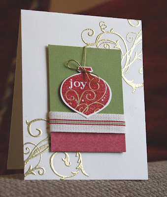
Christmas Joy

I am enjoying this new Delightful Decorations from SU's Holiday mini catalog, especially because it has a coordinating punch! I actually ordered this set thinking it would be perfect when I wrap gifts (on Christmas eve) and run out of tags like I inevitably do! But I didn't realize how versatile it would be for cards and scrapbook pages as well until I started playing with it.

This time I embossed the ornament in Real Red then watercolored in the swirls with some Old olive so it would match the fabulous new ribbon called Sleighbells (also from the Holiday Mini). The flourishes from Baroque Motif are embossed in gold on a vanilla card base. The bottom strip of DSP is from the new pack called Christmas Cocoa. Finally, I finished it off with some gold elastic cord (also in the Holiday Mini).

Do you like this layout? It is from another Fall-to-Layout on the Clean & Simple blog that I mentioned yesterday.

Have a great day!
~Kristin

SUO Supplies
Stamps: Delightful Decorations, Baroque Motifs
Colors: Old Olive, Real Red, Very Vanilla, Gold
Accessories: Ornament punch, Gold elastic cord, clear EP, Gold EP, Sleighbells ribbon, Christmas Cocoa DSP

Saturday, September 19, 2009

Dreamy Bermuda Snowflakes!

I've been so inspired by (Michelle) Zindorf on SCS for her brayering techniques and amazing art! This card of hers is what I had in the back of my mind when I started playing around with these stamps and colors.

I started out just doing one snowflake on glossy white paper then kept going and then decided to cut it out with the Top Note die and Big Shot. I intended to daub on some Bermuda Bay, Sage Shadow and Soft Sky but turns out I really only needed the Bermuda Bay. I used a sponge dauber and just added the deepest color first and as the ink ran out I kept swirling and daubing (not an exact science obviously!) Ooh, did I mention that the snowflakes are embossed in white?? I guess that would help!

Initially I had the sentiment embossed in white on a piece of Bermuda cardstock which looks lovely, but covered up too many of my snowflakes so I decided to switch to vellum so nothing is covered. So glad I did!

I hope you like it and maybe try this technique out yourself!
Smiles,
~Kristin

SUO Supplies
Stamps: Serene Snowflakes, Many Merry Messages
Colors: Whisper White, Bermuda Bay
Accessories: Top Note die, Big Shot, Glossy white cardstock, vellum cardstock, white EP

Friday, September 18, 2009

Using Berry Christmas for Get Well Wishes


Are you sick of seeing Berry Christmas yet?? Well too bad- LOL! Today I decided to play around with the sketch challenge on Clean & Simple as well as the color challenge on the Color Throwdown. Look how versatile this stamp set is! In any color scheme you can make a fun non-holiday card using the bird and the flower as well as the branch for a stem. It only took a tiny bit of selective coloring on the branch with a marker- not hard at all!

The sketch is a bit simpler than my card but I using the bird was an afterthought and I just couldn't make myself leave him off. I'm pretty sure I'm using this card for my swap that is uh... supposed to be due tomorrow. Yikes! We all agreed we could just get them mailed by tomorrow- thank goodness. Especially since I've got to walk my little waterboy and coach husband across the football field tonight for parent's night.

Have a great evening and be sure to stop back tomorrow- I've got a card I'm so excited about using Serene Snowflakes!

~Kristin
SUO Supplies
Stamps: Berry Christmas, Teeny Tiny Wishes
Colors: Green Galore, Bermuda Bay, Barely Banana
Accessories: Silver hodgepodge, corner rounder, dotted Bermuda Bay grosgrain, small oval punch

And finally these two!

Last but not least by any means, are these two projects that we got to do at SU's regional meet in Cincinnati last weekend. Every project we did was with this stamp set Berry Christmas. One that I hadn't really even considered until we got to play with it all weekend.

This second project is actually a set of 3 little 3x3 notecards that all have a scalloped square with the bird stamped on them. So stinkin' simple and cute! They are in a cell bag (not sure of the official size) that is folded over and stapled closed with the tag and ribbon on the front. I chose not to use the Stamp-a-Majig to stack my birds (a personal challenge for myself I guess) then got a good laugh when they ended up looking like the leaning tower of birds.


Hope you enjoyed these!
Have a great weekend and thanks for stopping by! Go Wildcats!
~Kristin


Thursday, September 17, 2009

More Berry Christmas

As promised, here are closeups of two more of the projects we did at Regionals this past weekend. Of course there are slight variations of my own, mostly- scratch that- entirely done to cover up mess ups! The second one is an 8x8 scrapbook page that needs photos.
I am so pleased with the projects SU had for us- they are creative and clever and very stylish. They were fairly easy too and something I could duplicate for a workshop or class in some cases.

Hope you get some inspiration from these! Thanks for stopping by today!
~Kristin
PS- Oh hey, guess what!! I was a finalist for last week's MOJO Monday challenge! Seriously! I didn't win or anything, but came in in the top 14! If you watch the slideshow, the 8th card they show is by little 'ol me! Check it out.


Wednesday, September 16, 2009

A Diva Sketch!


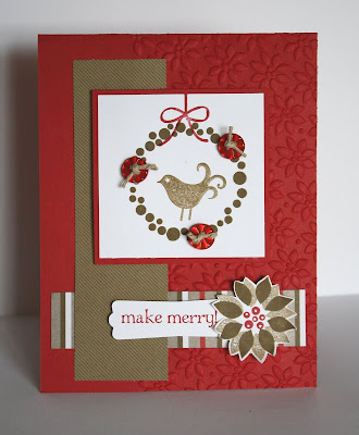
Good Wednesday morning!! I've got another Diva sketch challenge for you today (DCBD145)! This week I decided to use the new Berry Christmas set that I just got at regionals. I loved the projects so much that we made with it that I wanted to see if I could think of something on my own. You know what is so nice about this set?? It has so many coordinating components as well as a sentiment so it is easy to create a variety of cards with it and not need another single stamp! I think we call that VERSATILITY!! Well, here it is.

The strips of paper are from the Christmas Cocoa DSP from the Mini catalog. I still haven't been able to cut into that gorgeous flocked pattern... but I WILL! The buttons are from the Playgound collection tied up with some twine. I'm wishing I would've used the linen thread instead since it is more delicate, but I was distracted on the phone while trying to finish up this card! Did you notice the use of the Petals-a-Plenty embossing folder also?? Gotta love the texture those add!
Here's a picture of the inside. I figured I'd better do it now so my Christmas cards are easier to send when the time comes! So glad you decided to visit me today! Be sure to visit the Diva blog also so you can play along with our sketch challenge! We're thinking of starting something new there so you'll definitely want to join in the fun!!


~Kristin


SUO Supplies

Stamps: Berry Christmas

Colors: Real Red, Whisper White, Soft Suede

Accessories: Christmas Cocoa DSP, Petals-a-Plenty embossing folder, Big Shot, Playground buttons, twine, Modern Label punch

Tuesday, September 15, 2009

Berry Christmas

I hope you aren't feeling disgusted seeing Christmas cards and projects this early! I used to get that way but when you get new stamps you just have to play, no matter what time of year.

These are closeups of two of the projects we did at regionals this past weekend. The first involved stamping the flower twice, cutting one of them out and layering it on the other. This card is a 3x3. This ribbon was so fun to play with on our projects- it is the 3/4" Polka-dot grosgrain ribbon on page 183.

The little box is made from the Bitty Box and envelope die (pg. 201 in the SU catalog). It has a set of 5 tiny tags that we made to put inside. Both of these projects feature the Holiday Mini Catalog set called Berry Christmas.

Thanks for stopping by, and a special thanks to Nancy Riley who featured another of my cards on her iPICKS last night!

Have a great day!
~Kristin

SUO Supplies
Stamps: Berry Christmas
Colors: Soft Suede, Real Red, Bashful Blue, Certainly Celery
Accessories: Big Shot, Itty Bitty Box, silver brad, 3/4" dotted Real Red grosgrain, Linen thread

Monday, September 14, 2009

Something Old, Something New...

Well, nothing borrowed or blue but felt the title was appropriate considering all the retired stuff I mixed in with a few current Stampin' Up! products!

Hi, I'm back... yep, that's two posts today! I just couldn't wait! Today's Clean & Simple challenge on Splitcoast is to make a wedding card, a clean & simple wedding card obviously. I've been wanting to use the gorgeous largest snowflake from Serene Snowflakes (holiday mini) to make a background that isn't necessarily snow related so decided on that right away. I fooled around with the sentiment piece and focal point for quite a while before I decided on this.

The frame is from the retired set Frames With a Flourish and is embossed in silver on some Parisian Summer DSP (don't bother looking- it is retired also). The sentiment is from an old favorite Fancy Flexible Phrases and the ribbon is from an old ribbon originals assortment called Flirty I believe (maybe I should just list what is current instead of repeatedly telling you "retired").

On to the CURRENT stuff: The ink is Basic Gray as wella s the paper (oops, also some Pink Pirouette in there- man will I be sad when my stash is gone!). The wedding rings I made with two silver small grommets (CURRENT!) as well as a square rhinestone brad in the Fire collection.

Here's a closeup of the rings and sentiment piece.

I would call this clean for sure, and really pretty simple if you already have in your head what it should look like. Just making decisions took me forever on this one (oh, plus the pile of rejected parts laying on my desk now).

SUO Supplies

Stamps: Serene Snowflakes, Fancy Flexible Phrases (retired), Frames With a Flourish (retired)

Colors: Pink Pirouette (former In Color that I personally campaigned for), Basic Gray

Accessories: Flirty Ribbon Originals (retired), Small grommets, Square Fire Rhinestone brad, Parisian Summer DSP (retired)

Back from Stampin' Up! Regionals in Cincinnati!

I had a great weekend in Cincinnati at Stampin' Up! Regionals as well as hanging out with my sister and her family! It was much fun meeting up with my great on-line stampin' pals Lisa Henke, Crystal Birr and Becky Carafa for a stampin' good time! (Crystal, help, I can't find a link to your blog that works anymore?!)

Here are the fabulous projects we got to make with our new stamp set "Berry Christmas" which is in the current mini catalog! I'll show indivual shots of some of these over the next few days probably, but wanted to show you a picture of them all together. This is how nice projects look when they all coordinate in color, theme and even in stamps used!

Thanks for stopping in today. Have a great Monday and thanks for all the sweet comments while I was away. It was great to come up to some fun emails!
~Kristin

Saturday, September 12, 2009

Love You a Latte!

I've admired the sample on page 63 in the Stampin' Up! catalog ever since I first saw it. The colors and layout, and especially the unexpected piercing in the shape of a heart. Unexpected details are what I always strive to come up with. This is a fairly close CASE (Copy and Share Everything) of that sample- I used a different stamp set (Pun Fun) and I added a stamped detail to the right edge on the inside of the card so it shows when it is closed.

My image isn't "out of the box" due to it's limited shape, so I popped up a few punched hearts for a little dimension instead. I think nearly any image could be used in place of the kangaroo in the sample. The coffee cup I used was stamped with black Staz-On so I could use my aqua painter. I inked it up by squeezing Bermuda Bay ink into the lid of the ink pad before opening then picked it up with the aqua painter. The lighter color on the bottom is also Bermuda Bay after most of the ink had been brushed away on my grid paper.

Hope you like it! Why don't you consider piercing a shape on your next card? You could use a punched or die cut image as a template if you don't want to free hand, or just sketch something lightly in pencil like I did then erase it when you are done.
Here's a card my daughter did at the same time. She turned hers horizontally (mainly because of the paper I gave her to work with). She chose the colors (Eggplant, Bermuda Bay & Almost Amethyst) and did everything herself except tie the ribbon. She's getting pretty good, isn't she?! :) This is her birthday card for her cousin who we'll be seeing this weekend in Cincinnati as well.

I'm at SU's regional meeting in Cincinnati today and probably loving it! Can't wait to show you the projects when I get back! Happy Birthday to my niece Lyla today also!

Thanks for visiting,

~Kristin

PS- Question for you: I frequently combine current SU products with retired ones. How do you feel about that? Does it help when I tell you in the supplies list what is not current or does that matter? Let me know your thoughts, I'm curious!

SUO Supplies
Stamps: Pun Fun, Beyond the Basics (retired)
Colors: Bermuda Bay, Kraft, Very Vanilla, Kiwi Kiss (former In Color), Black Staz-on
Accessories: Bermuda Bay dotted grosgrain, Heart to Heart punch, Paper Piercing tools, distressing tool, aqua painter.

Friday, September 11, 2009

Paradise!

Good morning! Although I should have been packing up to head to Cincinnati for Stampin' Up! regionals last night instead I sat down to make a card. What better way to procrastinate?!? I was intrigued by this week's color combination challenge on Splitcoast: Old Olive, Basic Black and Elegant Eggplant.

I actually thought this would be easy as I love the colors together, but once I got started I realized getting the black in was going to be difficult. That's what led me to using the jumbo grommet under the ribbon.

The Paradise stamp set is a new one to the current SU catalog and I thought would be a great one to use with all sorts of other sets... but I just realized how neat the Little Leaves Sizzlet looks with it! I had fun using the Cheesecloth background that hasn't seen ink in a while.

For the Eggplant strip on the left side I wanted it to somewhat mimic the Top Note shape so I used the Lovely Label punch multiple times.

Thanks for all the sweet comments lately- I'm so glad you are stopping by to visit and love that you take the time to say hello! Have a great weekend!!

~Kristin
PS- OMG, this spacing thing is going to be the death of me!
SUO Supplies
Stamps: Paradise, Great Friend, Cheesecloth
Colors: Elegant Eggplant, Old Olive, Very Vanilla, Sahara Sand (on the Cheesecloth), Basic Black
Accessories: Big Shot, Little Leaves Sizzlit, Top Note Die, Old Olive grosgrain, Black jumbo grommet, Lovely Label punch.

Thursday, September 10, 2009

Popped Up Love!

This week's CAS challenge on Splitcoast was to make a Clean & Simple card with something popped up on Stampin' Dimensionals (pop dots)! This isn't hard as I use them on nearly every card I make! Decided this time to go with the cleanest, simplest card I could so I got out my hostess set Out of the Box to see if I could make something I actually LIKE with it.

I started by swiping some white ink on the craft cardstock with a sponge. Let it dry for a few minutes/seconds then stamped the box with black craft ink just to be sure it would show up well. While it was drying I stamped the heart in Melon Mambo and cut it out then added 2 dimensionals stacked to really give it some pop. The sentiment piece is made with Fancy Flexible Phrases (still one of my faves even though it is long retired!!) and I just cut it out by hand then notched the ends with the 1/4" square punch- easy! It is on a tiny bit cut from dimensionals as well (I do this all the time- cut them into little pieces).

Inside I stamped hearts multiple times with Melon Mambo and white then popped one out on a thin strip of kraft cardstock that was just folded accordion style. It's simple, but adds some fun when it pops out at the person opening the card for a little surprise.

I hope you like it and you try to pop something out yourself! It's fun and easy!
~Kristin
SUO Supplies
Stamps: Out of the Box, Fancy Flexible Phrases (retired)
Colors: Kraft, Basic Black, Melon Mambo, Whisper White
Accessories: Stampin' Dimensionals, sponge

Wednesday, September 9, 2009

Who's up for a color challenge??


Well I've got one for you sponsored by the Diva's Coffee Break Designs! This week we have these four luscious colors to work with and it was fun. I do have to apologize and admit that I ran off to our county fair yesterday, ended up with 6 kids to chase from ride to ride, and got home late (after a gigantic downpour!) and completely forgot about my Diva card- OOPS! So I whipped something out after 10pm last night and was able to put the finishing touch on this morning before getting it posted.

Hope you like it! This is the Branch Out set which I've been feeling bad about not using much lately, as well as a sentiment from Think Happy Thoughts. When it was all done I added the sponged shadow beneath the tree because it felt too stark, but now I'm not so sure I should have... what do you think? (It's OK to be honest- I'm a big girl).


Thanks for stopping by and visiting on this lovely Wednesday! Hope you have a fabulous day and have a chance to stamp something for yourself! Hey, while you're at it, why don't you go play along with our Diva challenge- I'd love to see it!


~Kristin


SUO Supplies
Stamps: Branch Out, Think Happy Thoughts
Colors: Rich Razzleberry, Pale Plum, Whisper White, Soft Suede, Bermuda Bay
Accessories: Crimper, Corner Rounder, Circle punches, Scallop edge punch, Scallop Circle punch, Build-a-Brad, sponge.


Monday, September 7, 2009

Champagne Mist... Now who doesn't like the sound of that??

My DH was ready to walk out the door today when he sat back down to watch "just one more play" of some football game. Well, I took that opportunity to get started on a card for today's Mojo sketch. I wasn't expecting much from this card when I left- it was lacking some pizazz. But when I got back I finished putting it together and am so pleased with how it came out.


I had it entirely assembled when it dawned on me that this shimmery champagne colored paper (from the new Specialty Designer Series paper in SU's holiday mini, Christmas Cocoa) is probably a match to the Champagne Mist shimmer paint that is also available in the new mini. I hadn't used it yet so got it out just to see... Well, one thing led to another and I had some on my finger (oops) which I rubbed on a stamp from Itty Bitty backgrounds then though, what the heck, it just might look like snow. So that's how it ended up on the deer. What do you think?


Next thing I know I'm using the end of a stylus to dab the paint into the recessed centers of the poinsettias on the black strip at the right. My photo probably doesn't show this well, but I used the new petals-a-plenty Textured Impressions Folder (also from the mini) on that black piece but instead of placing it with the embossing side up I flipped it so it is essentially "debossed". Is that what happens when your kids grow up and don't think they have to listen to you any more... because you're debossed??

Anyway, the rhinestone collar was Cindy B's idea- isn't that great?!! I also added a felt snowflake underneath the tiny sentiment from Delightful Decorations (also a mini item- seriously!)


Now that it's done the only thing I would do differently is use Shimmery White cardstock instead of whisper white, but just a step up to the bling factor!

Hope you like it, and thanks so much for stopping by! Why not take a minute to let me know you're here- I'd love to come visit you too! Special thanks to Nancy Riley for listing me in her iPICKS yesterday- I am stunned at the amount of hits my blog took yesterday!


~Kristin
SUO Supplies
Stamps: Dasher, Delightful Decorations
Colors: Whisper White, Riding Hood Red (retired In Color), Basic Black
Accessories: Christmas Cocoa Specialty Designer Series Paper, Fire Rhinestone brads, Felt Flurries (retired), Riding Hood Red striped ribbon (retired), Petals-a-Plenty Textured Impressions Folder, Big Shot, Champagne Mist Shimmer Paint

Sunday, September 6, 2009

Vellum Vase

I saw someone use the new Ornament punch as a vase for flowers and just LOVED it!! In fact, that very idea is what put me over the edge and decide to order the ornament (and the coordinating stamp set of course!). Anyway, I was lamenting all the beautiful Ribbon Originals that I have purchased and savored and hoarded for so long that it is no longer available when I noticed how lovely these two ribbons are together. I'm not even sure if they are from the same colleciton or not! The layout I've used is CASEd from one I used for this month's WICKED challenges- if you're an SU demo go check them out {please!}. I didn't post this card there because of all the retired product on it (everything except the ornament punch, felt flowers and a few colors).Thanks for looking!


Have a great weekend!
~Kristin


SUO Supplies
Stamps: Itty Bitty Buds, Best Yet (both retired)
Colors: Purely Pomegranate, Groovy Guava (former In-Colors), So Saffron, Old Olive
Accessories: Vellum cardstock, Felt Flowers, Silver Brads, Ornament punch, Ribbon Originals (retired), Scalloped border punch.
ETA: Here is the card I saw using this ornament punch as a vase!!

Saturday, September 5, 2009

Of the Earth Night & Day

I really need to try and get a better picture of this card. It is actually kind of pretty in person, but still unusual especially for me. This is for the Sketch Challenge on Splitcoast (Yes, I'm allowed to say Splitcoast on here!) this week.

Another one of those projects that really took a turn. I stamped the sentiment in Real Red craft ink (seriously!) then intended to emboss with clear so that this would be black & white with a pop of red... well, I accidentally used white EP and kept wondering when the red was going to melt through. DUH! Well, then I decided to sponge with my basic black ink pad and stick with the B&W color scheme. Of course I'd forgotten how frustrating the black ink pad can be- it is a perfect match to the Elegant Eggplant paper which I ended up HAVING to go with. Anyway, I still like the end result but it's a bit off from my first two plans!

So glad you stopped by to visit today! I'd love to hear from you.
~Kristin

SUO Supplies
Stamps: Of the Earth, Happy Harmony (retired)
Colors: Basic Black, Whisper White, Elegant Eggplant
Accessories: Night & Day DSP, Square rhinestone brads, texturz plates, Big Shot

Friday, September 4, 2009

Homemade DSP

While on the journey of making another card today I hit many bumps along the way so took a break and went on a tangent... this is the tangent. I was inspired by the Night & Day DSP available in the new SU Holiday Mini. I decided I could maybe mimic the look myself so I embossed the flourish from Baroque Motifs on Going Gray then stamped my By Definition background stamp in Basic Gray over it and buffed the extra ink off the embossed areas. Worked like a charm!

Next I stamped and embossed the square bird image in black and punched it out with the square punch. Also punched a square in the front panel of this card which is raised on dimensionals so the bird is actually recessed. Stamped some flowers at the lower right (in Staz On)then added the ribbon which is from the old Ribbon Originals pack called Valet... Please tell me why I rarely use my Ribbon Originals until they are RETIRED and no longer available?!? It is a sickness I swear!

The ribbon is actually in one of the box bows, but is very hard to see. Here is a closeup of the bow which happens to also show how the square the bird is in is actually behind the front panel.

I could not decide on a sentiment and really didn't want to take the chance of screwing this card up since I really like it, so there's your reason why no sentiment. I'll place something nice on the inside when the time comes!

Thanks for stopping by! Have a safe and happy holiday weekend!
~Kristin

SUO Supplies
Stamps: Of the Earth, By Definition (retired), Baroque Motifs
Colors: Going Gray, Basic Gray, Black, White
Accessories: Valet Ribbon Originals (retired), square punch, black EP, white EP, sponge

Thursday, September 3, 2009

Red, White & Blue Anniversary

Here's another card I made for my WICKED challenge on Splitcoast to use Red, White and Blue. In case you can't tell, I'm am fully enjoying the Lattice Die and finding new ways to use it. This time it is holding this center fold card closed! The little center piece that is Night of Navy is actually one of the parts that gets cut out when using this die- can you tell?

Here's the inside of my card, again using parts of the Lattice Die to make that border at the bottom. I've also used the Medallion background stamp on the front and inside of this card- have you tried that Medallion stamp yet?? It is so awesome for making all kinds of different styles of cards and embellishments! The sentiment here is from one of the Sell-a-bration stamp sets this year called Congrats.

Thanks for visiting me today!
~Kristin

PS- Leave me a comment today to let me know what you like best about my blog (or what you'd like to see change is fine too!) and I'll put your name in a drawing. This Friday I'll draw a name and mail at least two of you a card I've made recently!

SUO Supplies
Stamps: Medallion background, Congrats
Colors: Ballet Blue, Real Red, Whisper White, Night of Navy
Accessories: Big Shot, Lattice Die, Styled Silver Hodgepodge