Saturday, July 31, 2010

Long Fellow HB

I wish I had a stamp that said "Dude" because that's what comes to mind when I see this ultra cool alligator!  Can't you just hear a teenager saying "HB, Dude!"  OK, well maybe not.  I've got a few years before my kiddos hit the teens so I could be way off base here. 

In any case, I hope you like this card as much as I do.  It isn't quite typical and is a little bit funky- which is what I strive for often and only occasionally capture.  I know that a lot of stampers haven't learned to love these Long Fellows yet, possibly because of their long awkward shape but that's precisely why I love them (and 'cause they're adorable!).  I love every card I've made with them so far I think.  They provide a great opportunity to get creative with patterns, colors and embellishments. 

I totally have a hodgpodge of stuff here.  The black/vanilla piece is from the new Newsprint DSP, while the dotted Old Olive is from a, I believe, retired pack called The Write Stuff.  My card base is Marina Mist, which is really starting to grow on me... I almost never think of Ballet Blue any more! 

Did you notice the tiny scrambled letters stamped behind the bite??  That's a new set called Confetti that I basically designed this whole card around.  The "HB" is from an old favorite set, It's Your Birthday. 

I added the pinking hearts edge in Cherry Cobler for a bit of bold color which just happens to suit the Friday Free 4 All challenge on Splitcoast to so something to one edge of your card.  Of course I couldn't stop there and had to fringe up the edge of the alligator piece and of course a "chomp" from the corner is always a fun touch.  I didn't photo the inside but I stamped more of the tiny letters in a row across the middle then stamped a birthday sentiment on top of them. 

Have a great day!  I've got relatives from Virginia coming in today so I'd better go do some  picking up around the house.  Thanks for visiting today!
~Kristin

SUO Supplies
Stamps: Long Fellows, Confetti, It's Your Birthday
Colors: Marina Mist, Old Olive, Cherry Cobler, Very Vanilla, Pear Pizzazz (to color the alligator)
Accessories: Newsprint DSP, The Write Stuff DSP, Pinking Hearts Border punch, Scallop Circle punch, small square punch, Marina Mist Narrow taffeta ribbon

Thursday, July 29, 2010

Sweet Scoops

I've been wanting to get more use from this set, Sweet Scoops,  lately so I set out to find a good challenge to work with.  Since there is no lack of challenges to choose from on the internet these days I only had trouble narrowing it down.  The others I wrote down in my handy-dandy challenge notebook so I can come back to them quickly without wading through the internet and getting bogged down looking then not taking any time to actually stamp.  (Want a whole list of challenge blogs categorized by day of the week?  Just click the bottom of my sidebar for the blinky that says "Daily Dare".)

I chose to use the color challenge CC281 and sketch challenge SC291 both from Splitcoast!  The color challenge is to use Daffodil Delight, Concord Crush and Pear Pizzazz.  No problem- I loved these colors together as soon as I got them out.  They look good in about any combination. 

The striped Concord Crush paper is from the Level One Hostess pack of paper patterns in the In Colors.  I'm getting quite a bit of use from that paper pack- love that it is in the new In Colors!!  My sentiment is from the stamp set called Something Sweet (I love how those sentiments can work with the ice cream cones)! 

Did you notice my little bumble bee??  I always think of those bees buzzing around whenever I think of ice cream cones in the summer.  He is from the recent Sale-a-Bration set called Picture This that I've been using frequently.  I just use my markers to ink him up and color him in, then added him to a build-a-brad!

Thanks for visiting today!  It looks lovely outside so I'm off...
~Kristin

SUO Supplies
Stamps: Sweet Scoops, Something Sweet, Picture This
Colors: Pear Pizzazz, Concord Crush, Whisper White, Daffodil Delight (white for sentiment, Crumb Cake for cone)
Accessories: Stitched Poly Ribbon in Concord Crush, scallop border punch, Build-a-Brad, 1/2" circle punch

Wednesday, July 28, 2010

A Late Diva Post!


Sorry for the delay!  I know every Wednesday you are used to the Diva challenge post but today I'm late.  I've had it done but I let things distract me and then I was gone all evening.  Anyw
ay, here it is.  We had a sketch challenge this week which you can find on the DCBD blog.  It's very simple and straight-forward. 

For this card I used several new items including the Watercolor Trio stamp set and Fabulous Phrases, the punch from the Bitty set of three punches (the one that looks kind of like an X), new tiny pearl accents, narrow Pear Pizzazz ribbon and the new Level One Hostess pack of Designer Series Paper Patterns in the In Colors.

The flowers, which actually look so neat in person, were quite easy to do.  I layered three of those punches "X's" by gluing them (staggered) down in the center then just crushing and rumpling up the edges.  Worked like a charm!

These Fabulous Phrases are a perfect set to use with the Stamp-a-Majig!  They work every time. 

Had to include my flowers in the picture! I love to bring bouquets in!
I posted this picture just so you can see my lovely bouquet of flowers I picked yesterday from my flower beds.  Enjoy! 

Thanks for stopping by and have a great day!
~Kristin

Sunday, July 25, 2010

Elegant Lines

Don't you just love using up scraps or parts of cards you start for something and end up not using? It feels so good to be resourceful and efficient! This embossed card was originally for a card I did a few days ago, but I was covering so much of the pretty embossing (plus it was supposed to be a clean & simple card). So I set it aside and decided to use it today.

This label stamp is from the new and popular Just Believe stamp set. Here I've stamped it in Rich Razzleberry and cut it out. My sentiment in Sahara Sand, is from the cherished old Fancy Flexible Phrases. Added a bit of my new narrow ribbon and called it done. Super quick and easy! Final card is 4.25"x4.25".


Hope you like it!
~Kristin

SUO Supplies
Stamps: Just Believe, Fancy Flexible Phrases
Colors: Sahara Sand, Rich Razzleberry, Whisper White
Accessories: Big Shot, Elegant Lines Textured Impressions Folder, Rich Razzleberry narrow ribbon

ETA: Thanks for your patience while I play around with new blogger designs.  I know it isn't perfect and it may take me some time to get it just so.  Thanks to Susan K for the input on the white background- good to know!!

Saturday, July 24, 2010

Admire Nature

Well, I'm no Zindorf with my brayering sunset skills, but it'll do. This stamp set, Nature Silhouettes, is one that I've seriously neglected and have felt guilty about it. Do you ever feel guilty about certain stamp sets?? Sometimes when it occurs to me that I haven't used a set enough to justify having purchased it I'll write it down so that next time I am stamping I reach for it first... and it works usually.

Anyway, I used a Pals Paper Arts sketch for this card. It is funny how this card evolved! I started out with the intentions of using Blushing Bride and Early Espresso, then chose this stamp set (out of guilt) and decided to try my hand at a brayered sunset. Well, Blushing Bride is in there but you just can't see it. My sunset from bottom up is Bravo Burgandy, Cherry Cobler (same as card base- yummy!), More Mustard and Blushing Bride. My silhouettes are in Early Espresso (which I'd love to emboss in!).

My brads are from the new neutrals collection- did you notice them?? Black, Crumb Cake, White and Vanilla. I've always wanted white and vanilla brads. If only they had some Espresso brads it would be a perfectly complete collection!

So glad you stopped in to visit me today! Thanks for the comments you guys leave me- they always make my day and definitely motivate me to keep posting. Have a great day!

~Kristin

SUO Supplies
Stamps: Nature Silhouettes, Woodgrain background
Colors: (ink mentioned above) Cherry Cobler, Really Rust, More Mustard, Early Espresso (all cardstock)
Accessories: Pumpkin Pie striped ribbon, neutral brads in Crumb Cake, brayer, sponde, Big Shot, Square Lattice textured impressions folder

Friday, July 23, 2010

Hi!

I think I may have mentioned that I love this stamp set, Aviary! Well, I couldn't resist trying it out again while stamping with my BFF Nicky yesterday. The color combo, Night Quite Navy, Crumb Cake and Baha Breeze is from the Stampin' 411 blog challenge.

For a bit of texture on the bottom I used the Square Lattice Embossing Folder. Also, "hi" is from the new Fabulous Phrases stamp set. I am starting to realize just how versatile this set is- it is a great font that can be elegant or casual.

Thanks for stopping by! I've got more to share tomorrow!
~Kristin

SUO Supplies
Stamps: Aviary, Fabulous Phrases
Colors: Baja Breeze, Night of Navy, Crumb Cake, Very Vanilla
Accessories: Big Shot, Top Note die, Square Lattice textured impressions folder, small heart punch, jumbo eyelet, vintage brad

Thursday, July 22, 2010

Slightly Vintage Birthday

I don't know about you but this new Soiree DSP (designer series paper) really caught my eye in the new SU Catalog! I just think the colors are perfectly paired, whimsical but not cutesy patterns that are totally my style! And how they coordinate with so many products is just awesome in my opinion! See the new Antique Brad?? They are so neat! There are 5 different styles and I must admit that I like them all! Did you notice my bit of Chantilly Lace ribbon on there? I wanted some but knew it would be too much wrapped around the whole card. Actually, not too much but it would've hidden too much of the gorgeous papers.

There's my new favorite stamp set again (Aviary) with the bird cages- I think you might be seeing a lot of these images from me. Also in use here are the French Filigree background stamp (in Versamark) and another new stamp set that I think will be very versatile: Fabulous Phrases.

OK, that's all the chatter. Back to stamping! Have a great day!
~Kristin

SUO Supplies
Stamps: Aviary, Fasbulous Phrases
Colors: Sahara Sand, Very Vanilla, Soft Suede ink, Soiree DSP
Accessories: Antique brads, Chantilly Lace ribbon, scallop trim border punch
ETA: I just realized I didn't mention the sketch challenge I used for this layout... and I totally forgot to link my card to their blog too. Bummer! Anyway, it is the SSC160 sketch on Stampin' 411. I enjoy their challenges because they are SUO- only Stampin' Up! products for the samples.

Wednesday, July 21, 2010

Just Believe

Just Believe is the name of this stunning new stamp set that seems to be all the rage already! I used this week's Clean & Simple sketch challenge on Splitcoast for this card. I tried to keep it simple- leaving off some of the embellishments I considered. I stamped the grass/flower image with vanilla ink on the Soft Suede piece then stamped the same image on the Sahara Sand card base with Versamark for just a hint of an image.

The bird is from the Extra Large Two-step Bird punch. The color shading was done with Daffodil Delight and Soft Suede and a sponge dauber. The sentiment piece is Rich Razzleberry ink on Sahara Sand then overstamped with the circle image from this set in Versamark.

Thanks for looking!
~Kristin
SUO Supplies
Stamps: Just Believe
Colors: Sahara Sand, Soft Suede, Rich Razzleberry, Daffodil Delight
Accessories: Modern Label punch, distressing tool, Two-Step Bird punch

Another Diva Wednesday!!

Are you ready for another color challenge?? Well we've got one for you! This week we are using: Early Espresso, Melon Mambo, Pear Pizzazz and Tempting Turquoise! What fun- I always love a good combination of a good bright, a luscious subtle and a rich bold neutral!

I'm sure you could've guessed that I'd be using new goodies here real soon and you're right. When I got home from vacation on Sunday evening my father-in-law called to say I had a few boxes arrive that he took home with him. So even though I didn't want to see the inside of a vehicle for a very long time we hopped in the car and went to visit him.

One of the first sets that really called out to me in this new Idea Book & Catalog was this Aviary! I always had a pet parakeet while growing up and also have always loved a neat bird cage as a decorative element. They are so... I don't know, visual I guess. Anyway, Stampin' Up! did not disappoint with this new set which includes 4 different cages, 4 birds and a perfect stand to put them on.
For this card I not only used the Diva's color challenge but also found a fun layout from the Clean & Simple blog to use. In case you haven't figured out I'm not one bit shy about combining old and new SU products. My sentiment here is an old hostess set from the last catalog called Picture This. I initially thought I'd use the "Happy Bird Day" stamp with the obvious connection to the bird in the cage... but then I saw this one and decided I hadn't really had the opportunity to use it. So I added some music notes near the cage by only inking that part with my Early Espresso marker then added the whole sentiment to the bottom.

Are you a fan of a little bit of glitter and bling? If so then SU's new rhinestones might be for you! I was so impressed to see FOUR different sizes of rhinestones on the set that I ordered! They should last me a while, even at this rate!

I'm not sure if you can see it but I finally broke down and bought the French Filigree background stamp with my new catty order. I've always had an eye for it, but now with the new Soiree papers and other coordinating items (like the amazing Elegant Lines textured impressions folder!!!) I couldn't resist any longer. You might even see it again tomorrow! ;)
Thanks for visiting me again!! It's so good to be back to blogland! Now why don't you go visit my Diva ladies and see what they've come up with for you!
~Kristin

SUO Supplies
Stamps: Aviary, French Filigree, Picture This
Colors: Early Espresso, Pear Pizzazz, Melon Mambo, Tempting Turquoise
Accessories: Basic Rhinestone Jewels, Scallop border punch, Melon Mambo dotted grosgrain, Modern Label punch

Tuesday, July 20, 2010

It's a GOOD MORNING!!

Good morning to you! I am back from my six state trip in seven days (PHEW!) and have gotten my laundry started and getting some things back to normal from being gone almost all of July... Had a huge box of new goodies waiting for me when I got back, so NOW I am ready to stamp and share some cards with you!

When I first get my new Stampin' Up! Idea Book & Catalog every year I notice all the gorgeous and very unique samples ideas the artists come up with and always think that I will copy some of my favorites, but it seems I never end up doing it. Well this time that's what I did FIRST! It is a great way to really "see" the catalog, a great way to find ideas for stamps that you might already own and an even better way to get yourself out of a stampin' slump!

This first card I made is a replica of a lovely sample on page 138. I tried to use similar colors and the same layout, but my papers and stamps were different than those shown. I still love how it turned out and am so glad I took the time to copy it! The papers I used for my patterned butterflies and the navy stripes down the edges are from an OLD hostess patterns paper pack. My flourish behind the butterflies, from Vintage Vogue, isn't symetrical but it works in a pinch I think.


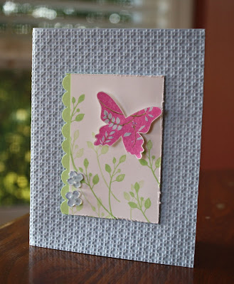
This one is a close copy of the sample on page 113. You'll notice I did a number of things different but still ended up with the same look. I didn't have that lighter striped ribbon so changed my colors to work with the olive stripes that I do have.

My card base is the new color Marina Mist which I've paired with Old Olive and Sahara Sand. The leaves in the sample appear to be hand cut- but I knew I could get a very similar look without all that tedious work (leave it to me to find a more efficient way!).

Also, I believe in the sample each of the tiny flowers is sewn on with thread... well, can you imagine how long that took? It was tedious enough gluing them all on there so I wasn't about to start sewing them. Anyway, mine all have a dot in the center from the Sahara Sand marker- MUCH faster!!

I added a spritz of Smooch Spray to my card base and left offf the sentiment for now since I like it as is.

So next time you get into a slump, grab your most recent SU Catalog and start browsing for your favorite sample... then get to work copying it as closely or loosely as you prefer and your supplies allow!

Stop back tomorrow for a new Diva Color Challenge and a peek at several more new goodies (can you say rhinestones?!!)! I've got another post ready to go for Thursday as well for your viewing pleasure... a little bit of vintage with some Chantilly Lace, some Soiree papers and maybe a little tweet!

Have a great day and thank you for remembering me even though I've totally neglected my blog baby this month! I'm back to stay- for the most part!
~Kristin

SUO Supplies
Card 1:
Stamps: Vintage Vogue
Colors: Crumb Cake, So Saffron, Night of Navy
Accessories: Beautiful Wings Embosslit, Basic Pearl Jewels
Card 2:
Stamps: Paradise
Colors: Marina Mist, Old Olive, Sahara Sand
Accessories: Itty Bitty Shapes punch, Log Cabin Smooch Spray, Old Olive striped grosgrain, linen thread, Sahara Sand marker

Friday, July 16, 2010

Hello from Tennessee!

Hi there! I'm sitting in a hotel lobby in Tennessee and thought I'd post a quick update since it's been a while! I've been out of town with my family for a while which is why I haven't posted recently. We'll be home soon and there are a few cards on my desk that I'll post as soon as I get there. Hopefully I'll be able to post much more frequently soon! Thanks for stopping by and I hope you are enjoying your summer as well!
~Kristin

Wednesday, July 7, 2010

Bashful Wasabi Roses

Well it took me all day to get it posted but finally, here is my Diva card for today. I thought I might struggle with these colors... and I did a little, but worked it out in the end. The Bashful Blue threw me for a loop but I squeezed it on there at the last minute. Initially I had the Bashful satin ribbon but it just rubbed me the wrong way so I switched it out for vanilla ribbon and a few Bashful square rhinestone brads- much better!

I can't believe I broke this stamp set out! It was a free gift from Stampin' Up! to current demonstrators who ordered something specific recently... and I've not been a big fan of it for some reason. However, I did enjoy the challenge of coloring it so it looked just right. To add some dimension and possibly cover up a few shading boo boos I ran it through the Big Shot with the Square Lattice embossing folder. I love that look- almost like a textile or something.

For the sentiment I used the Curly Label punch to coordinate with the Top Note. I'm not sure if you can see it but the Rose Red card base was in my stash of pre-cut and folded cards and it was already stamped with the old Floral background stamp.

Well I hope you like it and decide to play along with our Diva Color challenge! We'd love to have you join us!

Have a great day.
~Kristin

SUO Supplies
Stamps: Because I Care, Floral background
Colors: Rose Red, Vanilla, Wild Wasabi, Bashful Blue, Sahara Sand
Accessories: Big Shot, Square Lattice Textured Impressions Folder, Square rhinestone brads, Curly Label punch, Top Note die, Vanilla Satin Ribbon

It's the Thought- a double take on a Mojo sketch

Good morning! I'm glad you stopped by today. I enjoyed playing along with the Mojo 146 sketch yesterday and have not one but TWO cards to share with you, as well as the inside for each! This is actually the second of the two that I made but while I was making the first one I flipped over the long piece of DSP at the left to add some adhesive and I just loved the way the pattern fell only at the bottom so I HAD to use it just like that! That is what made me decide to do 2 of the same basic card but reverse the patterns of paper.


The flower vase stamp I used is brand new to me- the level one hostess set in the Summer Mini catalog called It's the Thought. It's got 7 adorable images and I couldn't wait to put some ink to it! I added color to the image with my fabulous new In Colors markers, Peach Parfait and Pear Pizzazz as well as a touch of Cherry Cobbler to the centers of the flowers.


The Designer Series Paper (DSP) I used here is also new called Greenhouse Gala. It has so many beautiful patterns in some luscious colors.


Both card bases I used are Sahara Sand and the sentiments (from Define Your Life) are stamped in Sahara Sand as well.


For the insides I used Versamark with Pick-a-Petal, a stamp set I haven't used in ages it seems! For the top card my sentiment fit on NOT the modern label punch, but the matching outline shape to it that comes with the Movers and Shapers set that works with the Big Shot. It took some doing since I had to use the Stamp-a-Majig- but it fits perfectly! That sentiment is from Vintage Vogue. The sentiment on my "Favorite" card is from Wonderful Favorites, another set I have neglected lately. I guess you can tell who I'll be sending this one to!

So glad you decided to stop by! Thanks for the sweet comments- they always make my day!

~Kristin

SUO Supplies
Stamps: It's the Thought, Pick-a-Petal, Define Your Life, Wonderful Favorites, Vintage Vogue
Colors: Peach Parfait, Pear Pizzazz, Sahara Sand, Whisper White
Accessories: 1 1/4" square punch, Scallop Trim border punch, distressing tool, black brads, markers

Tuesday, July 6, 2010

The Little Things

As you have probably noticed since my last post was up for over a week, I have a new niece. I really wanted to go all out on the perfect baby card to send my sister and brother-in-law... but this card took me several days to pull together. I can't believe how my creativity declines when I've taken some time off from stamping! Well I finally got it done and I'm pretty happy with it. The sketch I used is the FTL97 from the Clean & Simple blog that I enjoy checking out periodically.

I finally put my new embossing folder to use and really like it. Now I can't wait to get the other new one in the new catalog! I'm sure you noticed the cork butterflies. That was fun! I had a scrap of cork laying nearby and on a whim grabbed it to see if I could use my Bigz Butterfly die with it- worked great. Then I decided I needed to more smaller butterflies so tried the Beautiful Wings embosslit. I ran it through twice and it cut also (although not quite as well as the die).

Can you see the Fine Flourish stamped in Pretty in Pink craft ink on the Razzleberry layer?? I liked that so much I decided to use it on the inside as well (below). The Pink Pirouette layer and cork butterflies are spritzed with my vanilla Smooch Spray so are sparkly in person.

Here's the inside shot. Fine Flourish with Pretty in Pink craft ink and sentiment punched out with the wide oval punch. You'll probably notice my imperfect white scallops behind the sentiment. I tried using the oval scallop punch (in three pieces) to layer and was only somewhat successful.

Anyway, I it's worth the wait. I enjoyed the AC today and made two more cards as well. I'll be back with those on Thursday. Hopefully tomorrow I'll be able to get my Diva card done so you are enticed to play along!

Thanks for stopping by!

~Kristin

SUO Supplies
Stamps: Fine Flourish, In My Thoughts
Colors: Rich Razzleberry, Pink Pirouette, Whisper White
Accessories: Big Shot, cork, Beautiful Wings Embosslit, Bigz Butterfly Die, Modern Label punch, wide oval punch, scallop oval punch, square rhinestone brad, Vintage Wallpaper embossing folder, wide pink organdy ribbon

Saturday, June 26, 2010

I'm an Aunt (again!)- woohoo!

My new niece Lauren Elizabeth was born on Thursday June 24th at 10:33 pm weighing 5 pounds, 8 ounces and 18" long. Thank goodness for modern technology- we saw a video of her within hours even from a different state!
Welcome Lauren!

Wednesday, June 23, 2010

Take me out of the ball park!

***Alert: special bragging post. Although there is absolutely no crafting in this posting, my best creations ever are! No offense taken if you aren't interested. I'll be back next week with more cards and stuff.***

Almost done! It's been a long season of baseball this year. My little first baseman finished her season last night. She was glad for it to be over since we get to go visit grandma & grandpa now, but a little bummed about only one win this year.

This guy will be playing with his team for the Championship sometime next week then the traveling team will be left to play. Having three different teams going at the same time got a little crazy.


Thanks for tolerating my non-crafting post about my ball players and my attempt at some creative photography! Be back next week!
~Kristin

Dog-gone good friend!

Guess what, it's time for another Diva challenge. And let me tell ya, it's a toughy! I am the first one to admit I'm not a fan of bold bright colors... well, I should say I'm not a fan of them together! I love a splash of bold even a tidal wave of bold with some neutrals or other less bold tones. So this really challenged me and I feel like I almost cheated adding in my favorite Crumb Cake (kraft) neutral and totally skimping on two of the colors. But I'm in charge around here and I say I didn't cheat- so there. LOL!

With all that said, I am pretty dog-gone happy with this card! I initially intended to add my old Paw Tracks wheel to the mix with this super cute new doggie stamp from the new Level 1 Hostess set Long Fellows, then it dawned on me that I haven't used my Pawsitively Sizzlit that die cuts and embosses this paw print at the same time. How cool is that?! If you're not familiar with this Sizzlit it is part of the Build-a-Bear line of SU products. If you're not familiar with them that's my fault- I don't "do" Build-a-Bear stuff. Just not my thing and fortunately we don't live close enough that my kids have ever asked to go build a bear or any other animal for that matter. But I digress.

So I first stamped the image in Basic Brown so I could watercolor him without worrying about smudging. Then squished some Crumb Cake ink into the lid and watercolored the little guy with my aquapainter. I sponged some Crumb Cake ink around the edges of my paw prints as well. The one in the metal edge frame was punched out with the 1 1/4" circle punch so it would fit. I was somewhat going for a dog tag look there, in case you didn't put that together.

Anyway, I hope you'll rise to the challenge and play along with the Divas yet again this week! At the very least go visit the blog and see more fun samples with this crazy color combo.

Thanks for stopping by and bearing with my wise cracks.
~Kristin

SUO Supplies
Stamps: Long Fellows
Colors: Real Red, Crumb Cake, Whisper White, Summer Sun, Tempting Turquoise, Chocolate Chip, Basic Brown
Accessories: Big Shot, Pawsitively Sizzlit, Circle punch, Heart to Heart punch, aqua painter, Metal Edge tag, Tempting Turquoise brads

Sunday, June 20, 2010

Happy Father's Day!

I hope you all had a wonderful weekend and Father's Day today! We sure did- what a great day for enjoying family. I'm finally getting a chance to upload the father's day card I made for my dad. I decided to use my new Newsprint DSP again- this time using a piece that includes an add for an optician which, as an optometrist, my dad will surely notice. The sketch I've used is from the sketch challenge on SCS this past week. I used Circle Circus layered with Dusty Durango and the new Cajun Craze for my three squares on the right. It took me forever to figure out which Father's Day stamp to use from my stash- I just couldn't decide on placement so ended up going with clean and simple.
Here's the inside. Since I punched the Word Window through the front I "did up" the inside a bit and thought I'd show you.
I managed to get in a few different challenges for this one so I'll link them here:

CCMC103 to make a Father's Day Card
SC285 Sketch Challenge
WKD0610A Wicked challenge to use Dusty Durango
Thanks for stopping by, have a great day!
~Kristin
PS- I got too tired to post this yesterday so my Father's Day wishes are belated!

Wednesday, June 16, 2010

Loving Long Fellows!

I'm on a mission- to make everyone love this adorable stamp set as much as I do! Long Fellows is a Level 2 hostess set in the new Stampin' Up! Idea Book & Catalog that will be available July 1. I was able to preorder this set and am so glad I did. Here is my first card with this set that also has a bit of the stunning new paper collection called Greenhouse Gala!

My daughter helped me with this card- picking colors and making those final decisions on placement and layout. She also did the coloring on the turtle with the fabulous new In Color Pear Pizzazz.

Stay tuned for more from this set!

Thanks for stopping by!
~Kristin
SUO Supplies
Stamps: Long Fellows
Colors: Pear Pizzazz, Baja Breeze, Whisper White
Accessories: Pinking Hearts border, square punches, Playground and Sherbet Designer buttons

Newsprint Birthday

Good Wednesday morning! I hope it's sunny for you right now- it is bright and beautiful here this morning. You ready for a new Diva challenge?? I've got a sketch for you which I made into an aniversary card for my hubby. Yesterday we celebrated 14 years with shopping and dinner, with kids at grandpa's house! It was a nice evening!

So for this sketch I was itching to use some of my new goodies that came in my preorder from the new SU Catalog available July 1st. The designer series paper here is called Newsprint- I am just positive it will be wildly popular. It has several great newsprints, as well as a page of numbers, vintage looking ledger papers, sheet music etc.

Are you wondering what this luscious red color is?? That is the new Cherry Cobler which I think might be my favorite new color!! I also used my new Crumb Cake (Kraft) ink- woohoo, I'm so excited to finally have ink in that awesome neutral! And the bitty button from the Summer Mini catalog. Guess what- the tiniest heart in the Heart to Heart punch (the one with 3 hearts) fits the heart button perfectly!

Finally, in case you can't see it, the Crumb Cake strip of cardstock has been textured with the "Distressed" texture plate by SU. Unfortunately I can't find my silicone rubber piece that is needed to the texture isn't as deep as I'd hoped.

Oh yes, almost forgot to mention... the stamped print on my main oval panel is from the old background stamp called By Definition. Told 'ya I don't get rid of stuff! ;)

Have a great day! Be sure to check out the other Diva cards with this sketch then join us!
~Kristin

SUO Supplies
Stamps: Inspired By Nature, By Definition, Well Scripted
Colors: Cherry Cobler, Basic Black, Crumb Cake, Very Vanilla
Accessories: Big Shot, Texture Plates, Curly Label punch, Heart to Heart punch, Bitty button

Saturday, June 12, 2010

A Thought Away

Now that my mojo is back I've been trying to keep stamping for fear of it disappearing again. I whipped this one together pretty quickly Thursday night using the Pals Paper Arts color challenge to use Crushed Curry, Soft Suede and Bermuda Bay. Yummy- I really enjoyed using these colors together!

I also thoroughly love using Jackie Topa's idea of the bird wing from the Two-Step Bird Punch as a petal for a flower. Isn't that awesome?! Used some Crushed Curry ink around the edges (applied with a sponge dauber) for added dimension that makes a HUGE difference! The centers are just 1/2" Crushed Curry circles punched out then stamped with Soft Suede ink and the old Canvas background (I told you I NEVER get rid of stamps), then covered with those clear sticky circles from the Build-a-Brad. I have a bunch of the circles left but only 3 of the metal brads... go figure.


All the edges on this card are distressed with Soft Suede ink. I also used the distressing tool and the perforator tool on the suede piece. Added a library clip and some linen thread and called it quites. What do you think?! I adore the curry flowers on the suede and am so glad I found not only the color challenge but also Jackie's neat flower petal idea.

Well, gotta run! I'm out the door to head north for the weekend. Was dragging my feet because the UPS guy is over 3 hours late with my new catty but I just can't wait any more. At least I got this post done so you'll have something to see on Saturday (a rare treat from me, I know)!

Thanks for stopping in,
~Kristin

SUO Supplies
Stamps: Whimsical Words, Canvas
Colors: Bermuda Bay, Soft Suede, Crushed Curry, Very Vanilla
Accessories: Build-a-Brad stickers, distressing tool, Curly Label punch, Library clip, linen thread, sponge daubers

Friday, June 11, 2010

Wings of Friendship

I made this card with the awesome FTL93 sketch in mind, although I didn't exactly stick with clean and simple. I do love how this card came out, but I also plan to try again on this sketch and do it justice better.

My stamped image from Wings of Friendship stamp set is stamped in black craft ink then embossed with clear powder. I trimmed it so just a tiny bit is "out of the box" on the right edge. The sentiment (on Kiwi Kiss) is from the retired set "Designer Label" and is also embossed.

What do you think of this color combo (did I say that yesterday too?!)? It is Cool Caribbean (oh yeah, do you have any of that leftover??), Certainly Celery, Kiwi Kiss and Pumpkin Pie. Funny thing is originally I was going for all greens and blues (had Old Olive out also) and a watery theme (like whale from Pun Fun) plus a totally different sketch. Isn't that wild how things take a turn or two?! Once I put the Pumpkin Pie striped ribbon on there (thanks Lisa!) I knew it worked- at least for me. I don't think to use black very often so I went out of my way to get it in there today- knowing I wanted some drama.

Anyway, I hope you like it too. Thanks for stopping by!
~Kristin

SUO Supplies
Stamps: Wings of Friendship, Designer Label
Colors: Cool Caribbean, Certainly Celery, Kiwi Kiss, Basic Black, Pumpkin Pie
Accessories: Black EP, Filigree brad, Striped Pumpkin Pie ribbon

Thursday, June 10, 2010

Live, Laugh, Love

Guess what?! I think I'm back! Well, my stampin' mojo is back anyway. At least it was yesterday when I made this and another card that I'm happy with which I'll share tomorrow. It took me a while to find a few challenges that seemed to speak to me, then it was happy stamping. For this card I used the Mojo Monday sketch challenge (Mojo 142) in a simplified form. The glittery butterfly was punched from a sticky sheet then covered with glitter. I didn't actually peel off the backing since I wanted it to be raised with a Stampin' Dimensional.

What do you think of this color combo? It isn't for a challenge anywhere, but I came up with it on my own: Soft Suede, Crumb Cake, Rich Razzleberry and my trusty favorite retiring Ballet Blue!

Did you notice the embossed dots around the edges of the Crumb Cake layer? Well you know me and my SUO mentality... but I just couldn't resist ordering a pack of these strip embossing folders a while ago while doing some shopping online (got myself a really cool portable Ott Lite in lime green to take on my crops and for a better light on my desk). Can't believe it has taken me this long to use one of them, but that's where those dots came from. They are just like SU's Textured Impressions Embossing Folders which I can't get enough of. The texture from just one pass through the Big Shot is amazing!

Anyway, I hope you like it. I'm tickled that I do since I've really struggled with my crafting lately. It might be that I've been reading too much instead- I'm "between" books right now so have energy to focus on card-making!!

Well, off to do 3 loads of laundry so ball uniforms get clean for games tonight. Have a great day!
~Kristin

PS- Gosh, I thought I'd gotten such a great picture but this one really doesn't show the glitter at all, and the colors aren't quite right. Guess you'll have to imagine!

SUO Supplies (except where noted)
Stamps: It's Your Birthday
Colors: Soft Suede, Crumb Cake (kraft), Rich Razzleberry, Ballet Blue, Whisper White
Accessories: Big Shot, Butterfly punch, sticky sheet, Superfine glitter, Heart to Heart punch, Scallop border punch, Dotted Rich Razzleberry grosgrain, Provocraft Embossing Borders With Love

Wednesday, June 9, 2010

DCBD #180- A Color Challenge

Good Wednesday morning! I hope you're ready for a challenge- a color challenge from the Diva's that is. This week we are using Bashful Blue, Gable Green and Pixie Pink. This was a tough one for me... but I can tell you my Stampin' Tip for a tricky color combo: Choose two of the colors that you like best together and put the third aside for a while. Start with those two colors and use them as your primary and secondary colors then slip in a bit of the third color. At least that's what usually works for me.


So what do you think of the new Square Lattice Textured Impressions folder?? I love all texture so of course I think it's pretty nifty!

Well, I hope you'll go check out the other Diva's and then decide to play along with the Diva's Coffee Break Design Challenge.

Thanks for visiting!
~Kristin

SUO Supplies
Stamps: Great Friend
Colors: Gable Green, Bashful Blue, Pixie Pink
Accessories: Big Shot, Square Lattice Textured Impressions folder, Scalloped border punch, distressing tool, bitty buttons, bitty punch

Monday, June 7, 2010

Day late and a dollar short?!

OK, well more like 6 days late but anyway, here's my Diva Coffee Break Design card for last week! We had a great sketch to work with which I turned on it's side to accommodate this gumball machine that I hadn't yet inked. For fun dimension I punched out all the gumballs with the new itty bitty circle punch (in the current Summer Mini Catalog) then layered them and popped a few up on dimensionals. Then I went out on a limb and covered the entire piece with Crystal Effects which just so happened to have changed the pink ink color- honestly the sentiment matched the pink gumballs originally!

Anyway, it's late and I'm exhausted from baseball games, camping, weeding, strawberry jam making among other things besides stamping. Maybe one of these days I'll get my full mojo back and be ready to create. Until then stop back Wednesday for a new Diva challenge and card... and yes, it'll be here because I actually made it already!

Thanks for visiting!
~Kristin
SUO Supplies
Stamps: Something Sweet, Short & Sweet
Colors: Gable Green, Tempting Turquoise, Pink Passion, Close to Cocoa
Accessories: circle punch, Crystal Effects, Tempting Turquoise grosgrain, eyelet border punch

Friday, May 28, 2010

Some Teacher Gifts

Phew! The last week of school is certainly a busy one! It doesn't have to be but of course I PROcrastinate and make myself miserable. I basically spent all day yesterday making these teacher gifts for my kiddos' last day of school today and also 5 graduation cards that my hubby suddenly needed. I didn't even get a picture of those. Thank goodness I love making stuff like this.
For the kids' 3 main teachers I prettied up these tiny tins I bought several months ago at the dollar store. They were actually gift card holders with a Christmas theme. I just pulled out the plastic insert that held a gift card and decorated the outside.

I used the old Alphabet set, Doodle, in rainbow hues to label the tins, then added a little scallop edge and some ribbon around the edges to finish them off. Inside are a set of 12 or so tiny note cards that I always think will be handy for teachers to send notes home with students for various reasons. The cards ended up being 4x5 folded in half. I did a variety of styles for the note cards along with a monogram set for each teacher. Here are some pictures of the notecards. I'll label the stamp set below just in case you are curious! Spring Solitude
Flight of the Butterfly
Good Neighbor
Vintage Labels & Lovely Letters Alphabet
Good Neighbor
Vintage Labels & Lovely Letters Alphabet

Here is the little M&M holder I made for my son to give to his teachers. I thought he might be a little embarassed handing out the pink ones below. For this one I use the Have a Ball & Sporting stamp sets.
These were done with the Oval All set and Pocket full of Flowers
Well, that's all I've got for you today! Thanks so much for stopping by. If your teacher gifts aren't done yet hopefully these will inspire you to get going!
Measurements to make the little stand up chocolate holders are different every time I make them. The last time I posted them with measurements they didn't work for me this time so here's what I would recommend trying: you can get four from one sheet of cardstock if you make them 2.75 inches wide by 8.5 inches long. Then try scoring at 1", 4.5" and 5.5".
Have a great weekend everyone!
~Kristin