Saturday, June 30, 2012

Artisan Award Entry: An Easel Card with Window

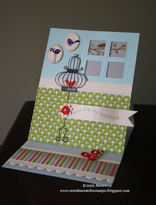
Of my 5 card entries for this year's Artisan Award entry, 3 were standard fold and size cards, one was a round card and this one was a special fold called an Easel Card.  This is a really neat style of fold that I've rarely done.  In fact this may only be the second time.  I usually only send them to someone I can later call and tell them how to stand it up because I would guess most non-card makers would not notice it can stand all on it's own. 

The card base on this one is vellum- designed that way so light comes through the window when it is set up.  This one involved a bit of planning ahead especially the branch stamped on the vellum so that it is seen through the window.  


To complete the scene I made some faux picture frames for the wall using the small oval punch.  To emboss the frame I just layed them on my paper piercing mat and drew an oval frame with a pencil, going over it multiple times to make the impression.  Then sponged the edges for an antiqued look.  The chair rail is made with the crimper and the wallpaper is the Everyday Enchantment DSP that was a Sale-a-Bration freebie.  My bird cage was stamped on vellum then "fussy cut" so that it is also transluscent. 
Here is a picture of the inside.  I had a rug in mind when adding the striped piece that, of course, matches the wallpaper.  :)  Itty Bitty punched flowers with tiny basic pearls complete the details. 

So that's it.  Let me know what you think about my most detailed and involved card for the Artisan Award entries.  There's a good chance I won't be making another of this one.  Thank you for visiting! 

~Kristin

SUO Supplies
Stamps:  Aviary, Something Sweet
Colors:  Pool Party, Poppy Parade, Naturals Ivory, Vellum, Old Olive
Accessories:  3/4" square punch, Itty Bitty Punch Pack, Boho Blossom punch, scallop border punch, small oval punch, scoring blade, crimper, basic pearls

Friday, June 29, 2012

AMAZED BY YOU! an Artisan Award Entry

If you're ready, I've got another scrapbook layout to share today.  This is probably the page I'm most proud of mostly because of the photography courtesy of yours truly.  This is my niece enjoying a play mat that hooks to a hose for sprinkler fun that we got her for her birthday last year.  I was so pleased with these pictures and knew good photos make for a better scrapbook page.  True to my nature I couldn't just pick one- had to get them all on there. 

I had also forgotten, and didn't get a good picture to showcase it, but the main largest picture (which is 5x7) was run through the Big Shot with the largest Apothecary Accents Framelit.  If you look closely can you tell?  I then raised it on Stampin' Dimensionals and placed right back on the original photo.  Wish I'd gotten a better picture of that detail!

My favorite detail about this page are the faux water droplets that are sprinkled throughout the page, from the title and on the pictures.  You may not have noticed them upon first glacne so here are a few closeups.  I made them with Crystal Effects.  Just dabbed them on in the shape of a water droplet and let them dry.  My initial idea was to make them on one of my clear stamp blocks then glue them on, but they got so hard I couldn't get them off without chipping them away, plus they ended up cloudy when I handled them.  This was SO SCARY to do after my page was entirely complete!  But I had extras of everything if I needed to start over. 

 My main image that was mounted on vellum cardstock actually lifted by the black dotted ribbon to show the journaling block as well as a final hidden picture. 

In case you are curious, here is the actual journaling...


Finally, I would like to make a VERY SPECIAL shout out to Louise Streater (AKA Evalou) who so generously and super quickly responded to my plea for help on Splitcoast by cutting and shipping within about an hour it seemed, the very letters used on this page!!!  She even went so far as to send me two full sets just in case I messed up (which I didn't so I can now make myself a copy)!  AND she sent them in the most beautiful card ever... I'll have to post a picture of it soon.  So, THANK YOU LOUISE!  I didn't win but thanks to you I was at least able to do my best and be proud of trying!

Thanks for visiting today!  I hope everyone is staying cool and safe today, especially if you are facing 90+ degrees temps like we are here in Ohio- PHEW! 

~Kristin

Edited to add:  Closeup of main photo showing the detail of the Apothecary Accents Framelit.  You can see more faux water drops here too.


SUO Supplies: 
Stamps:  none (uh, maybe that could've helped me get selected, duh!)
Colors:  Wild Wasabi, Naturals Ivory cardstock, Pool Party, vellum
Accessories:  Apothecary Accents Framelits, Big Shot, Black dottted scallop ribbon, jewelry tag punch, linen thread, scallop border punch, Polka Dotted embossing folder, Jelly Bean Sweet Shop brad

Thursday, June 28, 2012

Artisan Award Entry: Hello Baby!

Clean & Simple is an understatement on this one I think.  Here is yet another of my Artisan Award Entries that I made back in April or May.  This is one that I never got sick of.  Love how the punched hearts coordinate with the tiny hearts in the Adorning Accents embossing folder.  My little extra details include the clear heart button with a curled wisp of matching cardstock.  Just cut a sliver then wrap it tightly around a toothpick and pull the toothpick out... all done AFTER you thread it through the button, not before!  Sorry the photo is a little over exposed. That pale ink is hard to photo!

Quick shot of the vey simple inside. 

Thanks for stoppin in to see me and for your lovely comments! 
~Kristin

SUO Supplies
Stamps:  Teeny Tiny Wishes, Full of Life
Colors:  Marina mist, Pool Party, Pink Pirhouette, Crumc Cake
Accessories:  Big Shot, Adorning Accents Embossing folder, Lots of Tags sizzlit, Bitty Buttons, Heart to Heart punch, Modern Label punch

Tuesday, June 26, 2012

Love You Much: Artisan Award Entry

So far you've seen a card, my recycled album clock and a scrapbook page... all entries in SU's Artisan Award contest in which I did not make the finalist round.  Up next is another card.  This was one of the first cards I made so I was sick of it by the time I shipped it off.  In fact, considered redoing it several times.  Now that I've not seen it in person for over a month I am liking it again.   

The fun details that I thought made it unique are the punched flower window with a white lattice piece behind it showing through.  I love the idea of seeing something behind that punched flower... but maybe the lattice is too busy, or the white too stark?  That's the part I reconsidered dozens of times then left.   


Perhaps my favorite detail is the three rows of scallops at the bottom that show from the inside when the card is closed.  Sort of like a 2 for 1!  I left the inside blank so it could be used as a note card for any occasion.  Thanks for stopping by! 
~Kristin

SUO Supplies
I'll stop back to add supplies.  Must run right now!


Sunday, June 24, 2012

Artisan Entry: Explore (a scrapbook page)


Good morning!  Are you here looking for another Artisan Award entry?  Well here you go, one of the three scrapbook pages that were required.  I finished this one last and was the most pleased with it I think.  I'm willing to bet many of the winning entries only had 1 large photo as the focal point as those are the most dramatic pages... but I decided at the outset to stick to "my style" and I generally tell a story on my scrapbook pages that usually can't be told in one photo.  Rather than covering the entire page with photos I chose to offset them on an angle for visual interest and some creative cropping.  I've done this before and love the outcome every time, despite the extra work involved.

This page is from a recent family outing to the Hocking Hills State Park in southern Ohio.  What a beautiful place!  We enjoyed every single minute of it and I'm so happy to have my layout all designed (need to make myself a duplicate though). 


The patterned paper and journaling tag are both from the Tickets & Tags Simply Scrappin' Kit (now retired).  I also used the Extreme Elements stamp set to further grundge up the background paper.  For my title I used chipboard letters from Onboard Alphabet Soup, dirtied them up with some Soft Suede ink and- my favorite detail- textured them with the Square Lattice embossing folder.  I was excited to experiment with this and find out that chipboard easily embosses with the Big Shot! 


Some of the details include a new Naturals button with a bit of linen thread and twill tape.  One of the hardest things about this page was leaving myself off (one of SU's rules for fairness).  My husband is just as interested in photography as I am and gets really creative sometimes so many of the best photos he took which means I am in them.  On the other hand, I like it even more that I'm NOT on it!

Well, once again, thanks for stopping by and for your comments.  They keep me going! 
~Kristin

SUO Supplies
Stamps:  Extreme Elements
Colors:  Baja Breeze, Soft Suede
Accessories:  Tickets & Tags Simply Scrappin' Kit, Linen Thread, Twill Tape, Bitty Banners Framelits, Natural Button, Alphabet Soup Onboard Chipboard

Saturday, June 23, 2012

Recycled Album Clock


Here is one of the two 3D items I submitted for the Artisan Award contest for Stampin' Up!.  I've had this idea in my head for a long time so it finally came to fruition recently.  I had SO MUCH FUN putting this together!  The best part is the album and clock parts were both recycled.  The album came from a friend who said she didn't want it.  I laughed so hard when she gave it to me because written on the album cover was "this is horrible", "terrible", "lousy album" etc.  Obviously I knew why she was willing to give it up.  LOL! 
The flowers are a Decor Element called Wildflower which has since retired.  However, I loved this so much when it was done that I ordered another one so I can duplicate this for myself!  Can't wait to hang it in my stampin' studio aka kids' playhouse.  :)

I used the Beautiful Wings embosslit for the butterflies flying around on the ends of the clock hands.  If you ever decide to try this you should know that a single layer of cardstock is the only weight the hands could actually carry around the clock.  Any heavier or more layers bogged the hands down so they could not make the upswing.  The papers I used are the new Floral District.  Finally, did you notice the glimmer brads in Rich Razzleberry?  They popped right through thanks to the Crop-o-Dile!

Well, thank you for all the kind comments and emails about the disappointment of being a non-winner.  They have helped tremendously and I've now got my sights set for trying again next year.  Stop back tomorrow and I'll show you one of my scrapbook pages.   

~Kristin

Friday, June 22, 2012

Non-Artisan Award Winner...


Yes, I'm a little bummed to have not gotten a call yesterday about the Stampin' Up! Artisan Award contest for demonstrators to be on SU's Design Team for the coming year.  However, the upside is I can show you all my projects now.  Unfortunately I won't get any of them back.  Here is a picture of the group of them.  Over the next few days I'll show them to you individually so you can see the details.  Which would you like to see next? 
This card was one of my favorites.  It is so me- very earthy and natural, just my style.  I also love that shade of blue (I think it was Marina Mist) paired with River Rock and Always Artichoke.  This now-retired stamp set will go down as an all time favorite of mine, Inspired by Nature.  I used the Adorning Accents Edgelit to make the "frame" for the flowers, then punched a 3/4" circle in it to showcase the Antique Brad with the jewelry tag sentiment. 

I didn't get a picture of the inside but I mimicked the River Rock piece and left it blank for writing a note. 

I think this was the best sample of my style because it is somewhat clean & simple, with a few unexpected details.  I hope you like it better than the SU judges did.  LOL! 

Thanks for stopping by! 
~Kristin

SUO Supplies
Stamps:  Inspired By Nature, Pennant Parade ("Love")
Colors:  Marina Mist, River Rock, Always Artichoke
Accessories:  Big Shot, Adorning Accents Edgelit, 3/4" circle punch, Antique Brad, Jewelry tag

Thursday, June 21, 2012

Dotted Birthday

More new stuff!  Isn't this bicycle stamp cute?!  It is part of the new Ronald McDonald House stamp set called Moving Forward.  Every year Stampin' Up! designs a stamp set which they donate $3 of the proceeds of every sale to the Ronald McDonald House and this is it.  I stamped it in Basic Gray then added the little flowers which I colored with Old Olive and Marina Mist markers.  And I didn't even need the Stamp-a-Majig, just eye-balled it! 

The sentiment is from the new Itty Bitty Banners cut out with the Bitty Banners framelits set.  Once again found a use for the new Polka Dot Parade DSP too. 

Here is the inside shot.  Wanted to keep with the circles theme inspired by the bicycle wheels so I added a few punched circlesm, a bit of ribbon and the birthday sentiment from the retired Happiest Birthday Wishes set.  My niece is turning two this weekend so this one is for her.

 I'm just tickled with how this one turned out.  Let me know what you think!

Here is the sketch challenge I used for this card.  For the Paper Players 100th challenge celebration you get to choose any of their previous 100 challenges so I chose PP53.  I love this sketch- it is perfect to showcase a fun variety of DSP and still keep it clean & simple, just my style!  Click on the picture for a link to the challenge.  Thanks for stopping by again!
~Kristin

SUO Supplies
Stamps:  Moving Forward, Itty Bitty Banners, Happiest Birthday Wishes
Colors:  Basic Gray, Marina Mist, Old Olive, Daffodil Delight
Accessories:  2 1/2" circle punch, corner rounder, Mini Silver Brads, Bitty Banners Framelets, narrow Daffodil Delight ribbon

Chevron Congrats

Finally!!  Managed to get a picture uploaded to fussy blogger.  Getting completely annoyed with these upload issues BLOGGER, you hear me?!!  Grrrr.  Anyway, after about 10 tries here is a recent graduation card I've designed.  New stuff on here includes the new Blue Ribbon stamp set, Midnight Muse stitched satin ribbon and the fun new Chevron embossing folder.  That Daffodil Delight paper is also new:  Polka Dot Parade DSP.  Maybe today I'll get a chance to play with more of my new goodies. 

Thanks for stopping by!
Kristin

SUO Supplies
Stamps:  Blue Ribbon
Colors:  Midnight Muse, Basic Gray, Daffodil Delight, Whisper White
Accessories:  Big Shot, Chevron Embossing Folder, small star punch, mini silver brads, Midnight Muse stitched satin ribbon, large scallop circle punch

Wednesday, June 20, 2012

Wedding Wishes

Good first day of Summer!  I don't know about you but here in Ohio I am appreciating my AC today!!  And dreading sitting at yet another ball game tonight in the 90+ degrees! 

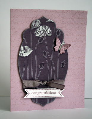
Anyway, I had some time to play with new things recently and wanted to share it with you.  Made this wedding card using the fabulous new Apothecary Accents Framelits and Bitty Banners Framelits.  Also new here is my favorite new background stamp, Pleasant Poppies.  Isn't it pretty?!  I stamped it with white ink on Perfect Plum cardstock complete with the new Perfect Plum ribbon. 

Finally, added the Beautiful Wings butterfly accent with a few rhinestones, the background stamping with my retired French Script, some sponging wtih white ink, shadows made with the Versamarker and a bit of highlight painting with some shimmer paint. 
Here is a glance at the inside.  The frame is obviously the negative of the cut out piece from the front.  Again added some rhintestones and a butterfly to finish it off. 

So what do you think?  I've got another to show you tomorrow so stop back!  Thanks for visiting. 
~Kristin

SUO Supplies
Stamps:  Pleasant Poppies, Itty Bitty Banners, Full of Life, French Script
Colors:  Perfect Plum, Pale Plum (retired), Whisper White
Accessories:  Big Shot, Apothecary Accents & Bitty Banners Framelits, Beautiful Wings embosslit, rhinestones, shimmer paint, Versamarker, Perfect Plum ribbon

Thursday, June 14, 2012

Sunset & Cattails

Needed a birthday card for my Brother-in-law so decided on the grass from Inspired by Nature stamp set.  I don't think I've ever made them into cattails before even though I've always wanted to.  This might also be one of the only brayered sunset cards I'ved made using the masking technique for a moon.  Hope you like it!  I've got lots of new stuff to play with now if I ever find the time between ball games... so surely you'll see something new here soon! 

Thanks for visiting! 
~Kristin

SUO Supplies
Stamps:  Inspired by Nature, Happiest of Birthdays (both retired- BOO!)
Colors:  Concord Crush, More Mustard, Raspberry Ripple (that's it!)
Accessories:  Linen Thread, 1" circle punch, horizontal slot punch, distressing tool

Thursday, June 7, 2012

Betsy's Birthday

Playing around with Betsy's Blossoms again.  Thought I'd try it out with the Colour Q challenge this time.  Thanks for stopping by.
~Kristin

SUO Supplies
Stamps:  Betsy's Blossoms, Create a Cupcake
Colors:  Tempting Turquoise, Lucky Limeade, Island Indigo, Real Red
Accessories:  Sizzlit Lots of Tags, Modern Label punch


Wednesday, June 6, 2012

Forever Friend

You know the kind.  That friend you've had forever that you can go months without seeing but nothing changes, you're comfortable together, you start right where you left off without missing a beat.  That's a Forever Friend.  This card is a CASE of the one on page 133 of the new Stampin' Up! Idea Book & Catalog.  Have you seen it yet?  It is beautiful and full of MUST HAVES and I've linked it over on the right so you can see it online if you don't have it in person.  The list of words on the sample from Fabulous Phrases are perfectly lined up so I'm guessing the Stamp-a-Majig was used.  Obviously I eyeballed mine, but I'm OK with that.  I'm guessing my friend will be too! 

Speaking of the Stamp-a-Majig, if you have one and have no clue how to use it or have no idea what I'm talking about, see page 37!  A VERY good, simple explanation of how to use it!  Come to think of it, there are lots of little tips and handy tricks in this new catalog which will make it a great resource to have.  If you would like a catalog let me know and I can get you hooked up! 

Here's a quick shot at the inside.  I tried to match my embossing to the scalloped edge and it didn't quite reach... but it worked out because I had the perfect place to add a little flower to tie it to the front.  Hope you are feeling inspired!  Let me know which idea you are going to CASE in the new catalog. 

~Kristin

SUO Supplies
Stamps:  Fabulous Phrases
Colors:  So Saffron, Melon Mambo, Gumball Green, Whisper White
Accessories:  Itty Bitty Punch pack, Stitched Satin Ribbon in Gumball Green, Dotted Scallop ribbon border punch, mini silver brads, Edgelits Adorning Accents and matching embossing folder

Friday, June 1, 2012

New In Colors!


Hello again!  So glad you decided to stop by.  Here's another one I put together based on page 71 in the new catalog.  See if you can find it.  I used Simply Soft until I can get my hands on that new background stamp!  Can't wait- will be on my first order for sure!  Also used all new In Colors:  Raspberry Ripple, Summer Starfruit, Midnight Muse.  Yum!  A few other new things:  Comfort Cafe DSP and the neat Apothecary Accents Framelits for the Big Shot.  Hope you like it! 

Don't forget:  TODAY is the first day to order out of the new Stampin' Up! Idea Book & Catalog starting at noon MT! 

~Kristin

SUO Supplies
Stamps:  Simply Soft, I forget the sentiment set (will look it up)
Colors:  Raspberry Ripple, Summer Starfruit, Midnight Muse, Very Vanilla
Accessories:  Mini Silver brads, Apothecary Accents Framelits, Pinking Hearts border punch, Crimper

Thursday, May 31, 2012

The Sky is the Limit

Good morning!  Back with a quick post today before I'm off and running.  The last few days I've been stealing a moment here and there to choose favorite samples from the new Stampin' Up! 2012-2013 Idea Book & Catalog to CASE (copy and share everything).  I can begin ordering out of this fabulous new favorite catalog of mine TOMORROW, June 1, but in the mean time I'm just recreating some of my favorites samples with stuff I already have. 

This time I copied the first card on page 79.  Used a similar color scheme but different stamps and papers, and slightly different accessories.  I also separated my panels instead of having them all on one piece. 

Anyone else want to play along?  If so, choose a favorite sample from the current or new catty and see what you can do with it.  Tomorrow I'll share another one from page 71. 

Have fun!
~Kristin

Wednesday, May 30, 2012

Baby Shower Gifts... Part 4

Finally, what I've been waiting to share with you.  My favorite of the Baby Shower Gifts.  Saw this idea on Pinterest and thought it was adorable.  It was so much fun to use cherished things from my stash, some old and some new!  So many possibilities with this one.  This little canvas is a 6"x6" and came in a four pack so I can do THREE more before I need new supplies.  Isn't that awesome?!  The ideas have been swirling ever since I bought them. 
Here's a view of the edge so you can see how it is wrapped in Old Olive striped ribbon.  Love that finishing touch even though the sides were nice.  Many of these buttons and brads were from my SU stash and some were from my "random buttons that fell off" stash.  I did buy a few too, but not many.
I was finally able to upload my picture of the whole set.  If you'd like to see them individually please see the previous 3 posts. 

Thanks for stopping by!  I hope you've enjoyed these as much as I did making them! 
~Kristin

Tuesday, May 29, 2012

Baby Shower Gifts.... Part 3

If you go to the trouble of making unique, coordinating gifts then it is a MUST that the packaging and card match too!  Using several repeating elements tie them all together regardless of what they are.  Here is the gift bag I gussied up to go with the gifts.  I tried to keep it simple and elegant.   


Here is the card I made.  It turned out so nice compared to my first idea!  Let's just say it got scrapped before I even got very far.  Don't you just love these colors together?!  Thought the embossed dots would soften it all up and add a tiny bit of whimsy.  Hope you like it!  Up tomorrow is my most favorite part of all!  And hopefully I can add my picture of the entire group (fingers crossed).  Thanks for visiting,

~Kristin

PS- In case you missed them, here are the other parts to this gift so far. 

Monday, May 28, 2012

Baby Shower Gifts.... Part 2

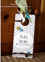
If you saw my teaser yesterday you are ready for the second installment of "Baby Shower Gifts" so here it is.  I thought it would be fun to make a door hanging "Do Not Disturb" sign.  This could be used on the baby's bedroom door, or even on the front door so as to warn visitors to avoid using the doorbell. Of course it has to have a decorated flip side too!  Even if it isn't used it will be a cute matching decor item just for fun!
In case you missed it, here is the first item in this series.  The details can be found HERE.

Same supplies used as yesterday plus the Labels Collection Framelit.  And I think it is kind of appropriate that the free font I downloaded from the internet is called Reisling.  Just what a new mama needs, eh?! 

Hope you'll stop back tomorrow for Part 3 in my Baby Shower Gifts series.  Hint:  Everything must match!
~Kristin

Sunday, May 27, 2012

Baby Shower Gifts.... Part 1

Did I mention before that I was working on something really exciting??  Well, I went to a baby shower today of a very special family friend and decided to put my best effort into creating something unique. Since my photo of all the gifts, card and packaging won't upload for some crazy reason I am only showing you the first part today.  That means I can drag this out for a few days and you'll have to come back to see the rest.  Of course, I'll save my favorite part for last.  (How's that for a teaser?)

I managed to find out ahead of time that baby Noah is whom we are anticipating and his room will be decorated in Chocolate, Olive and Turquoise.  Isn't that a fun color combo?  I hope she'll send pictures when the room is all complete! 

I love the name Noah so had to do something with his name.  This is a banner made with chipboard squares the size of restaurant coasters, just cut from spare chipboard included in random Stampin' Up! products.  I used a retired pack of SU papers called Au Chocolate.  I'm so glad I had a lot left over because they gave me the perfect base to work with!  Here are closeups of each letter:   


I used all Stampin' Up! products with the exception of the pawprint brad on the "O".  I also used the Cricut to cut the letters out.  I will include a list of products I used at the end.  Well, be sure to stop back for Baby Shower Gifts... Part 2.  Here's a hint at what's to come:  Do Not Disturb!

Thanks for stopping by!
~Kristin

SUO Supplies: 
Stamps:  Have a Ball (retired)
Papers:  Au Chocolate DSP, Old Olive, Tempting Turquoise, Very Vanilla
Accessories:  Variety of ribbons and buttons (some retired), small star punch, Polka Dots embossing folder, Big Shot