Showing posts with label Tip. Show all posts

Thursday, February 16, 2012

Mixed Bunch & Punch

Hope you are up for another card using Mixed Bunch and the coordinating punch because here it is.  This time I clear embossed the elegant flower design before punching it out for some added detail to this otherwise fairly simple card.   I love those antique brads and especially think the style works nicely with this flower image! 
Here's a closeup shot- hoping to show the embossing detail better.  Of course I can't possibly finish a card without my trusty Big Shot and at least one embossing folder or die!  Here I added the framed tulip frame over both the River Rock and the Early Espresso layers. 

Want a TIP on how to emboss without having the Craft ink??  Ink your stamp in Versamark first then whatever color of classic ink you want.  There will be just enough sticky to catch your embossing powder!  Works every time! 

Thanks for visiting!! 
~Kristin

SUO Supplies
Stamps:  Mixed Bunch, Happiest Birthday Wishes
Colors:  River Rock, Early Espresso, Marina Mist
Accessories:  Antique brad, quilted Espresso ribbon (from Holiday Mini I think), Blossom Punch, Framed Tulips embossing folder, Clear Embossing powder

Sunday, September 26, 2010

Peek-a-Boo!


Good morning!  I've got a card for ya today, believe it or not.  This sweet stamp set, Build-a-Roo just arrived on Friday and I had to get it inky right away!  I've always thought it is cute and fairly versatile.  This sketch is from the Pals Paper Arts (PPA61) challenge and the color combo is for the Color Throwdown (CTD111). 

For my circle element for the sketch I used a black jumbo grommet.  I have TIP for using those babies:  don't try to put the prongs through the paper, just bend them flat with an old eyelet hammer and attach it with glue dots.  It doesn't wrinkle up the paper and is much easier to attach. 

I colored the kangaroo with my blender pens and some River Rock ink then some touches of Soft Suede for some shading.  Yes, I know, my coloring skills aren't up to par with the masters! 

If you have a Stamp-a-Majig this is a great set to use it for to get the accessories in the kangaroo's pouch!  This set comes with not only the baby roo, but also flowers and hearts plus a few things to put in her hand and 3 different sentiments.

Have a great Sunday!
~Kristin

SUO Supplies
Stamps:  Build-a-Roo
Colors: River Rock, Pacific Point, Whisper White, Basic Black, Melon Mambo
Accessories: Pacific Point striped grosgrain, Big Shot, Dotted Embossing folder, black Jumbo Grommet, Scallop border punch, blender pens

Wednesday, June 9, 2010

DCBD #180- A Color Challenge

Good Wednesday morning! I hope you're ready for a challenge- a color challenge from the Diva's that is. This week we are using Bashful Blue, Gable Green and Pixie Pink. This was a tough one for me... but I can tell you my Stampin' Tip for a tricky color combo: Choose two of the colors that you like best together and put the third aside for a while. Start with those two colors and use them as your primary and secondary colors then slip in a bit of the third color. At least that's what usually works for me.


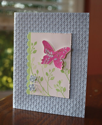
So what do you think of the new Square Lattice Textured Impressions folder?? I love all texture so of course I think it's pretty nifty!

Well, I hope you'll go check out the other Diva's and then decide to play along with the Diva's Coffee Break Design Challenge.

Thanks for visiting!
~Kristin

SUO Supplies
Stamps: Great Friend
Colors: Gable Green, Bashful Blue, Pixie Pink
Accessories: Big Shot, Square Lattice Textured Impressions folder, Scalloped border punch, distressing tool, bitty buttons, bitty punch

Monday, April 19, 2010

Tiny Tux, Taffeta & Tulle

Happy Sunny Monday stampers! I hope you had a fabulously fun and productive weekend like I did! The scrapbook retreat was top notch, as always and I got.... wait for it.... TWENTY ONE pages completed! Yep, that's right. I was on a roll. And even better is that I am totally pleased with most of them (nobody's perfect, right?!).

Over the next week or so I'll show them all to you. You'll notice that several of them are wedding related. My sister got married in 2003. Somehow in my scrapbooks I left off with this event and skipped all the way to November of 2004! YIKES! I just noticed this the morning of my retreat so I changed my strategy and decided to try to catch up that 15 month gap. Anyway, that's why I'm suddenly working on pics from 7 years ago.
My son was 3 at this time and was (if I may so say) the cutest stinkin' little kid in a tux I've ever seen (I may be biased a little). I just want to go back in time and squeeze him. Nowadays I mostly see him in baseball cleats, jeans with holes in the knees and dirt in various places... although he's still cute as ever I think.
He was promised a new BB gun by my mother-in-law if he walked down the aisle just like he was told. We all thought he might back out at the last minute due to nerves, but he sure did it just like a little man. It was one of the flower girls that had last minute nerves and couldn't make it.

Anyway, this is the first of the 12x12 scrapbook spreads you'll be seeing by me. For it and all 5 wedding layouts I did I used the Designer Series paper by Stampin' Up! called Parisian Summer (retired a while back). It was SO NICE to have a collection with such soft lovely and coordinating colors to make every page look lovely together, but all be different. You'll see what I mean!

Scrappin' Tip: To help with faster and easier coordinating pages for multiple layouts of the same event try using a pack of Designer Series paper! It will make your work MUCh easier, trust me!

Thanks for visiting. My next post will be a different topic completely (still scrapbooking though!).
~Kristin

PS- As always my supplies will vary. Mostly I used SU stuff, but in this case the sticker title (ancient something from my stash) as well as the epoxy flowers (also ancient!) and the silver stick-on pearls are all non-SU. The background paper is Basic Gray.

Wednesday, April 14, 2010

{friend to friend} A Diva Challenge

Today is a Diva Coffee Break Designs Day- and we are offering up a fabulous color challenge! Cameo Coral, So Saffron and Chocolate Chip! When I saw this color combo in our lineup a few weeks ago I couldn't wait to try it! I have several other ideas in mind but don't have time to put them to paper right now.

I used Cameo Coral as my card base since it will no longer be with us as of July 1. Paying tribute ahead of time I guess. I've always been a supporter of Cameo when it gets dissed by other stampers! Circle Circus is the stamp set of choice today. Pretty straight-forward, don't ya think?!

Stampin' Tip: Need a boost to get your card making started? Find a card with a layout you love, switch out the colors, change up the stamps and voila! That's what I did here. Here is the card layout that I copied for this card.

Hope you have a great day, and please go check out the Diva blog for more inspiration so you can play along too!
~Kristin

SUO Supplies
Stamps: Circle Circus, Teeny Tiny Wishes
Colors: Cameo Coral, So Saffron, Chocolate Chip
Accessories: Wide Chocolate Grosgrain, Scallop circle punch, 1 1/4" circle punch, 1 3/8" circle punch, Designer Circle Brads

Wednesday, March 31, 2010

Feathered Flock- Part I {DCBD171}

Good morning! Are you ready for a new Diva Coffee Break Designs sketch challenge?? This week we've got a very simple, straight-forward sketch which leaves a lot of room for creativity and interpretation!


Just yesterday I found a blog with an absolutely lovely collection of punched birds done with the Extra Large Two-Step Bird punch that I couldn't wait to try. Literally I spent all morning making SEVEN different birds. I can't wait to put these into a collection as a gift for someone whom I know will appreciate them. (Not mentioning any names in case she reads this too soon!)

To see most recent collection and even order a very well done set of instructions go visit Lynn Pratt at Stamp-n-Design or click here to view her original set of bird cards. I am happy to say that I suggested the 3 types of birds in her most recent collection and not only did Lynn put that idea to work right away, she also sent me a copy of her instructions as a thank you! Thank YOU Lynn.

So stay tuned for the rest of my collection- I have even added two birds to Lynn's collection that are common in Ohio. Can't wait to share them with you!

Thanks for stopping by today and don't forget to go check out the rest of the Diva's creations for today's sketch then play along yourself and link your card to the Diva blog!

Have a wonderful sunshine-filled day!
~Kristin

SUO Supplies
Stamps: Whimsical Words (last day to get this is TODAY!!!)
Colors: Very Vanilla, Pumpkin Pie, Creamy Caramel, Basic Black, Old Olive, Chocolate Chip
Accessories: Extra Large Two-Step Bird punch, Pinking Hearts border punch, Jumbo Eyelet, 1.24" circle punch, tag corner punch, rope (retired)
Today's TIP:
  • Always give proper credit when borrowing an idea from another artist! It's the right thing to do.
  • Have fun with your punches- they are tools with endless possibilities!

Tuesday, March 23, 2010

A few Fish Stories

Here's another layout I finished this weekend. Both layouts were inspired by sketches from various magazines. The papers I used were all from a retired SU collection called Playground (I believe). I can't say enough about how wonderful it is to work with Stampin' Up! collections of patterned papers when scrapbooking. The coordination and excellent design choices make pages a snap! The alphabet title on this page is an old alpha for my Sizzix that works in my Big Shot (woohoo!) and the little scribble detail is a sizzlit available through Stampin' Up! called
Swirls Scribbles. Did you notice the scribble detail here again? I used the throw-away part from cutting it out for the previous page as a stencil and sponged some white ink over it. Worked like a charm for making fun coordinating accents. The word "stories" is an alphabet I borrowed from Lisa and I'm not sure of the brand or name of it, sorry!

Here's the entire layout as it will be in my album. And I've got a Stampin' Tip for you that I've learned from experience!
Stampin' Tip:
  • If you are behind in your scrapbooks but work chronologically (as I do, these pages are from 2005) then take some time to save your thoughts behind the pictures when saving them on your computer. This will help tremendously when journaling and you will be SO GLAD you did 5 years down the road! Trust me! ;)

Thanks for stopping by! You know I'll be back tomorrow with my Diva card and challenge and maybe another scrapbook layout. Have a great day!

~Kristin

SUO Supplies

Stamps: Circle Circus (for circles on the chipboard "fish")
Papers: Playground DSP, Whisper White
Accessories: Swirls Scribbles Sizzlit, Big Shot, Chipboard, non-SU Sizzix alpha

Monday, March 22, 2010

Hair Today Gone Tomorrow- a Scrapbook Layout

First off, a big SHOUT OUT to my friend Lisa Henke for hosting a fabulous scrapbook weekend! We had a blast: I met some new friends and completed 10 pages in my albums!! What could be better?? Well, I got to hang out with my sister and her family for a night as well! Thanks to this fun productive weekend you will get to see some scrapbook pages over the next few days and I must say they are a notch better than my normal work so hopefully you won't mind.
Here is a fun page on which I HAD to squeeze NINE pictures on to tell the fun story (fun to my family at least). During a trip to visit my aunt and uncle at their lake house in Virginia we spent a beautiful afternoon on their dock, which included the guys all getting Buzz Cuts whether they wanted them or not. I got many fun pictures of my dad and his brother which I have very few of so this page will hold a fond memory for a long time.

Stampin' Tip: This type of layout full of 2" or 2x4.25" pictures is a great way to accommodate a BUNCH of pictures. It was hard for me to do that much major cropping but I love the result.
Here is the right side of the spread which includes the title on some key points for journaling. I used the retired Pina Colada Simply Scrappin' Kit for the designer papers (aren't they awesome?!). The layout on the right was inspired by one Lisa found in a magazine of hers. She taught me by example that using magazine layouts is a great way to get fabulous pages done!

My title is done with the Naturally Serif Decorative Strip alphabet die and the Big Shot. Yes I will be adding this to my next order! The "gone tomorrow" I just wrote with the white gel pen. I added the wide Old Olive ribbon with every intention to switch it to my Riding Hood Red when I got home, but now I've changed my mind and will keep the Olive.

Gotta run, but thanks so much for stopping by today! It's raining here but that's OK because I MUST spend some time getting my taxes ready by this afternoon so toodles!

~Kristin

SUO Supplies unless otherwise noted
Paper: Pina Colada Simply Scrappin' Kit, Old Olive, Basic Black, Real Rust
Accessories: Circle cutter, Naturally Serif Decorative Strip alphabet die , Big Shot, jumbo white brads, Playground designer buttons, butterfly punch, non-SU white number stickers

Tuesday, March 9, 2010

Long time no see!

Goodness, sorry it's been a while since I've posted! Honestly, it's been a while since I've stamped! I've had a number of things going on lately that have kept me super busy- don't worry, mostly good stuff. My hubby is finally getting a new truck (well, used but new to us)- he's been driving his current one for 15 years! And I have a new mattress coming today- finally! I don't even want to admit how old our current one is, but a clue would be that it is older than ME. No we didn't win the lottery, it is just long over due for both of these things. Let's just hope that all our major appliances continue chugging along for the foreseeable future!

OK, enough chatter, on to the card. Today is a Diva day- thank goodness for Diva days to get me stamping even when I'm not sure I've got time. This week we've got a color combo that might make you cringe... until you try it. It's fun, trust me! The first time I saw this color combo was on something amazing by Angie Tieman. When I find it I'll come back and link to hers- it is just beautiful!
Stampin' Tips:
  • When using Sweet Treat cups, be sure to plan ahead and consider how the recipient will retrieve the treats inside. I've punched a 3/4" circle in the paper covering the back and covered that hole with a Full Heart Punch that is adhered with a repositionable adhesive.
  • Don't be afraid of funky color combos. Remember, you don't have to use every color in cardstock form- you can add a hint of color with just ink or ribon.
  • For good color balance remember this rule: when using two colors your accent color should only be used about half as much as the primary color. When using three, the third color should be used a third, and so on. Make sense?
  • There are some excellent tips on SU's Color Coach color wheel!
I hope this Diva Day will get you stamping as well! Thanks for stopping by!
~Kristin
SUO Supplies
Stamps: Something Sweet
Colors: Soft Suede, Cameo Coral, Certainly Celery, Bermuda Bay
Accessories: Sweet Treat Cups, 1 3/4" circle punch, Modern Label punch, Celery twill ribbon (no longer available), small heart punch, Eyelet border punch, crimper

Wednesday, February 24, 2010

Beauty is God's handwriting

I must admit, I messed up! I made this card for today's Diva Coffee Break Designs challenge... then realized (too late) that I used entirely the wrong colors. This must have been another color challenge I saw somewhere else. The DCBD challenge for today is to use Pale Plum, Certainly Celery and Rich Razzleberry. I inadvertently used Pale Plum, Soft Suede and Perfect Plum. Oops!


Fortunately I made a card the other day (second one down) with these colors so that is why what you see here and what you see linked to the DCBD blog are two differently cards! Now you know.

Anyway, for this one I was using a sketch from this card. The stamp set is an old hostess set that I'd never mounted. I've always liked it, but had put it up on my top shelf and forgot all about it. The Soft Suede patterned paper is actually from the Thoroughly Modern Designer Series Paper pack- did I ever mention that this pack of paper went missing for about 2 months? I found it tucked away with my scrapbook stuff. I swear I am fairly organized, but somehow things still manage to sneak away from me for a while. I guess the good news is that I do find almost everything eventually (except those two scoring blades and that one butterfly stamp).

The flowers have a dot of Crystal Effects in the center, and the butterfly has a hint of Pale Plum coloring done with the aquapainter and ink from the lid.

Stampin' Tips: (I've seen this feature a few other blogs and think it is very informative and helpful so I'll try to add this for your convenience, from time to time.)
  • Wondering how to free-hand cut out an image neatly? The key is using the right scissors. In fact, you should have one scissor for cutting ribbon, one for rubber and one for paper! SU's Paper Snips are amazing- they are tiny and very sharp- perfect for those little details. Also, be sure to hold the scissors in place and move only the paper you are cutting. One more thing, I try to leave a thin border of paper around what I am cutting- getting too close is more difficult. Practice makes perfect- don't be afraid!
  • Add dimension! Variation of dimension on a card is a way to go from nice to WOW! Use Stampin' Dimensionals to raise a layer, and Crystal Effects to add a bit of shine, even added texture with some embossing or crimping makes a big difference without added expense!
That's about it! Thanks for visiting me today! So why don't you try out this color challenge then upload to the Diva blog- heck, you might even be selected as our next Featured Stamper!
~Kristin

SUO Supplies
Stamps: God's Handwriting
Colors: Pale Plum Perfect Plum, Soft Suede, Very Vanilla
Accessories: Crystal Effects, Paper Snips, Scallop Trim punch, Very Vanilla taffeta ribbon

Monday, November 30, 2009

A Makeover!

Today's Clean & Simple challenge on Splitcoast is to makeover one of your own cards. It can be anything as long as it ends up CAS! Here's my card. I redid this one. I like making over my own cards because inevitably when I'm all done designing something I can see at least one thing I would do differently if I were doing it all again. Well, this time I really liked the card I started with, but I knew it would be pretty in a Clean & Simple style as well. So why don't you try it- go dig through your gallery and find something you'd like to try again, for whatever reason!

Thanks for stopping by today. Gotta run!
~Kristin

PS- Did you know that you can color directly on your stamps with the fabulous Stampin' Write markers?! That's what I did here. It's a great and easy way to use multiple colors on one image!

SUO Supplies
Stamps: Inspired by Nature, Short & Sweet
Colors: Sahara Sand, Rich Razzleberry, Basic Black
Accessories: Rich Razzleberry dotted grosgrain, distressing tool

Tuesday, September 29, 2009

It Just Figures!

Does this ever happen to you? I let a fellow SU demo borrow two things, just two things on Sunday, and guess which two things I wanted to reach for today?!! That's right. Is it a sickness, is it my mean sub-conscious playing with me?? I haven't used this particular Hodgepodge in ages and yet TODAY I decided I needed to even though I don't have my Designer Label punch at this very moment. No problem, trace the Hodgepodge and cut it out, really not a problem. Except I cut it a bit small and it wasn't enough to glue to the Hodgepodge so now you can see between the paper and the hardware which is NOT the look I was going for. Ah well, I'll just fix it when I get my punch back.

By the way, this color scheme is from today's Color Challenge on Splitcoast! To use Pretty In Pink, Going Gray and Sage Shadow. Also, the rope cording I used here is a retired SU product that I just got at a GREAT price because SU offered some serious discounts to us demos on retired stuff! (Hey, that sounds like a recruiting statement!) One more thing about the main image (a TIP), the dove is colored in with the white Watercolor Pencil in SU's set and to get the flowers Rose Red I first inked the entire thing with Basic Gray, then removed the ink on those flowers with a Blender Pen (yes this works great!) then added the Rose Red ink with my marker. Hope that helps!

Other item I lent out was my Top Note die thinking I've got so many new Big Shot items that I can play with I surely won't miss it. Well, it's like a member of my family is gone. I did manage this card without it... but my DCBD card for tomorrow... well, it just won't be the same. Maybe I've got a spare one cut out that I can trace. Yeah right!

Thanks for stopping by! I swear I am trying to work up some season appropriate fall cards and stop skipping an entire season, but my newest "stuff" is all Christmasy, or mostly. I think this is the last of my new stamp sets so I'll try to move on.

Have a great day,
~Kristin

SUO Supplies
Stamps: Gifts of Christmas (not in the Holiday Mini- surprise!)
Colors: Going Gray, Pretty In Pink, Rose Red, Sage Shadow, Very Vanilla, Basic Gray
Accessories: Vanilla Hodgepodge, Pretty in Pink brads, scallop border punch, sponge, Watercolor Pencils, rope twine, Designer Label punch (I wish)

Thursday, August 20, 2009

Thinking of you...

It figures. I thought I was so on the ball doing a challenge the actual day it is posted only to realize that today is THURSDAY and the sketch challenge on SCS is posted on Wednesday! Oh well- it was fun and got me stamping. In fact, I made THREE cards today- that's right. My kiddos are back to school and my hubby had a teacher work day today so I had the house to myself and spent it doing what I love best!

I've been wanting to put this gorgeous DSP Cottage Wall to use and finally got a chance to do so with this sketch. I love stripes and having coordinating patterns to go with them is almost intoxicating- LOL!

I've linked two pictures of this card because neither show it quite how I wanted. The butterfly is stamped with Rich Razzleberry and embossed in clear powder for that extra sheen. Are you wondering how the powder stuck since we don't have craft ink in our In Colors? Easy! TIP: Ink the stamp with versamark then immediately ink it with the Classic Ink of your choice, then stamp and emboss like normal. Works like a charm!

TFL! More to come!
~Kristin

SUO Supplies
Stamps: For All You Do, Teeny Tiny Wishes
Paper: Cottage Wall DSP, Rich Razzleberry, Old Olive, Pale Plum, Whisper White
Accessories: Clear EP, Versamark, Modern Label punch, jumbo white brad, scallop edge punch, Razzleberry dotted grosgrain, corner rounder

Saturday, May 23, 2009

Happily Ever After

Today my daughter is a flower girl and I wanted to make a special card for the bride. She babysat for us and I babysat for her when she was little. Her colors are periwinkle with a touch of light pink. I couldn't quite decide which of SU's colors is closest to periwinkle so I went with Almost Amethyst and Vintage Violet.

For the flowers I ran white cardstock through the Big Shot with the Manhattan Flower embossing folder. Then I flipped it over and brayered ink (vintage violet, Almost Amethyst and Pink Pirouette) into the backside so the debossed flower remains white. Then I cut it out and layered it over the Vintage Violet piece which was stamped with French Script in Versamark.

I pierced the edges of the Vintage Violet then added my sentiment in a Hodgepodge Frame, tied on with pink organdy ribbon. Once it was all put together I sprayed the entire thing with pearl-ex mixed in hairspray for an overall shimmer! See those larger dots of pearl-ex that are showing?? After I took the picture I found a way to reduce the visibility of those... just sand those areas with a corner of the sanding block. Just a TIP for you!

Ooh, forgot to say that I also highlighted some of the petals with the Versamarker (thanks for the idea Lisa!) to add more dimension.

Here's a quick picture of the inside. I stamped this phrase from Full of Life because I think it is perfect for a formal frilly wedding. First I stamped directly on the card but thought it just lacked something... so I tried again on white, this time inking Love with the pink marker. Added some layers and punched the bottom edge with the eyelet border punch. Also, I stamped one of the images from Frames with a Flourish under the sentiment for a more decorative touch.

Hope you like it, and have a beautiful Memorial Day weekend!

~Kristin
SUO Supplies
Stamps: Fancy Flexible Phrases, Designer Label, French Script, Full of Life, Frames with a Flourish
Cardstock: Almost Amethyst, Vintage Violet, Whisper White
Accessories: Big Shot, Manhattan Flower embossing folder, pearl-ex hairspray, Silver Hodgepodge, Pink organdy ribbon, paper piercing tools, brayer

Wednesday, May 20, 2009

In Color Embossing... a TIP!

Yes, it's Diva day again! And look at this gorgeous color combination we had to work with! Shouldn't have been much of a challenge, but I managed to make it one! This is one of those cases where combining challenges doesn't always make for an easier card. I loved this sketch from the Clean & Simple Stamping Blog that I've mentioned in the past and just really wanted to use it... but the great outdoors is calling me today so I just had to use both challenges together.

I think I will try this color combo again to see if I get more of the look I was hoping for. Not that I dislike my card, it's just not where I thought it would go. Anyway, I have a little TIP for you! Have you ever wanted to emboss something in an ink color (like an In Color) that you don't own in the craft formula? Well, let me tell you how you CAN emboss those wonderful colors! First you ink your stamp with VERSAMARK then, before stamping, ink it again with your ink color (Riding Hood Red in my sample). Then stamp and emboss as you normally would! That's it- easy as pie, eh?!

I felt that this butterfly should be embossed since I knew I wanted to color in the leaves (to fulfill my color requirements) but red ink is known to bleed fairly easily. Embossing always resolves that problem. Once it was done I just used my markers to fill in the open areas, buffed with a clean tissue and voila!

Well, that's what I've got for you today. I hope you like it. Please take a moment to go check out the DIVA blog. We'd love to have you play along with our challenge!
Thanks for stopping by!
~Kristin
SUO Supplies
Stamps: Great Friend
Paper: Whisper White, Kraft, Always Artichoke
Ink: Certainly Celery, Always Artichoke, Riding Hood Red, Versamark
Accessories: Scallop border punch, Clear EP, Regal Rose, Certainly Celery and Always Artichoke markers, Kraft taffeta ribbon

Thursday, May 14, 2009

Funky Father's Day...

Just messing around trying to work out a quick CAS Father's Day card. I started with the stamp since it's the only current one I have that says Father's Day. I stamped it in Perfect Plum on Going Gray (finally got some!). I then pulled out some scraps of basic gray, kiwi kiss (already textured), Pale Plum and Perfect Plum to play with. I had all kinds of layouts in mind- all very clean and simple but I couldn't decide- I thought they all looked cool.

After fussing and trying to pick my favorite I just decided to toss the pieces down and wherever they landed I'd go with (if I didn't like it I planned to cheat and do it again- so it was a safe bet). Anyway, this is where they fell the very first time and I like it. Kind of retro, funky and I think the back side of the embossed dots (kiwi piece) looks kind of industrial (use your imagination for crying out loud!). I crimped the pale plum piece to go with that industrial look. I really wanted to use a corduroy button since I love them, have them in 3 colors, but never seem to get them fit on the card... and I hadn't used my arrows punch in awhile so added one of those onto the button for fun. My dad will like it- he always does!

Here's a TIP: When you have already chosen your color scheme but feel you need maybe one more- go with a shade darker or lighter than what you've already got (like Going Gray and Basic Gray, or Pale Plum and Perfect Plum). It adds your extra umph you needed for good design yet doesn't overwhelm your color palette!

Hope you like it too! Don't be a procrastinator- go make a Father's Day card today (then put it in a safe place so you don't lose it, but not so safe that you can't find it later, then be sure to mail it by about June 17th!)

Have a great day!
~Kristin


SUO Supplies:
Stamps: All Holidays (have you noticed how much I use this set??)
Cardstock: Kiwi Kiss, Basic Gray, Perfect Plum Pale Plum, Going Gray
Accessories: Basic Gray corduroy button, My Way punch, Crimper, distressing tool, dotted embossing folder (this one is not SU's but we have one too)

Saturday, May 2, 2009

Best Wishes- Embossed Vellum & a color challenge

Yippee! Dawn McVey posted another Raspberry Suite color challenge (her 4th week)! I've been nearly stalking her blog waiting for this- she is a master at using color and being a color enthusiast I am always excited about trying out her combinations! This time it is brown, soft aqua and white AKA Chocolate Chip, Baha Breeze and Whisper White.

As soon as I saw the inspiration bedding I pictured the Floral background in Chocolate Chip over a Baha Breeze card base. I'm sort of wishing I had embossed it now so the chocolate would be even darker and would shine a little too... next time...

While playing on Thursday I used the Manhattan Flower Embossing folder on vellum and really like how it turned out. I love that the Floral pattern can be seen through the vellum, adding another dimension almost. The sentiment is embossed on vellum and a rhinestone brad was added for extra elegance and sparkle!

Want to know a TIP I learned about adding vellum to carstock without the adhesive showing?!? This is the second time I've tried it and I gotta say, it's much better than anything else I've tried. Although, it is showing a bit on the sentiment, but I think that is because I did it twice (first time on Baha and it didn't show up as well) and because it is on very dark cardstock. In most cases though, I think it works well. So here it is. TIP: Squeeze a small amount of Tombo Multi Glue (white with green lid) onto your finger tip and spread onto vellum in a very thin layer. It dries extremely fast this way so you have to work quickly. In this case I mostly glued down the edges.

I hope you like! I'm not sure about the white box bow at the top corner. I've been racking my brain trying to figure out how/what to fix with it, but I'm just not sure, short of removing it altogether. What do you think? I have a Baha satin ribbon just like it but wider which I forgot about until my card was together. I think I'd probably like that better because it wouldn't stand out as much. But would the box box still be too much? Maybe a knot would be better and would symbolize "tying the knot" so to speak...

Anyway, I hope you try out Dawn's color challenge sometime- she is super talented!
Glad to have you here!

~Kristin

SUO Supplies
Stamps: Oval All, Floral Background
Paper: White Vellum Cardstock, Baha Breeze, Chocolate Chip
Ink: Chocolate chip
Accessories: Clear EP, Scallop oval punch, Wide Oval Punch, Big Shot, Manhattan Flower embossing folder, rhinestone brad, white taffeta ribbon

Friday, March 20, 2009

Hoppy Easter Basket

Boy did I mess up! Today's Limited Supplies Challenge on Splitcoast is to make a spring card using a spring flower or bulb as the main image and only the Soft Subtles color family! I started out just fine- picked the basket of tulips in the A Flower for All Seasons stamp set- then I made this basket weave background. Next is where I messed up- I decided I should use my NEW Easter set An Egg-celent Easter instead since I've only had time to use it once so far... so I switched. And didn't realize I was breaking the "rules" for the challenge until I had this all done!

Oh well, besides some fairly obvious smudging (crap!) I do like how it turned out. Here's a TIP: for anyone wanting to do something at all similar: USE STAZ-ON black ink, NOT Basic Black!!! I was doing fine adding a tiny bit of shading around my bunnies then without warning my aquapainter flow got a bit too heavy. OK, no problem, I just flipped the image over and tried to dab off the extra water on my grid paper. YIKES! I turned it over and was so frustrated to see that was a big mistake. I had already paper pieced the bunnies' outfits and used the SAMJ to determine just where to stamp them... I wasn't going to start over (although the thought did cross my mind!)

ETA: OK, so I was mixing up the Stamp Something Challenge for today and the LSC on SCS! So this is GOOD for Stamp Something's Spring challenge!
Finished it off with a few easter eggs (which I DID use Staz-On for) and a pretty pink button from the Button Bouquet, topped with some Pretty in Pink grosgrain ribbon.

Hope you like it, even if I can't post it to the LSChallenge!
Thanks for stopping by- hope you're having a great day!

PS- Ha! I just realized while posting my supplies that I accidentally used Sahara Sand and Kraft- not a combination I would recommend! What a ding dong I am today!
~Kristin

SUO Supplies
Stamps: An Egg-cellent Easter
Paper: Sahara Sand, Kraft, Very Vanilla, Parisian Summer DSP
Accessories: markers, white gel pen, word window punch, square punch, Button Bouquet, Pink grosgrain

Tuesday, March 17, 2009

Welcome Home Baby Girl!

For Monday's CAS06 challenge I made two cards! Both were inspired by this website. The first one I made for a baby girl so of course I had to make a second one for a boy (I'm a mom- things must be fair!). I'm posting the baby girl card today and will post the other one tomorrow (just a teaser!).

Here are the shoes that inspired me. I took it very literally and fashioned my card in the same colors and design as the shoes! This ribbon, also part of the Ribbon Originals Valet pack, is new to me so I've been reaching for it often.

The sentiment is from Sweet Little Somethings, a level 1 hostess set. It is framed by Frames With a Flourish.

Did you notice the scored lines on the vanilla piece? I thought I'd do a faux stitch or paper piercing there then decided I really liked the simplicity of the scored lines!

TIP: Want help making this type of bow? A box bow I think it is called. Well, just cut a length of ribbon (I'd start with 4-5 inches) and tape the ends together to make a loop. Next, glue one end of the ribbon on the spool to the center of this loop (where the ends meet) and wrap it around once. Cut there and glue down. This way ensures that you don't waste any ribbon! You know me, nothing if not economical (yes, you can call it cheap if you want to).

Thanks for stopping by!
~Kristin

SUO Supplies
Stamps: Sweet Little Sentiments, Frames With a Flourish
Paper: Pink Pirouette, Very Vanilla
Accessories: Scoring blade, Valet Ribbon Originals

Saturday, March 7, 2009

Friend to Friend

I needed a quick card today and found this beauty by AJ (Willosmama). I love the simplicity and decided to CASE (copy and share everything) it! Here is my version with a few changes. I grabbed DSP from my scrap stash of some old retired papers, used Pocket Silhouettes stamp set and made mine square. I also added the detail of the perforation around the top and sides just to balance it a little more since my stamp is not quite to scale like AJ's is. This was done with the perforation tool on the Cutter Kit which I've almost never used until now... I think I'm liking the possibility!

OH, I almost forgot that I won a contest on http://www.soshelli.com/ yesterday! Shelli Gardner is the CEO/founder of Stampin' Up! and hosts a challenge on her blog each month. I try to enter each time just for fun, and honest-to-goodness, she picked my card this time! Although I'm not exactly sure which one since I posted a link to a huge assortment of SAB projects I've done. Anyway, THANKS SHELLI and a big HI to everyone stopping by my blog via Shelli's contest page!

Thanks for looking today! And thanks for all the well wishes. I'm afraid I'm still under the weather with this nasty headcold. Since we've all had it in my family we're down to only one box of tissues left to share which is NOT GOOD! Everytime someone sneezes I hear "where is the kleenex box?!?" and it's usually me yelling it! Speaking of empty tissue boxes, here's a handy TIP: use an empty tissue box (I like the small rectangle ones that stand upright) on your stampin' table for small scraps of trash! Very handy- I save them all the time and once they are full then it goes in the trash can. Now I've got plenty of empties! You could even decorate them so they are pretty if you want- but they come in so many fun colors now that I don't bother.

Hope you are having a great weekend!
~Kristin

SUO Supplies
Stamps: Pocket Silhouettes
Cardstock: Kraft, scraps of Spring Flowers & Petals and Paisleys
Ink: Chocolate Chip
Accessories: Button Bouquet, Fresh Favorites Buttons, Soft Subtles buttons, Linen Thread, Perforation Tool on the Cutter Kit.