Showing posts with label Big Shot. Show all posts

Tuesday, April 16, 2013

Thinking of You: Last of the series

Here it is, the last of the series of 6 that I donated to a fundraiser for a local Domestic Violence shelter.  In fact, I think today is the day of the auction.

Yet another pattern of this Epic Day DSP is shown here.  If this paper is any indication of the types of goodies coming out in the new SU catalog on June 1, I am THRILLED!  Can't wait!

Thanks for stopping by.  Tomorrow I've got a very simple set of Monogram cards I made for my Amish neighbor recently.  Stop back!
~Kristin


EDITED TO ADD:  Geesh!  Just realized how awful my pictures look the last several posts.  They look great on my editing software but once uploaded they look overexposed and just awful.  Any tips for me?  I have no idea why this happens periodically.  Sorry!  I'm making this one large instead of XL to see if that helps...
SUO Supplies
Stamps:  Teeny Tiny Wishes
Paper:  Crumb Cake, Very Vanilla, Epic Day DSP
Accessories:  Big Shot, Polka Dots embossing folder, Labels Collection framelits, Basic Gray striped ribbon, Modern Label punch, Everyday Enchantment brad

Monday, April 15, 2013

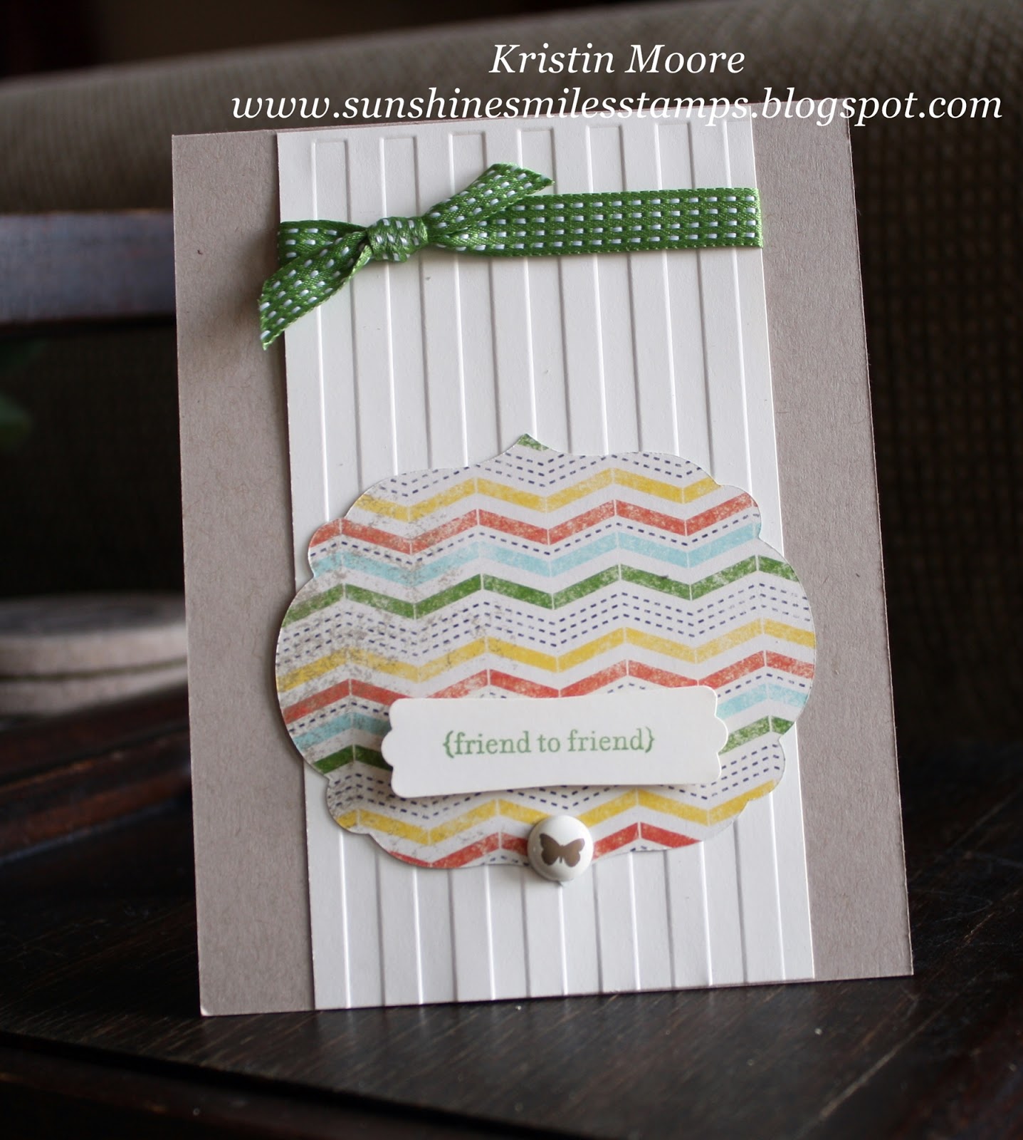
Friend to Friend- fifth in the series

Ooh, isn't that paper just wonderful?  I adore it with this Gumball Green Satin Stitched ribbon!  And the Stripes Embossing Folder...  That butterfly brad is another from that old Everyday Enchantment collection.  Have any of those left?  I still have a few- will be sad when I run out!

Thanks for stopping by today.  One more left in the series I think.  Enjoy!
~Kristin

SUO Supplies
Stamps:  Teeny Tiny Wishes
Paper:  Crumb Cake, Very Vanilla, Epic Day  DSP
Accessories:  Gumball Green Sating Stitched Ribbon, Everyday Enchantment brad, Stripes embossing folder, Big Shot, Labels Collection framelits

Sunday, April 14, 2013

Happy Anniversary & Happy Birthday: third & fourth in a series


Hi there!  Up next in the series of six is this clean & simple anniversary card.  What do you think of the texture and sophisticated color combination together?  That wide striped ribbon is Basic Gray, embossing folder is called Vine Street, and brad is from the retired Everyday Enchantment collection.  Isn't it awesome that even retired products from Stampin' Up! coordinate with the current stuff?  I just love using up older favorites. 


And here is a birthday card made in that same series of six that I donated recently for a Domestic Violence Shelter fundraiser.  For all 6 cards I used a similar sketch as well as the new This and That Epic Day Designer Series paper which is a sneak peek from the upcoming brand new Stampin' Up! catalog (June 1), and is available now in a bundle with some other fabulous coordinating products.  Check them out!  Stop back tomorrow to see the next one in the series!

This one uses the Chevron embossing folder!  Doesn't it just add a funky flair to those gorgeous designer papers?!!  Once again, I used Teeny Tiny Wishes for the sentiments on both of these, as well as the Modern Label punch and the Labels Collection Framelits.  

Gotta run, stop back tomorrow for another in this series!  
~Kristin

Saturday, April 13, 2013

Get Well Wishes: second in a series

Hello!  Here is the second card in the series of six cards that I donated recently for a Domestic Violence Shelter fundraiser.  For all 6 cards I used a similar sketch as well as the new This and That Epic Day Designer Series paper which is a sneak peek from the upcoming brand new Stampin' Up! catalog (June 1), and is available now in a bundle with some other fabulous coordinating products.  Check them out!  Stop back tomorrow to see the next one in the series!

If you aren't in love with this new designers series paper yet, just wait!  I've got 4 more to show you...

~Kristin

Stampin' Up! products
Stamps:  Teeny Tiny Wishes
Colors:  Crump Cake, Very Vanilla, Summer Starfruit 
Accessories:  Big Shot, Honeycomb embossing folder, Satin Stitched ribbon, Modern Label punch, Pool Party button,  Labels Collection framelit, Baker's Twine

Friday, April 12, 2013

Hello Baby: first in a series


Good morning!  I have a clean & simple baby card to share this morning.  I made this in a series of six cards that I donated recently for a Domestic Violence Shelter fundraiser.  For all 6 cards I used a similar sketch as well as the new This and That Epic Day Designer Series paper which is a sneak peek from the upcoming brand new Stampin' Up! catalog (June 1), and is available now in a bundle with some other fabulous coordinating products.  Check them out!  Stop back tomorrow to see the next one in the series!

Thanks for visiting and hope you are having a great spring!
~Kristin

Stampin' Up! Products
Stamps:  Teeny Tiny Wishes
Paper:  Crumb Cake, Whisper White, Epic Day DSP
Accessories:  Big Shot, Cloudy Day embossing folder, Labels Collection framelits, Calypso Coral Button, Calypso Coral baker's twine, Modern Label punch

Wednesday, March 20, 2013

Love you!

Doing some virtual stampin' with my old pal Lisa Henke today!  We try to get together virtually (since we're about a 3 hour drive apart) once in awhile to stamp by sharing challenges with each other and stamping at the same time.  Today Lisa suggested we try the Color Throwdown challenge.    I also combined it with the Create With Connie & Mary sketch but missed the deadline by about 2 hours.  UGH!  Hate it when I do that.  

I have a little journal that I keep solely for stamping challenges.  Oftentimes I'll take some time to write down 6-8 current challenges then refer to my journal the rest of the week to work on them.  Unfortunately I rarely remember to write down the due dates.  Oh well, they get me stamping and that's the important thing!  
Funny thing... at first I thought I couldn't work with these colors- they just didn't appeal to me.  But I stuck with it and finally came up with something I really like.  Hope you do to!

Thanks for visiting!  Be sure to stop by Lisa's blog to see what she's been up to also.
~Kristin

SUO Supplies
Stamps:  Betsy's Blossoms, Itty Bitty Banners
Colors:  listed above
Accessories:  large scallop punch, smaller scallop punch, Boho Blossoms punch, antique brad, Vine Street embossing folder, Bitty Banners Framelits, 5 petal flower punch

Thursday, January 24, 2013

Custom Wedding Invitation

Here it is, the project that has all but consumed me for the last month or so and the actual assembly part is JUST beginning.  If this looks familiar to you it is THIS card you are remembering.  The bride's mother found it on the internet somewhere which led her to asking me if I'd consider doing 215 wedding invitations!  Fortunately I helped two friends last summer with wedding invitations so I had some experience, but I mostly did the design and step-by-step instructions for those, along with a little bit of hands on help.  This time they are ALL up to me.

The label across the heart will have the bride & groom's names in a pretty script font that they chose, which will coordinate with the actual invitation wording on the inside.  There will also be a little band on the inside cover which will hold the RSVP and Reception cards in place.

So far I have really enjoyed the challenge and the process, and getting to know the bride a bit.  I have even learned a few things along the way.

Do you like how I embossed the envelope flaps to coordinate?  Well guess what, my Big Shot broke down right in the middle of that process!  Yep.  Thank heavens my dad was here visiting and is far more handy than I.  He had it fixed in a jiffy and got me back to work.  Then he even stood next to me and handed me envelope after envelope for probably an hour!  Thanks Dad!

I've also learned to always save my MDS (My Digital Studio) files as a .pdf file instead of a .jpg for the printer, and that you can not over estimate how much time the whole designing process will take.  Plus I've learned tons of neat tricks on MDS that I never would have known.  Makes me excited to try this again some time (ask me how I feel in a month after gluing 430 birds, branches and wings down!)

Special thanks to my kiddos also for helping me with the little things so far, like punching and scoring!

Thanks for stopping by again!
~Kristin

Wednesday, January 16, 2013

Thank You

As I mentioned yesterday, my pal Lisa Henke and I decided to do some virtual stamping together on Monday as we occasionally do.  Basically that means we chat via email and choose challenges to do together then enjoy stampin' with a stampin' buddy (sort of).  It is fun because we live about 3 hours apart and rarely get to see each other. 

So Lisa chose our first challenge which is the Clean and Simple challenge from Splitcoast.  The challenge was actually a color challenge to use Bermuda Bay (or any tuquoise color), Kiwi Kiss (lime green), Ruby Red (any red) and Chocolate Chip (brown).   I did use the Burmuda Bay on the sentiment, but the background blue is actually Pool Party. 

Before the holidays of 2012 I had the privledge (as an SU Demo) to preorder a few things from the now current Spring Catalog which runs through May as well as the Sale-a-Bration catalog which runs from Jan 22- Mar 22 (SOON!).  It was hard to get all those new goodies during such a hectic season but it was worth the wait because I had so much fun playing yesterday! 

You have probably noticed by now the two new embossing folders I put to use.  The top one is appropriately called Cloudy Day (from the new Spring catalog) and the bottom one is Vine Street (FREE during Sale-a-Bration)!  If you are like my your stash of embossing folders is growing because they are ADDICTING!! 

In an effort to keep this as CAS as possible I kept the stamping to a minimum with just a flower and a sentiment.  BUT, the stamps and even the tiny punch are ALL BRAND NEW also!!  The flower is from a Sale-a-Bration (FREE) option called Madison Avenue and that tiny little thank you is from Pretty Petites which coordinates with the new punch Petite Curly Label (both FREE during Sale-a-Bration!).

Gosh, that's enough info I'd say.  But here is a quick shot at the inside detail.  I just stamped the vine image 3 times then punched out two of the stamped flowers and put them on dimensionals so they pop out. 

Thank you for stopping by today!
~Kristin
 
SUO Supplies
Stamps:  Madison Avenue, Pretty Petites
Colors:  Kiwi Kiss (retired), Pool Party, Ruby Red (retired), Chocolate Chip, Bermuda Bay (retired), Whisper White
Accessories:  Petite Curly Label punch, Cloudy Day embossing folder, Vine Street embossing folder, Big Shot, 2 1/2" circle punch, Coredinations cardstock (in Pool Party), sanding block

Sunday, October 28, 2012

Not 1, not 2 but 3 cards this time!


I had so much fun using THIS SKETCH from Create with Connie & Mary that I just had to use it again.  I LOVE the diagnal aspect!  Just like my last card, I used the Comfort Cafe DSP, but this time I used it for a casual card that could even be considered masculine I suppose.  I cut this boot out in three different colors before I got it right- this one is River Rock stamped with Soft Suede ink. 

 My daughter needs some thank you notes for birthday presents she received this month so I set my sights on those.  This one puts 2 challenges to test:  The sketch from Fab Friday (which I took some artistic liberties with) and the color challenge from Color Me Beautiful (Calypso Coral, More Mustard, Raspberry Ripple, Always Artichoke, Vanilla).  I just love how this turned out- the colors are fallish but wonderfully vibrant together, and the variety of textures are so FUN- just what I needed on this cold blustery day!  Edited to add:  the Color Me Beautiful sketch is one from several weeks ago that I'd written down in my sketch journal.  Oops! 
 Here's another Thank You note.  This time I followed the sketch from Paper Players, and the color challenge from Color Q.
 
Quick shot of the inside. 
 
Well, thanks for stopping by! 
~Kristin

Monday, October 15, 2012

Blue Ribbon Birthday- a Mojo Sketch & TEXTURE!


Surprise!  Yep, I'm back to stamping.... at least for today.  Saw the weekly Mojo sketch in my email inbox and couldn't resist.  So between laundry loads and other things I managed to squeek this one out. 
Also decided to join the SUO Challenges to use texture.  Duh!  That's not too hard.  Gotta love those embossing folders.  I managed to use THREE on here!  Polka Dots, Stripes and the Chevron.  So fun! 
 
I had planned to join a color challenge somewhere but somehow these colors grabbed my eye from my own scraps and I HAD to go with them.  Basic Gray, Perfect Plum, Wisteria Wonder and Summer Starfruit! 
 
Besides the texture on here I spiffed things up with some Summer Starfruit stitched satin ribbon and some Filigree brads, and of course several punches! 
 
I also made a new necklace this weekend so if you're interested hop on over to my Beading and Jewelry page (link at top below my blog title).  Here's the sketch if you'd like to play along!
 
 Thanks for stopping by today! 
~Kristin

Wednesday, September 26, 2012

Holiday Cheer

I've been working to come up with some designs for our annual Stamp-a-Stack which is coming up October 6th.  Since I've been neglecting my stamping for jewelry lately I'll post four cards at once.  I have another done, but haven't yet photographed it. 
 
 My new order from SU will be here on Friday so I'll have more stuff to play with and post then!  This first one is using the new Holiday Frame embossing folder.  I love how the Cherry Cobbler baker's twine looks but the punch I used on the corners is not by Stampin' Up! so I don't think we'll be making this one. 

For this one i stamped an ornament from Delightful Decorations on the Limited Edition DSP then embossed it with clear powder.  I have ordered the Cherry Cobbler powder so next time I can stamp with Versamark instead of the Versamark then Cherry Cobbler combination.  

 
This style of stamping has a name, something like Subway style?!?  Basically you just gather a large number of sentiments and stamp them in varrying directions.  I have at least 15 different stamps on here, many from very old retired stamp sets, all stamped in various shades of green.  The card base is Gumball Green, and it is finished off with some Cherry Cobbler Seem Binding.  Are you getting the idea that I like Cherry Cobbler for Christmas cards??
And finally... this one is actually Real Red with Always Artichoke and Naturals Ivory.  The tree, from Snow Swirled is an old favorite.  I embossed it in silver on the Limited Edition DSP then sponged over it with Artichoke ink.  If you're wondering, my sponge dauber had some other green on it and even though it was dry, it showed up more than the artichoke.  Next time I'll use a brand-new sponge dauber.  The tree ornaments were punched from the glittery red paper with a standard hole punch and the 1/8" hole punch. 

Thanks for visiting!  Why don't you let me know YOUR VOTE if you had to choose which of these you'd want to make at a Holiday Stamp-a-Stack. 

~Kristin

Sunday, July 15, 2012

Celebrate Love- A natural, casual wedding Card

Hello again!  Here is my natural, earthy, casual wedding card for a wedding I have coming up in August.  Think burlap and twine, brown paper and mason jars with candles.  You know, all things hot and trendy on Pinterest right now!  I helped this bride design her invitations and I must say they turned out great!  I might post one, but they are hard to photograph and even harder to appreciate without it in your hand...  I wanted to make her a wedding card with the same style and design so here it is. 

Everything is lightly sponged with Soft Suede ink for a softened look.  The Wild Wasabi piece is distressed (just crumpled then smoothed out) and torn.  And the poppies were colored with an Aqua Painter and some Wild Wasabi ink. 

I used the sketch from Freshly Made Sketches on this one, and obviously let some things off kilter to make it my own.  If you look closely I'm sure you'll see the resemblence though! 
 And a shot at the inside too.  You may notice by now, I like things a little off kilter, unusual and asymetrical.  Hope you like it anyway!  :)  Thanks for visiting. 
~Kristin

SUO Supplies
Stamps:  Pleasant Poppies, Fabulous Phrases, Full of Life
Colors:  Wild Wasabi, Soft Suede, Naturals Ivory
Accessories:  (NEW!) Woodgrain embossing folder, Antique brad, Linen Thread, Decorative Label punch (inside), sponge, Modern Label Punch

Friday, June 29, 2012

AMAZED BY YOU! an Artisan Award Entry

If you're ready, I've got another scrapbook layout to share today.  This is probably the page I'm most proud of mostly because of the photography courtesy of yours truly.  This is my niece enjoying a play mat that hooks to a hose for sprinkler fun that we got her for her birthday last year.  I was so pleased with these pictures and knew good photos make for a better scrapbook page.  True to my nature I couldn't just pick one- had to get them all on there. 

I had also forgotten, and didn't get a good picture to showcase it, but the main largest picture (which is 5x7) was run through the Big Shot with the largest Apothecary Accents Framelit.  If you look closely can you tell?  I then raised it on Stampin' Dimensionals and placed right back on the original photo.  Wish I'd gotten a better picture of that detail!

My favorite detail about this page are the faux water droplets that are sprinkled throughout the page, from the title and on the pictures.  You may not have noticed them upon first glacne so here are a few closeups.  I made them with Crystal Effects.  Just dabbed them on in the shape of a water droplet and let them dry.  My initial idea was to make them on one of my clear stamp blocks then glue them on, but they got so hard I couldn't get them off without chipping them away, plus they ended up cloudy when I handled them.  This was SO SCARY to do after my page was entirely complete!  But I had extras of everything if I needed to start over. 

 My main image that was mounted on vellum cardstock actually lifted by the black dotted ribbon to show the journaling block as well as a final hidden picture. 

In case you are curious, here is the actual journaling...


Finally, I would like to make a VERY SPECIAL shout out to Louise Streater (AKA Evalou) who so generously and super quickly responded to my plea for help on Splitcoast by cutting and shipping within about an hour it seemed, the very letters used on this page!!!  She even went so far as to send me two full sets just in case I messed up (which I didn't so I can now make myself a copy)!  AND she sent them in the most beautiful card ever... I'll have to post a picture of it soon.  So, THANK YOU LOUISE!  I didn't win but thanks to you I was at least able to do my best and be proud of trying!

Thanks for visiting today!  I hope everyone is staying cool and safe today, especially if you are facing 90+ degrees temps like we are here in Ohio- PHEW! 

~Kristin

Edited to add:  Closeup of main photo showing the detail of the Apothecary Accents Framelit.  You can see more faux water drops here too.


SUO Supplies: 
Stamps:  none (uh, maybe that could've helped me get selected, duh!)
Colors:  Wild Wasabi, Naturals Ivory cardstock, Pool Party, vellum
Accessories:  Apothecary Accents Framelits, Big Shot, Black dottted scallop ribbon, jewelry tag punch, linen thread, scallop border punch, Polka Dotted embossing folder, Jelly Bean Sweet Shop brad

Thursday, June 28, 2012

Artisan Award Entry: Hello Baby!

Clean & Simple is an understatement on this one I think.  Here is yet another of my Artisan Award Entries that I made back in April or May.  This is one that I never got sick of.  Love how the punched hearts coordinate with the tiny hearts in the Adorning Accents embossing folder.  My little extra details include the clear heart button with a curled wisp of matching cardstock.  Just cut a sliver then wrap it tightly around a toothpick and pull the toothpick out... all done AFTER you thread it through the button, not before!  Sorry the photo is a little over exposed. That pale ink is hard to photo!

Quick shot of the vey simple inside. 

Thanks for stoppin in to see me and for your lovely comments! 
~Kristin

SUO Supplies
Stamps:  Teeny Tiny Wishes, Full of Life
Colors:  Marina mist, Pool Party, Pink Pirhouette, Crumc Cake
Accessories:  Big Shot, Adorning Accents Embossing folder, Lots of Tags sizzlit, Bitty Buttons, Heart to Heart punch, Modern Label punch

Tuesday, June 26, 2012

Love You Much: Artisan Award Entry

So far you've seen a card, my recycled album clock and a scrapbook page... all entries in SU's Artisan Award contest in which I did not make the finalist round.  Up next is another card.  This was one of the first cards I made so I was sick of it by the time I shipped it off.  In fact, considered redoing it several times.  Now that I've not seen it in person for over a month I am liking it again.   

The fun details that I thought made it unique are the punched flower window with a white lattice piece behind it showing through.  I love the idea of seeing something behind that punched flower... but maybe the lattice is too busy, or the white too stark?  That's the part I reconsidered dozens of times then left.   


Perhaps my favorite detail is the three rows of scallops at the bottom that show from the inside when the card is closed.  Sort of like a 2 for 1!  I left the inside blank so it could be used as a note card for any occasion.  Thanks for stopping by! 
~Kristin

SUO Supplies
I'll stop back to add supplies.  Must run right now!


Sunday, June 24, 2012

Artisan Entry: Explore (a scrapbook page)


Good morning!  Are you here looking for another Artisan Award entry?  Well here you go, one of the three scrapbook pages that were required.  I finished this one last and was the most pleased with it I think.  I'm willing to bet many of the winning entries only had 1 large photo as the focal point as those are the most dramatic pages... but I decided at the outset to stick to "my style" and I generally tell a story on my scrapbook pages that usually can't be told in one photo.  Rather than covering the entire page with photos I chose to offset them on an angle for visual interest and some creative cropping.  I've done this before and love the outcome every time, despite the extra work involved.

This page is from a recent family outing to the Hocking Hills State Park in southern Ohio.  What a beautiful place!  We enjoyed every single minute of it and I'm so happy to have my layout all designed (need to make myself a duplicate though). 


The patterned paper and journaling tag are both from the Tickets & Tags Simply Scrappin' Kit (now retired).  I also used the Extreme Elements stamp set to further grundge up the background paper.  For my title I used chipboard letters from Onboard Alphabet Soup, dirtied them up with some Soft Suede ink and- my favorite detail- textured them with the Square Lattice embossing folder.  I was excited to experiment with this and find out that chipboard easily embosses with the Big Shot! 


Some of the details include a new Naturals button with a bit of linen thread and twill tape.  One of the hardest things about this page was leaving myself off (one of SU's rules for fairness).  My husband is just as interested in photography as I am and gets really creative sometimes so many of the best photos he took which means I am in them.  On the other hand, I like it even more that I'm NOT on it!

Well, once again, thanks for stopping by and for your comments.  They keep me going! 
~Kristin

SUO Supplies
Stamps:  Extreme Elements
Colors:  Baja Breeze, Soft Suede
Accessories:  Tickets & Tags Simply Scrappin' Kit, Linen Thread, Twill Tape, Bitty Banners Framelits, Natural Button, Alphabet Soup Onboard Chipboard

Friday, June 22, 2012

Non-Artisan Award Winner...


Yes, I'm a little bummed to have not gotten a call yesterday about the Stampin' Up! Artisan Award contest for demonstrators to be on SU's Design Team for the coming year.  However, the upside is I can show you all my projects now.  Unfortunately I won't get any of them back.  Here is a picture of the group of them.  Over the next few days I'll show them to you individually so you can see the details.  Which would you like to see next? 
This card was one of my favorites.  It is so me- very earthy and natural, just my style.  I also love that shade of blue (I think it was Marina Mist) paired with River Rock and Always Artichoke.  This now-retired stamp set will go down as an all time favorite of mine, Inspired by Nature.  I used the Adorning Accents Edgelit to make the "frame" for the flowers, then punched a 3/4" circle in it to showcase the Antique Brad with the jewelry tag sentiment. 

I didn't get a picture of the inside but I mimicked the River Rock piece and left it blank for writing a note. 

I think this was the best sample of my style because it is somewhat clean & simple, with a few unexpected details.  I hope you like it better than the SU judges did.  LOL! 

Thanks for stopping by! 
~Kristin

SUO Supplies
Stamps:  Inspired By Nature, Pennant Parade ("Love")
Colors:  Marina Mist, River Rock, Always Artichoke
Accessories:  Big Shot, Adorning Accents Edgelit, 3/4" circle punch, Antique Brad, Jewelry tag

Thursday, June 21, 2012

Chevron Congrats

Finally!!  Managed to get a picture uploaded to fussy blogger.  Getting completely annoyed with these upload issues BLOGGER, you hear me?!!  Grrrr.  Anyway, after about 10 tries here is a recent graduation card I've designed.  New stuff on here includes the new Blue Ribbon stamp set, Midnight Muse stitched satin ribbon and the fun new Chevron embossing folder.  That Daffodil Delight paper is also new:  Polka Dot Parade DSP.  Maybe today I'll get a chance to play with more of my new goodies. 

Thanks for stopping by!
Kristin

SUO Supplies
Stamps:  Blue Ribbon
Colors:  Midnight Muse, Basic Gray, Daffodil Delight, Whisper White
Accessories:  Big Shot, Chevron Embossing Folder, small star punch, mini silver brads, Midnight Muse stitched satin ribbon, large scallop circle punch

Wednesday, May 30, 2012

Baby Shower Gifts... Part 4

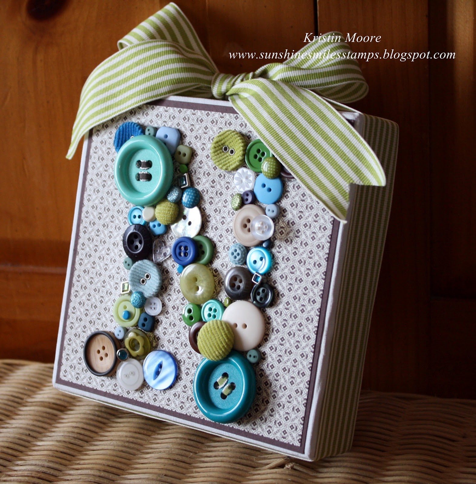
Finally, what I've been waiting to share with you.  My favorite of the Baby Shower Gifts.  Saw this idea on Pinterest and thought it was adorable.  It was so much fun to use cherished things from my stash, some old and some new!  So many possibilities with this one.  This little canvas is a 6"x6" and came in a four pack so I can do THREE more before I need new supplies.  Isn't that awesome?!  The ideas have been swirling ever since I bought them. 
Here's a view of the edge so you can see how it is wrapped in Old Olive striped ribbon.  Love that finishing touch even though the sides were nice.  Many of these buttons and brads were from my SU stash and some were from my "random buttons that fell off" stash.  I did buy a few too, but not many.
I was finally able to upload my picture of the whole set.  If you'd like to see them individually please see the previous 3 posts. 

Thanks for stopping by!  I hope you've enjoyed these as much as I did making them! 
~Kristin

Tuesday, May 29, 2012

Baby Shower Gifts.... Part 3

If you go to the trouble of making unique, coordinating gifts then it is a MUST that the packaging and card match too!  Using several repeating elements tie them all together regardless of what they are.  Here is the gift bag I gussied up to go with the gifts.  I tried to keep it simple and elegant.   


Here is the card I made.  It turned out so nice compared to my first idea!  Let's just say it got scrapped before I even got very far.  Don't you just love these colors together?!  Thought the embossed dots would soften it all up and add a tiny bit of whimsy.  Hope you like it!  Up tomorrow is my most favorite part of all!  And hopefully I can add my picture of the entire group (fingers crossed).  Thanks for visiting,

~Kristin

PS- In case you missed them, here are the other parts to this gift so far.