Showing posts with label sympathy. Show all posts

Tuesday, October 15, 2013

Too Kind

Sometimes a heartfelt, handmade card feels like the best way to convey our deepest sympathy at a time of loss.  We lost a dear, dear friend recently who was like a grandma to our whole family.  Making this for the family left behind was quite comforting and healing to me, as I hope receiving it was for them.  

I think this new stamp set, Too Kind, was a beautiful choice.  If you want to get dimensional looking flowers with this two step stamping process, rather than trying two different colors, try stamping in the same color but "stamp off" once for the background layer before stamping on your paper.  After a lot of experimenting I found this worked best for the soft look I was going for.  Let me know what colors you've tried with this technique!

Thanks for stopping by.
~Kristin

Monday, September 10, 2012

Sharing Your Sorrow

Good Monday morning, I hope.   I found a fabulous new sketch challenge blog this weekend called Fab Friday.  This sketch is their FIRST EVER challenge!  So excited I found it right from the beginning.  The simplicity of this sketch really appealed to me- lots of room to add those unique creative touches.  Found out that I needed a sympathy card just before I put the sentiment on so this quickly went from birthday to a sympathy card.  Don't worry, I did a second variation for a birthday which you'll see tomorrow.  
 
 Can you tell that my top picture was taken in morning light and these bottom two in evening light?  I couldn't decide which was better so you get both. 
 Here is the sketch:  Go ahead, have fun with it! 
Thanks for stopping by!
~Kristin
 
SUO Supplies
Stamps:  Thoughts & Prayers
Colors:  Lucky Limeade, Basic Gray, Marina Mist, Basic Black
Accessories:  Big Shot, Stripes embossing folder, Flower Garden embossing folder, Kiwi Kiss corduroy button (remember those?!), Pinking Hearts border punch, Modern Label punch

Monday, October 24, 2011

Vintage Sympathy and a Layout


How about a slightly vintage sympathy card today?  I put this together last week for a sketch challenge then never got around to uploading it.  I love the new Spice Cake DSP- so many nice colors and designs that look lovely together (even though I only used one here).  Was trying to keep this as Clean & Simple as possible- I think for another CAS challenge somewhere. 
Here is a quick shot of the inside using the new set Four Frames for the sentiment panel.  And I've finally gotten around to sharing a few of the scrapbook pages I did over a month ago.  This one seems sort of vintage to me so thought I'd include it in this post.  More to come! 

Thanks for stopping by! 
~Kristin

SUO Supplies (card):
Stamps:  Nature Walk, French Script background, Petite Pairs, Four Square
Colors:  Sahara Sand, Soft Suede, Pool Party, Naturals Ivory (cardstock)
Accessories:  Scallop Square punch, Chantilly Lace ribbon, Dotted scallop ribbon border punch

Sunday, August 7, 2011

Flower Garden sympathy

Just had to try out my new Flower Garden embossing folder today!  There have been some complaints about the embossing being on the right side instead of the left side where it is pictured in the catalog, but I must say that doesn't bother me a bit.  I think it is beautiful. 

Here I embossed it first then rubbed over it very gently with a sponge and some Champagne Mist shimmer paint.  I intentionally let the swipe marks show and I like it that way.  Kind of an artistic look I'm hoping for.   
On the inside I used the butterfly stamp from Watercolor Trio as well as a sentiment from Thoughts & Prayers. 

Thanks for stopping by!  That's all I've got for now but hope to be back to stamping again soon. 
~Kristin

SUO Supplies
Stamps:  Teeny Tiny Wishes, Watercolor Trio, Thought & Prayers
Colors: Wisteria Wonder, Elegant Eggplant
Accessories:  Champagne Mist shimmer paint, Big Shot, Flower Garden embossing folder, Decorative Label Punch

Friday, August 5, 2011

Heartfelt gratitude from me

Before I type a word about this card, my first since May I believe, I'd like to first extend my heartfelt gratitude to you, my on-line friends, who have left the most endearing messages regarding the loss of my mom.  I can honestly tell you I've read them many times and each time they brought me comfort.  I'm so very touched, so THANK YOU! 

Thanks to some of the beautiful handmade cards I received from people like Angie Tieman and Lisa Henke, I am finally inspired to stamp again.  I spent most of my day at my "creative station" enjoying some of my new SU goodies that I've had for some time but never opened.   For this card I used the sentiment from my new stamp set Faith in Nature as well as the retired Sale-a-Bration set called Bliss.  My color combo is Soft Suede, Concord Crush with the new In Color Wisteria Wonder and a touch of Calypso Coral on the butterfly. 

Extra details include Basic Pearls, the Dotted Scallop Ribbon Border punch, Log Cabin Smooch Spritz and some Dazzling Diamonds. 

For the inside I used the stamp set Vintage Labels and the sentiment is from Silhouette Sentiments (retired hostess set).  My layout came from the Clean & Simple blog sketch #152.  I hope you enjoy it as much as I enjoyed stamping again! 

Be sure to stop back tomorrow and the next day as I've got MORE to show you!  Thanks for visiting today!

~Kristin

SUO Supplies
Stamps: Faith in Nature, Bliss (retired), Silhouette Sentiments (retired), Vintage Labels (retired)
Colors:  Soft Suede, Concord Crush, Wisteria Wonder, Calypso Coral, Whisper White
Accessories: Dazzling Diamonds, Basic Pearls, Dotted Scallop Ribbon border punch, Log Cabin Smooch Spritz, Curly Label punch

Wednesday, April 27, 2011

With Sympathy

Hello stampers!  I'm back today with a creation for the Diva Coffee Break Designs sketch challenge.  I was in the mood for something sort of pretty and elegant and needed a sympathy card so this is what I came up with.  Obviously I've turned the squares on their sides so I've got a little different look than the sketch. 

I hope you like my color combo!  It is Soft Suede, Sahara Sand, Vanilla and Cherry Cobbler.  Doesn't that Cherry Cobbler seem binding look pretty?  It has such a nice sheen in real life! 

Well, gotta run (again).  Baseball practice and weeds are calling my name, not to mention dinner and laundry.  I did finally get my bathroom all complete and will take some after pictures to share with you tomorrow (hopefully).  I am so pleased with how it turned out- despite all the work and effort it took (about 5 days). 

 Please stop by to see what the other Divas have done for today's challenge!

Thanks for stopping by!
~Kristin

SUO Supplies
Stamps: Watercolor Trio, Fine Flourish
Colors:  Soft Suede, Sahara Sand, Very Vanilla, Cherry Cobbler
Accessories: Cherry Cobbler seem binding, pearls, Lattice die, Big Shot, small oval punch

Tuesday, February 22, 2011

Build a Blossom

Have you seen this new set Build a Blossom in the Occasions Mini Catalog yet?  And its fun coordinating punch, Blossom Petals?  I've had fun playing with these that I borrowed from my friend and downline Jennifer.  Versatility is always important for me when I'm deciding which stamps and accessories to buy.    So I had to play around before deciding.  This first card is pretty straight forward, using the punch and stamps just as designed.  I've also borrowed the sketch from Create with Connie & Mary.   
SUO Supplies:
Stamps: Build a Blossom, Thoughts & Prayers
Colors: Soft Suede, Cajun Craze, Early Espresso, Sahara Sand
Accessories: Blossom Petals punch, Decorative Lable punch, Chantilly lace ribbon, Square Lattice Textured Impressions folder, Dotted Scallop ribbon border punch, Big Shot
Here is another use for this set. I saw the idea of using the petals as wings on Create and Enjoy with THIS card.  I just had to try it out and loved it!  I also employed the new Framed Tulips embossing folder for good measure.  Sentiment, from Something to Celebrate hostess set, is stamped in Night of Navy on vellum cardstock and enhanced with basic Pearls.  So what do you think?

SUO Supplies
Stamps: Build a Blossom, Something to Celebrate
Colors:  Sahara Sand, Certainly Celery, Bashful Blue, Marina Mist
Accessories: Big Shot, Framed Tulips embossing folder, Scribbles Swirls Sizzlit, vellum, basic pearls

That buttefly card has me wishing for warmer temps.  Here is a photo I took last summer to brighten your day (and mine too). 
Thanks for visiting!
~Kristin

Wednesday, August 4, 2010

Just Believe & Some Layered Ribbon

Ooh lala, I knew I'd like this color combo as soon as I read about it!  This week's Color Challenge on Splitcoast is to use Blushing Bride (In Color), Riding Hood Red, Early Espresso. 

My first attempt got pitched though, but the second one worked out better.  I attempted another use of my Smooch Spray, the Vanilla, just on the butterfly and like the added shimmer.  My ribbon is layered with the retired striped Riding Hood Red and some new Early Espresso Taffeta on top.  I actually taped them together in spots to make it easier to tie and realized that kept them together pretty well. 

Added a bit of extra dimension with the paper piercing around the circle and the Vintage Wallpaper embossing folder on the left.  What do you think?  I'm pretty happy with it... even though I did completely forget about today's Diva challenge (and this card does NOT qualify).  I'm off to play along with my Diva pals now.  Why don't you come play too?! 

Hope you're having a great day!  Thanks for stopping by.
~Kristin

SUO Supplies
Stamps: Just Believe, Teeny Tiny Wishes
Colors: Early Espresso, Riding Hood Red, Blushing Bride, Very Vanilla
Accessories: Big Shot, Vintage Wallpaper Textured Impressions embossing folder, Beautiful Wings embosslit, Striped Riding Hood Red grosgrain, Early Espresso taffeta ribbon, 1 3/8" circle punch

Tuesday, March 30, 2010

Inspired Watercolored Sympathy

I rarely get to play along with the Inspiration Challenge on Saturdays at SCS. But this weekend I did. We were directed to find inspiration at Thymes.com which was no problem. I used the entire Lavendar collection to guide this card. Obviously I grabbed the soft shades of purple with a lot of white space, and added some texture with the embossing after the stamping and the pinking hearts border punch.

Since this is watercolor paper, after I stamped the images I gently went over them with a wet aquapainter just to let the ink bleed a bit. Lends to a softer more artistic look I think. This card ended up being 4.25x4.5" so it's not quite square.

Topped it off with the vanilla hodgepodge hardward and some wide vanilla organdy ribbon. Hope you like it!

Thanks for stopping by!
~Kristin
SUO Supplies
Stamps: Oldies but goodies: Art of Life, Easy Elegance, Stem Silhouettes
Colors: Elegant Eggplant, Almost Amethyst, Very Vanilla
Accessories: Wide Organdy vanilla ribbon, Vanilla hodgepodge hardware, Big Shot, Manhattan Flower Textured Impressions embossing folder, Pinking Hearts border punch

Monday, February 1, 2010

Felt, crimper & brads: A Sketch!

Sorry I've been MIA since Wednesday! I enjoyed a wonderful weekend scrapbooking with my mom, sister and aunt this weekend (and spent a few days getting ready for that, plus volunteering and other stuff of course). We had so much fun and I got 12 pages done!

However, last night I had the pleasure of sitting down to make four cards for today's Clean & Simple challenge on SCS. For the challenge we were given a sketch... actually, we were given a card and told to use it for our sketch. For these two cards I simplified the sketch even more by only using one layer of cardstock and a few Felt Flowers attached with brads. I used the crimper for a bit of texture and for the horizontal line that was a big part of the sketch. Added a white sentiment and was done. Yes, they were fast and easy which is exactly why I got 4 cards done in a very short time frame.

The flowers on this first card are Baha Breeze and Old Olive on the Chocolate Chip cardbase. I also used silver brads from the Vintage brads. Sentiment on these first two is from Short & Sweet- an awesomely versatile set that is a must-have as far as I'm concerned!

These flowers are Rose Red and Pink Pirouette on the Chocolate base with white ink for the sentiment. Easy peasy!

Since I've been missing for so long I think I'll just show you the other two cards now and fill in the rest of the week with scrapbook layouts when I need to. Hopefully that means no more days off from blogging this week. I've missed you guys!

So this is actually the first card I did. You'll see later this week that it actually mimics a scrapbook layout I did (which, incidentally, was heavily influenced by a sample on the cover of the Simply Scrappin' Kit I used). The retired SS Kit I used is called Pina Colada. I adore the collection of patterns of paper in this kit, not to mention the galore of gorgeous adhesive die cut stickers! I can't wait to show you the pages I did with it. In fact, 10 of the 12 pages I completed this weekend were done with Simply Scrappin' Kits I believe!

Anyway, the sentiment on this one is from Vintage Vogue (pretend it isn't smudged a little, will ya please?!) I used the butterfly punch and an old Old Olive polytwill ribbon.
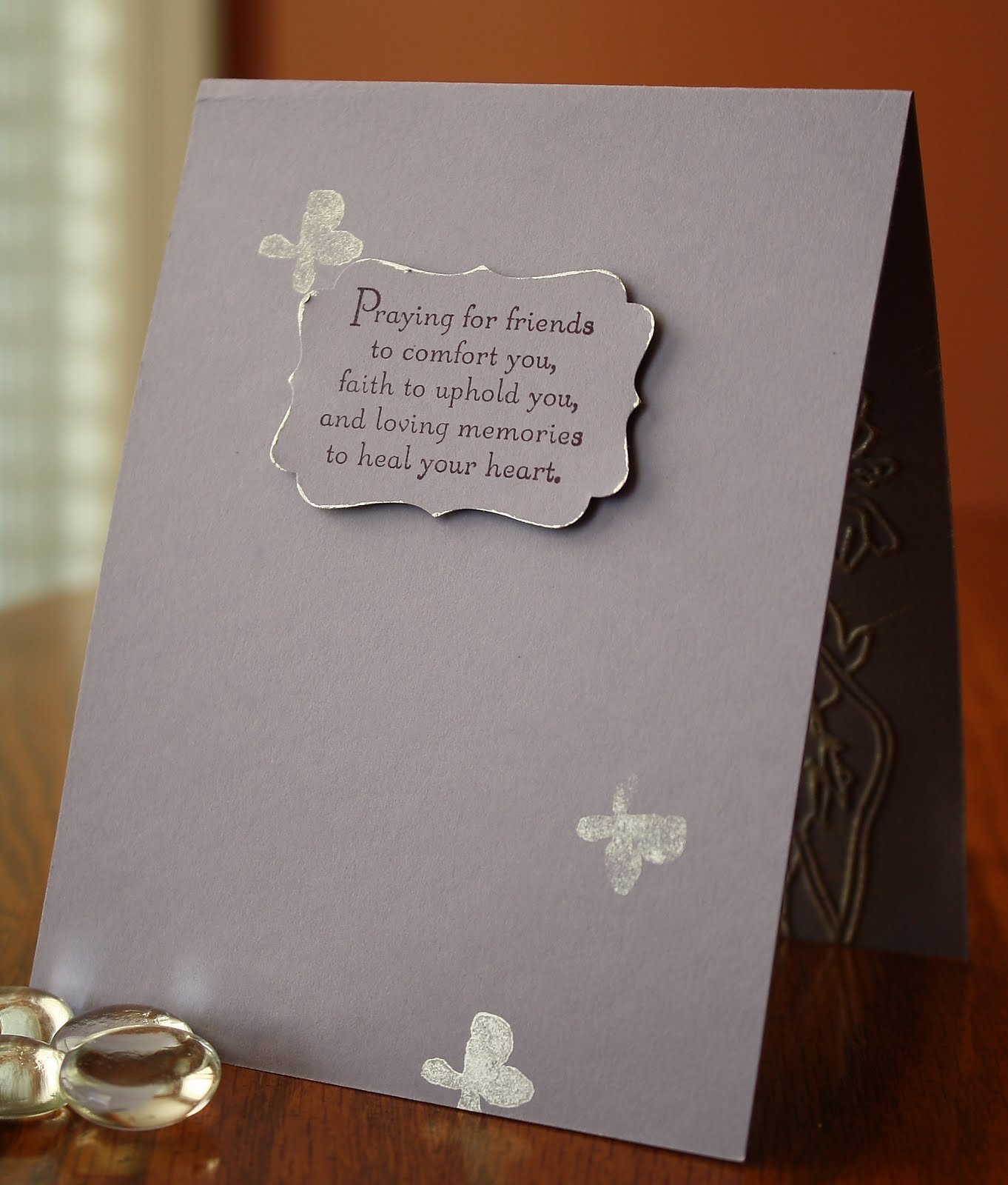
And finally, a single layer sympathy card. This was the second card I made and I wanted to go as different as I could from the bright summery butterfly card. I was hoping to use a soothing netural color palette and elegant style. Vintage Vogue is a good stamp set for accomplishing that look I think. Plus the colors Soft Suede, Kraft and Whisper White help too. Accessories I used here are a Latte button, Kraft Taffeta ribbon and the Modern Label punch in vellum cardstock. The sentiment is from Teeny Tiny Wishes.

Thanks for waiting patiently for me and especially for visiting today!
~Kristin

SUO Supplies listed above in the description.

Wednesday, October 21, 2009

Good Morning!

Hello! After some sporadic posting I am back. I had a few SU events which all went well but kept me busy. Had sick kids home yesterday and had some yard work to do since it was so nice out, but today I'm solo and ready to stamp. Well, I still have some yard work to do and think I'll vacuum out my car one more time before it is too cold... plus washing some bedding so I can take advantage of this warmer weather and use my clothesline today. But FIRST, I will be stamping!

I made this card for today's Diva Color Challenge. Sometimes I really struggle with color challenges- isn't that funny since I'm a "color person"?! I guess I have strong ideas about color so of course every challenge isn't going to appeal to me. Next to each other these colors look a little drab, but it didn't take me long to get working with them. Funny thing is my biggest challenge was getting the gray in there once I had this designed. That's funny because I LOVE Basic Gray!

This week's Clean & Simple challenge on Splitcoast is to do a CAS Sympathy card. I didn't mind doing one because I usually don't until I need one, so now I will have one ready for an unfortunate time when I might need one. I also managed to fit in a sketch challenge from Monday's Mojo challenge. I'm not normally a fan of combining many challenges (I know you are laughing at me Lisa) but this one just fell together that way, so it isn't forced. KWIM?

Anyway, thanks for stopping by! I am hoping to play a little while today so I'll definitely have something to post for tomorrow. Have a great day and enjoy the sunshine if you have some where you live!

Oh Hey, I forgot to say, go check out the Divas today! (Like my rhyme??)

~Kristin


SUO Supplies
Stamps: Pocket Silhouettes, Circle Circus, Teeny Tiny Wishes
Colors: Old Olive, Certainly Celery, Real Rust and Basic Gray
Accessories: Distressing tool, Paper Piercing tools, Wide Old Olive grosgrain, 1 1/4" and 1 3/8" circle punches, Versamark, markers

Friday, October 2, 2009

With Sympathy

I just got this set, Asian Artistry this week and was happy to use it, just not happy about the occasion. The layout is actually from the Sweet Sunday Sketch challenge. I think I'm too late to officially enter, but that's OK... I needed a sketch and this one fit the bill. Instead of one panel inthe back I used three strips of varying size instead.

The main flower stamp was inked in white then wiped the ink off the flowers with my finger (easy enough due to their location) and reinked them with the Ballet Blue marker.

Stamped the dragonfly wtih black stazon on the vellum tag then colored with a blender pen and Watercolor Wonder Crayons. I placed a 1" white circle behind the vellum so that I could adhere it and it would be more of a focal point. Now I'm wishing it wasn't such a focal point so I tried to tone down the white with an aquapainter and some blue ink. That helped, but not totally.

Finished it off with some kraft taffeta ribbon. Thanks for stopping by. Hopefully no more sympathy cards for a while. I'll try to work on something happier to post.

Thank you, my dear followers, for the always sweet comments you leave! They keep me stamping even when I should be doing something else. ;) Stampin' Hugs!
~Kristin

SUO Supplies
Stamps: Asian Artistry, Sanded background
Colors: Kraft, Ballet Blue, Whisper White
Accessories: vellum metal-edge tag, kraft taffeta ribbon, sponge, aquapainter

Watercolored Sympathy

I'm sorry to say that I am in need of a sympathy card today. I made this with the Inspired by Nature stamp- which always seems appropriate to me for almost any occasion. This time I inked it up with my Watercolor Crayons- yes I do own them even though you almost never hear me mention them. When I first stamped this image I said 'Yuck' and so did my kids, but once I cut it into the oval shape, sponged the eges and layered the vanilla under it I felt it actually worked. The true story is that my water bottle that I normally would use to mist the stamp is missing and the only other one I have only sprays a direct squirt- no mist. Well, I did the best I could with it and this is the result. Also, this isn't watercolor paper so just imagine how nice this could look.

Anyway, the background is layered with my cherished and retired French Script then dry embossed with the Big Shot and the Elegant Bouquet Textured Impressions Embossing Folder (had to look up that mouthful as I can never remember what to call it!). The nice thing about the embossing folder is the impression it leaves on the inside too. The sentiment piece is done with the Modern Label punch as well as well as the coordinating Movers & Shapers die for the layer. The words from Thoughts & Prayers fit right inside. The wide organdy ribbon is long retired, but a favorite just the same and always adds an elegant yet understated touch.

Unfortunately I found out early this morning that I'll be needing yet another sympathy card so you may see another one soon.

I hope you are having a wonderful day and have a safe and happy weekend.
~Kristin

SUO Supplies
Stamps: Inspired By Nature, Thoughts & Prayers, French Script
Colors: Almost Amethyst, Very Vanilla, Elegant Eggplant, Mellow Moss, Always Artichoke
Accessories: Elegant Bouquet Textured Impressions Embossing Folder , Big Shot, Vanilla wide organdy ribbon (retired), Watercolor Crayons, distressing tool, Modern Label punch, sponge

Saturday, August 15, 2009

A Triple Post Today!

Thanks for your patience with me this summer- I know I've been sporadic and posting more excuses than creations! School starts on Wednesday so I will be back in some sort of consistent routine again, albeit still busy.

Today I've got three for you, including one I actually made last week but didn't have time to post, a sympathy card I unfortunately needed and also a fun card entirely designed and stamped by my 7 year old daughter.
This first card I made for two on-line challenges but the funny thing is I cannot find one of them for the life of me. It was a color challenge to use Basic Gray, Blush Blossom, Pumpkin Pie and Really Rust. If you know of it, let me know so I can link it here and give credit. The sketch is from the Clean & Simple blog's FTL54. I tried my hand at some doodling which reminded me why I never do it- I stink at it! LOL!
This next card is the sympathy card that I needed for a friend. I love using that Medallion background stamp and really wanted it to be subtle but still a focal point if that makes sense, so I decided to use it as the background but to accent the center of it on the sentiment. The wide organdy ribbon is a retired SU product that I reach for often on these types of cards. However, the bow that I started with seemed too cheery and pretty for the occasion so I decided to try a different type of knot which feels a bit more subdued I guess. What do you think? The brad in the center of the medallion is not an SU product but I couldn't say what it is- I've had them for years and years. In true Beate style I decided to show you the inside as well.
Finally, here is the card my daughter made for her cousin's birthday party we are going to today. She chose the colors right off the top of her head, grabbed the Medallion background and went to work. I cut out the butterfly for her, but that's it. I think it's pretty good and I plan to CASE her color combo soon. FYI- it is Barely Banana, Certainly Celery, Rich Razzleberry and Taken with Teal. The rhinestone things are fairly new so I happen to still have the packaging- they are Crystal Stickers by Mark Richards. She wasn't thrilled with how the Medallion didn't stamp all the way the first time but I convinced her it looks cool that way.

I won't list individual supplies lists because it would be too confusing so if you have any questions feel free to ask and I'll do my best to answer. Most everything except the things I mentioned above are by Stampin' Up!

Thanks for stopping by,
~Kristin


PS- Hey, I just figured out where my color combo came from on the top card. It is from the Color Throwdown #54!


Friday, May 8, 2009

With Sympathy

I made this card using this sketch from the Clean & Simple Stamping Blog. I wanted to do something bold and dramatic so chose to use the red/black combo on a kraft background. I didn't start out intending to do a sympathy card, but unfortunately found out while I was making it that a good friend's mother-in-law passed away unexpectedly yesterday. Do you ever worry about sending a handmade sympathy card? I know not everyone has an appreciation for handmade art and I would hate for anyone to actually be offended for receiving one. I am sure this friend won't feel that way, but this question has gone through my mind before... what do you think?

Anyway, I guess my go-to set is Inspired by Nature lately so it came to mind right away for this sketch. The flowers are stamped on the kraft cardstock with Black Staz-On then restamped on the vanilla after reinking with markers Real Red, Mellow Moss and Basic Black. The grass is stamped on the kraft cardstock in versamark so it is very subtle.

I wanted to try a trick I saw somewhere recently to make a scalloped oval without a fancy tool of any kind. Since I don't have a fancy cutter to make that I gave it a whirl here. I cut a thin strip of black cardstock- probably 1"- then punched it with my scallop border punch, then ran it through the crimper. I did end up trimming the final piece to about 1/2 an inch or less. Next, I added adhesive all around the outer edge of the oval piece and slowly bent and stuck, bent and stuck until it wrapped around the entire thing. This strip of black paper was 11" long and just fit! It isn't perfect and there are some creases and tucks, but I like the end result.

Well, that's about all I can tell you I suppose. Thanks for stopping by! Hug your loved ones today!
~Kristin

SUO Supplies
Stamps: Inspired by Nature, Warmest Regards (retired)
Cardstock: Kraft, Basic Black, Very Vanilla
Ink: Versamark, Basic Black, Real Red, Mellow Moss
Accessories: crimper, scallop border punch, Riding Hood Red taffeta ribbon

Tuesday, December 9, 2008

Thinking of You


Hi! I'm taking a break from my internet shopping for a little bit, and in between classroom volunteering thought I'd make a card. Unfortunately I need a sympathy card again for a stampin' sister who lost her brother this week.
I love this flower stamp from an old set from 2005 called The Art of Life. I had these colors laying on my desk and decided they look very pretty together. They are Baha Breeze, Basic Gray and Silver. The far right edge is the silver cardstock, and the sentiment and flower are both embossed in silver.
The left edge is stamped in Baha with the Floral background stamp. All the edges are smudged with white ink. The one thing used on this card that is not from Stampin' Up is the glass dew drop thingys. These were a gift from my good buddy Lisa Henke and I truly adore them! It would be a dream if SU offered a nice variety of these in our next catalog (fingers crossed!). Last item used on here is our Basic Gray Taffeta ribbon.
Thanks for stopping by today.
~Kristin

Wednesday, November 26, 2008

Diva Coffee Break Design Challenge #103!

I'm a bit late with all the excitement of today's start to the Stampin' Up! Holiday Extravaganza Sale, but here is my design for today's Diva Coffee Break Design Challenge. This is our third, and you can hope to see a new design every Wednesday!

Unfortunately I am in need of a sympathy card today, so this will go out in the mail right away.


I thoroughly enjoyed this sketch and do plan to use it again. I haven't peeked at my fellow DCBD designers' cards yet so I could do this totally without inspiration. It is always fun to see how we all come up with such different designs based on the same sketch or colors.

Today I used the Wonderful You stamp set, as well as a few retired sets: Wonderful Regards & French Script. The designer paper is Urban Garden (part of one of the bundles for sale today coincidentally), and the cardstock is Baha Breeze, Not Quite Navy & Whisper White.

Other supplies I used are the new wide oval punch, Satin Kiwi Grosgrain, Square Ice Rhinestone brads (aren't they lovely?!?), a sponge and the distressing tool. Also, in the center of the flower as well as around the edges of the white piece I applied a tiny touch of two-way glue with Dazzling Diamonds.

I actually redid this a few times- the main flower image and the greeting. The ribbon was a last minute addition and my DD (who gives her input on everything) isn't so sure about that part. What do you think?

Thanks for stopping by! Have a great Thanksgiving weekend and stay safe! I may be MIA for a few days...

~Kristin

Monday, August 25, 2008

With Sympathy


Unfortunately I've needed a few sympathy cards recently so I naturally reached for this serene set, Inspired by Nature. For this card I stamped it in chocolate craft ink then embossed with clear powder. I wish we had an EP in chocolate so I could get a deeper, richer brown with embossing. I love the look of embossing, especially a silhouette, on DSP.

I've got more in the works today so stay tuned...

Stampin' Up! Supplies

Stamps: Inspired by Nature, Warmest Regards
Paper: Chocolate chip, very vanilla, Bella Rose DSP
Ink: Chocolate chip
Accessories: clear EP, wide chocolate double stitched grosgrain, large oval punch, Antique brass hodgepodge hardware, corner rounder