Hello again! Told you I am addicted to ocean-y colors. Can you blame me? And look how compliant I am with this sketch today?! I tend to be a sketch-flipper who takes all kinds of artistic liberties. Didn't need to this time- I loved it just as is.
Had to give you two views of this so I could be sure you would see the added sparkle on the flower there... but also because I'm making a serious attempt at improving my photography skills. I know I'm not there yet, but better is better.
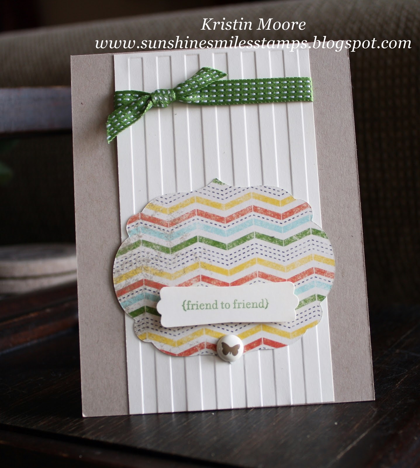
If you are here to find all brand new Stampin' Up! products I'm sorry to disappoint. I have TONS of old stuff, keep everything (almost) and love to mix it in with whatever I feel like. However, the things that I used here that are fairly new, if not current are the Big Shot dies: Apothecary Accents and Adorning Accent edgelits. Also, Coastal Cabana (of course!) and Pistachio Pudding a few of the awesome new In colors. However, the stamps (Simply Soft and French Script background) are retired and REALLY retired in that order, and the Baker's Twine is no longer available in Lucky Limeade.
So tell me, if ocean-y colors are not your thing, how would you describe your go-to palette?? I'd love to hear. See you tomorrow with something scrumptiously different... think Baked Brown Sugar and Raspberry!
~Kristin
SUO Supplies
Stamps: Simply Soft (retired hostess), French Script background, Bloomin' Marvelous (SAB)
Colors: Basic Gray, Coastal Cabana, Pistachio Pudding, Whisper White
Accessories: Apothecary Accents framelits, Adorning Accent Edgelits, Baker's Twine, Dazzling Diamonds Detail (glitter glue)