Here it is, the project that has all but consumed me for the last month or so and the actual assembly part is JUST beginning. If this looks familiar to you it is THIS card you are remembering. The bride's mother found it on the internet somewhere which led her to asking me if I'd consider doing 215 wedding invitations! Fortunately I helped two friends last summer with wedding invitations so I had some experience, but I mostly did the design and step-by-step instructions for those, along with a little bit of hands on help. This time they are ALL up to me.
The label across the heart will have the bride & groom's names in a pretty script font that they chose, which will coordinate with the actual invitation wording on the inside. There will also be a little band on the inside cover which will hold the RSVP and Reception cards in place.
So far I have really enjoyed the challenge and the process, and getting to know the bride a bit. I have even learned a few things along the way.
Do you like how I embossed the envelope flaps to coordinate? Well guess what, my Big Shot broke down right in the middle of that process! Yep. Thank heavens my dad was here visiting and is far more handy than I. He had it fixed in a jiffy and got me back to work. Then he even stood next to me and handed me envelope after envelope for probably an hour! Thanks Dad!
I've also learned to always save my MDS (My Digital Studio) files as a .pdf file instead of a .jpg for the printer, and that you can not over estimate how much time the whole designing process will take. Plus I've learned tons of neat tricks on MDS that I never would have known. Makes me excited to try this again some time (ask me how I feel in a month after gluing 430 birds, branches and wings down!)
Special thanks to my kiddos also for helping me with the little things so far, like punching and scoring!
Thanks for stopping by again!
~Kristin
Showing posts with label wedding. Show all posts
Thursday, January 24, 2013
Wednesday, August 22, 2012
Wedding Invitation & Beaded Jewelry Gift
I think I mentioned in the past a wedding invitation I helped a friend on and since a few of you have requested to see it, here you go. I hesitated to post before because the wedding hadn't occurred yet and because it didn't photograph nearly as well as it looks in person. This bride wanted very natural and simple and she chose all the details.
The soft suede cardstock was cut to fold over the vellum cardstock by 1.5" so the final size is 4.25" x 5.5" just like a standard card, fitting nicely into a standard envelope. It was tied with a bow of twine (I used linen thread for my example here).
The piece underneath with the printed details is Naturals Ivory cardstock. We incorporated the green (Wild Wasabi) from her wedding colors by stamping this image from Inspired by Nature (it is stamped off once so not too distracting.)
I didn't take a picture but the programs were this exact style but ended up being 4.25" by 7.5" finished, including the 1" folded over piece at the top. This way we were able to efficiently use an entire piece of cardstock! I am a tad anal about being efficient.
In case you missed it, HERE is the card I made for the happy couple. Of course I had to make sure it coordinated in color and style!
Up next is a gift I've been working on for my best friend Nicky for a LONG time (her birthday was in June!). I finally gave it to her yesterday after several setbacks so I'm able to post it now without spoiling her long awaited surprise. This is the first set of necklace, bracelet and earrings I've ever made and I'm super pleased with how they turned out. Her daughter told me her favorite color was purple (how did I not know that after 30+ years??) so that was my starting point- these beautiful natural polished purple stones.
Funny story about the necklace... after I had it all done, and realizing that I didn't really know what I was doing, I decided I should wear it around for a little bit to make sure it wasn't scratchy etc. So I put it on and proceded to sit at my desk to check a few emails. Approximately five minutes later it suddenly without warning snapped and beads flew everywhere! I honestly was only moving my fingers so I'm SO GLAD I thought to wear it. That is one of the reasons it was so late, I basically had to start over!
Now that my kids are back in school you'd think I'd be stamping every day but I've still got so many projects to clean up from and catch up housework that it might be a few days still. We've finally gotten our playhouse/game room painted and started putting furniture in so I've been cruising Pinterest obsessively trying to come up with cute ideas. Now to put them all to use! Maybe I'll have some fun pictures to share once we're all settled in.
Well, that's it. Thanks for stopping by!~Kristin
Sunday, July 15, 2012
Celebrate Love- A natural, casual wedding Card
Hello again! Here is my natural, earthy, casual wedding card for a wedding I have coming up in August. Think burlap and twine, brown paper and mason jars with candles. You know, all things hot and trendy on Pinterest right now! I helped this bride design her invitations and I must say they turned out great! I might post one, but they are hard to photograph and even harder to appreciate without it in your hand... I wanted to make her a wedding card with the same style and design so here it is.
Everything is lightly sponged with Soft Suede ink for a softened look. The Wild Wasabi piece is distressed (just crumpled then smoothed out) and torn. And the poppies were colored with an Aqua Painter and some Wild Wasabi ink.
I used the sketch from Freshly Made Sketches on this one, and obviously let some things off kilter to make it my own. If you look closely I'm sure you'll see the resemblence though!
And a shot at the inside too. You may notice by now, I like things a little off kilter, unusual and asymetrical. Hope you like it anyway! :) Thanks for visiting. ~Kristin
SUO Supplies
Stamps: Pleasant Poppies, Fabulous Phrases, Full of Life
Colors: Wild Wasabi, Soft Suede, Naturals Ivory
Accessories: (NEW!) Woodgrain embossing folder, Antique brad, Linen Thread, Decorative Label punch (inside), sponge, Modern Label Punch
Wednesday, June 20, 2012
Wedding Wishes
Good first day of Summer! I don't know about you but here in Ohio I am appreciating my AC today!! And dreading sitting at yet another ball game tonight in the 90+ degrees!
Anyway, I had some time to play with new things recently and wanted to share it with you. Made this wedding card using the fabulous new Apothecary Accents Framelits and Bitty Banners Framelits. Also new here is my favorite new background stamp, Pleasant Poppies. Isn't it pretty?! I stamped it with white ink on Perfect Plum cardstock complete with the new Perfect Plum ribbon.
Finally, added the Beautiful Wings butterfly accent with a few rhinestones, the background stamping with my retired French Script, some sponging wtih white ink, shadows made with the Versamarker and a bit of highlight painting with some shimmer paint.
Here is a glance at the inside. The frame is obviously the negative of the cut out piece from the front. Again added some rhintestones and a butterfly to finish it off. So what do you think? I've got another to show you tomorrow so stop back! Thanks for visiting.
~Kristin
SUO Supplies
Stamps: Pleasant Poppies, Itty Bitty Banners, Full of Life, French Script
Colors: Perfect Plum, Pale Plum (retired), Whisper White
Accessories: Big Shot, Apothecary Accents & Bitty Banners Framelits, Beautiful Wings embosslit, rhinestones, shimmer paint, Versamarker, Perfect Plum ribbon
Monday, March 19, 2012
Wedding Card Stash=1
I don't know about you, but I NEVER have a wedding card when I need one. They just don't get made that often, probably because I don't specialize in "elegant". So when trying to decide on a sentiment for this one I figured it might be a good idea to build up my stash. Wedding card stash=1.
This striped embossing folder keeps making appearances in cards that are drawing my attention. So it came to mind when putting this one together. Like how it takes a lot of plain white area and adds some interest? Texture can do that!
My ribbon is pretty sad. Considering I tried to duplicate a neat tutorial for making it all curly and bouncy like (wrap around a pencil and heat). Well it was for awhile but, just like my hair, it went flat. Since taking the picture I've tied the ribbon in a bow so it isn't so sad looking.
Wondering about the sentiment piece?? Well, obviously it is the Modern Label punch. But behind it is one petal from the new Blossom punch. Not entirely necessary since I have the Movers & Shapers die that would layer perfectly, but since someone pointed out on their blog that they layer nicely I had to give it a go. Maybe tomorrow I'll show you a better example.
Yes I did the inside too. Kept it simple as well. Just layered a smaller label framelit with the Modern Label punch and added a few pearls.

Funny thing. After I completed this card the other day I was browsing around the internet for more inspiration and came across this sketch which I think is darn close (given some creative license) to my card. So off to Stampin' 411 to enter!
Hope you like it! Off to play some more.
~Kristin
SUO Supplies
Stamps: Fresh Vintage, Petite Pairs
Colors: Rich Razzleberry, Lucky Limeade, White
Accessorie: Big Shot, Framelits Labels Collections, Pearls, Modern Label punch, Stripes embossing folder, Blossom punch
Wednesday, March 23, 2011
Sweet Summer Wedding
Good morning! I hope you're ready for another Diva Coffee Break Designs challeng
e today! Here are the colors we challenge you to use together: Certainly Celery, Pretty in Pink and Perfect Plum.

Would you like an awesome sketch to pair with our color challenge?? How about this one from Stampin' 411?! I loved it and it really helped get me going on this card when I didn't have much time to crank it out.
So glad you stopped by today! I hope you'll visit the Diva blog and consider playing along with our challenge. We'd love to see what you come up with!
Hope you like it and thanks for stopping by!
~Kristin
Wednesday, November 24, 2010
Using Punch Potpourri
Good Wednesday! Sorry I've left you hanging ever since last Thursday with nothing to look at except that bragging post... how embarassing! Life has just gotten in the way- in a good way though, nothing stressful really. Although my husband's football team lost in the third round of the playoffs last weekend so that was a bummer. But, it was a great game and really came down to the end. The bright side is football season is now over. Phew!
I'm enjoying this first day of Thanksgiving vacation and have something to be thankful for. I left my weekly volleyball night early last night (which I NEVER do) because I started feeling really sick. By the time I made it home I thought for sure it was going to be the flu, but within an hour or so I felt much better and woke up this morning feeling fine. I don't know about you, but I think avoiding the flu is definitely seomthing to be thankful for!!
So, on to this card which is the main reason you are here! The Divas have a color challenge again this week for you. It is Rich Razzleberry, Pretty in Pink and Early Espresso. Not a challenge at all in my book- pinks and browns always look lovely together. I used the Punch Potpourri set for this card and combined it with the French Filigree and Elegant Lines embossing folder. Can you see the French Filigree background? It is embossed in clear powder on the white paper for a subtle elegant effect. I wish my clear powder wasn't dirty though- it has flecks of darker powders in it I'm afraid.
I colored the flowers on the main heart image using my aquapainter and Watercolor Crayons- almost forgot I had those it's been so long. Did you notice the frilly heart layer? That is the embosslit called Scalloped Heart of Hearts. Fits perfectly behind our large heart punch- love that!
Other details include some tiny pearls, a bit of the scallop trim border and some Early Espresso narrow ribbon- that stuff is so dainty!
In the end I decided to leave a sentiment off and just add it in the inside. This could be a wedding card or valentine, love or even a miss you kind of card. Hope you like it and you decide to play along with the Divas!
Ooh, I almost forgot to mention that I used the wonderful sketch from Create with Connie & Mary... and yikes, I only have 12 minutes left to upload! Gotta run!
Thanks for stopping by, I've got more planned for the next two days.
~Kristin
SUO Supplies
Stamps: Punch Potpourri, French Filigree background
Paper: Rich Razzleberry, Whisper White, Pretty in Pink, Early Espresso
Accessories: Early Espresso ribbon, Heart of Hearts embosslit, Big Shot, Basic Pearls, Elegant Lines embossing folder, clear embossing powder, scallop trim border punch, large heart punch, watercolor crayons, aquapainter
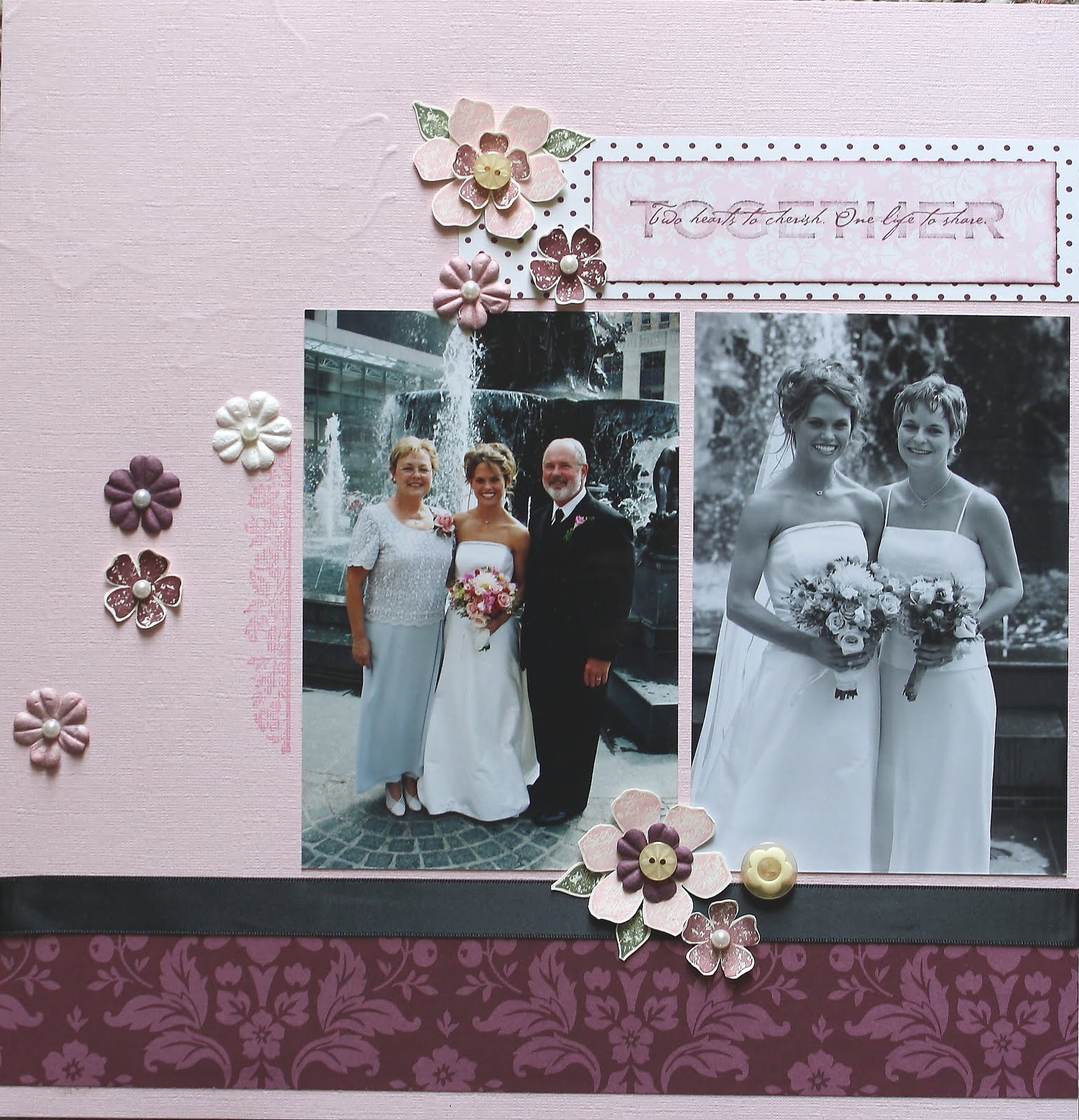
Wednesday, September 8, 2010
Fairytale Sketch Challenge
Today I've got a new Diva sketch challenge for you. I love how simple it looks because that gives you plenty of room to maneuver! As soon as I saw the circle I knew I wanted to use my Medallion background stamp that hasn't seen ink in a while. My next thought was purple and black and a touch of silver. Both the medallion center and the sentiment were stamped on Brushed Silver cardstock with black craft ink. My cardbase is Perfect Plum and the Medallion is stamped in Versamark. I had to add a little bling with the Jewel Basic Rhinestones and some satin ribbon too.
I hope you'll play along with the Divas! Thanks for stopping by.
~Kristin
I hope you'll play along with the Divas! Thanks for stopping by.
~Kristin
SUO Supplies
Stamps: Medallion background, Full of Life
Colors: Perfect Plum, Basic black, Brushed Silver
Accessories: Jewel basic Rhinestones, scallop border punch, black satin ribbon
Sunday, July 25, 2010
Elegant Lines
This label stamp is from the new and popular Just Believe stamp set. Here I've stamped it in Rich Razzleberry and cut it out. My sentiment in Sahara Sand, is from the cherished old Fancy Flexible Phrases. Added a bit of my new narrow ribbon and called it done. Super quick and easy! Final card is 4.25"x4.25".
Hope you like it!
~Kristin
SUO Supplies
Stamps: Just Believe, Fancy Flexible Phrases
Colors: Sahara Sand, Rich Razzleberry, Whisper White
Accessories: Big Shot, Elegant Lines Textured Impressions Folder, Rich Razzleberry narrow ribbon
Thursday, April 22, 2010
Together
Have a great day!
~Kristin
Monday, April 19, 2010
Tiny Tux, Taffeta & Tulle
Over the next week or so I'll show them all to you. You'll notice that several of them are wedding related. My sister got married in 2003. Somehow in my scrapbooks I left off with this event and skipped all the way to November of 2004! YIKES! I just noticed this the morning of my retreat so I changed my strategy and decided to try to catch up that 15 month gap. Anyway, that's why I'm suddenly working on pics from 7 years ago.
Anyway, this is the first of the 12x12 scrapbook spreads you'll be seeing by me. For it and all 5 wedding layouts I did I used the Designer Series paper by Stampin' Up! called Parisian Summer (retired a while back). It was SO NICE to have a collection with such soft lovely and coordinating colors to make every page look lovely together, but all be different. You'll see what I mean!
Scrappin' Tip: To help with faster and easier coordinating pages for multiple layouts of the same event try using a pack of Designer Series paper! It will make your work MUCh easier, trust me!
Thanks for visiting. My next post will be a different topic completely (still scrapbooking though!).
~Kristin
PS- As always my supplies will vary. Mostly I used SU stuff, but in this case the sticker title (ancient something from my stash) as well as the epoxy flowers (also ancient!) and the silver stick-on pearls are all non-SU. The background paper is Basic Gray.
Monday, September 14, 2009
Something Old, Something New...
Well, nothing borrowed or blue but felt the title was appropriate considering all the retired stuff I mixed in with a few current Stampin' Up! products!
Hi, I'm back... yep, that's two posts today! I just couldn't wait! Today's Clean & Simple challenge on Splitcoast is to make a wedding card, a clean & simple wedding card obviously. I've been wanting to use the gorgeous largest snowflake from Serene Snowflakes (holiday mini) to make a background that isn't necessarily snow related so decided on that right away. I fooled around with the sentiment piece and focal point for quite a while before I decided on this.
The frame is from the retired set Frames With a Flourish and is embossed in silver on some Parisian Summer DSP (don't bother looking- it is retired also). The sentiment is from an old favorite Fancy Flexible Phrases and the ribbon is from an old ribbon originals assortment called Flirty I believe (maybe I should just list what is current instead of repeatedly telling you "retired").
On to the CURRENT stuff: The ink is Basic Gray as wella s the paper (oops, also some Pink Pirouette in there- man will I be sad when my stash is gone!). The wedding rings I made with two silver small grommets (CURRENT!) as well as a square rhinestone brad in the Fire collection.
Here's a closeup of the rings and sentiment piece.
I would call this clean for sure, and really pretty simple if you already have in your head what it should look like. Just making decisions took me forever on this one (oh, plus the pile of rejected parts laying on my desk now).
SUO Supplies
Stamps: Serene Snowflakes, Fancy Flexible Phrases (retired), Frames With a Flourish (retired)
Colors: Pink Pirouette (former In Color that I personally campaigned for), Basic Gray
Accessories: Flirty Ribbon Originals (retired), Small grommets, Square Fire Rhinestone brad, Parisian Summer DSP (retired)
Wednesday, August 19, 2009
Sketch Challenge for the Divas
Anyway, I started out digging for a piece of glossy white cardstock and found a large piece I'd done some technique on a long time ago- I don't even remember just how it was done, but might have included reinkers and alcohol and cotton balls, but I could be wrong. I stamped the Medallion background on this piece in chocolate craft ink then embossed it in clear powder. Then I used the large square punch to punch out various sections.
The rest is pretty self-explanatory I think. I embossed the sentiment also, which is from Teeny Tiny Wishes. The Medallion is also stamped once on the background in Versamark.
Hope you like it, and please go visit our Diva blog so you can see other great examples of this sketch and also play along!
Thanks for stopping by!
~Kristin
SUO Supplies
Stamps: Medallion background, Teeny Tiny Wishes
Colors: Close to Cocoa, Chocolate Chip, Cameo Coral, Ruby Red
Accessories: Chocolate Taffeta Ribbon, Square Fire Rhinestone brads, Clear EP, Square punch
ETA: I think I found it... the technique I'm fairly certain I used to make the glossy paper have those gorgeous swirls of color was the Ink, Spray, Smash technique (I actually found it by searching on the word "smash" because I vaguely remember doing that!) If I remember correctly you end up with two or more pieces of paper, but only one of mine was that pretty, the other was kind of ho-hum. Anyway, hope that helps!
Saturday, May 23, 2009
Happily Ever After
For the flowers I ran white cardstock through the Big Shot with the Manhattan Flower embossing folder. Then I flipped it over and brayered ink (vintage violet, Almost Amethyst and Pink Pirouette) into the backside so the debossed flower remains white. Then I cut it out and layered it over the Vintage Violet piece which was stamped with French Script in Versamark.
I pierced the edges of the Vintage Violet then added my sentiment in a Hodgepodge Frame, tied on with pink organdy ribbon. Once it was all put together I sprayed the en
tire thing with pearl-ex mixed in hairspray for an overall shimmer! See those larger dots of pearl-ex that are showing?? After I took the picture I found a way to reduce the visibility of those... just sand those areas with a corner of the sanding block. Just a TIP for you!
Ooh, forgot to say that I also highlighted some of the petals with the Versamarker (thanks for the idea Lisa!) to add more dimension.
Here's a quick picture of the inside. I stamped this phrase from Full of Life because I think it is perfect for a formal frilly wedding. First I stamped directly on the card but thought it just lacked something... so I tried again on white, this time inking Love with the pink marker. Added some layers and punched the bottom edge with the eyelet border punch. Also, I stamped one of the images from Frames with a Flourish under the sentiment for a more decorative touch.
Hope you like it, and have a beautiful Memorial Day weekend!
~Kristin
SUO Supplies
Stamps: Fancy Flexible Phrases, Designer Label, French Script, Full of Life, Frames with a Flourish
Cardstock: Almost Amethyst, Vintage Violet, Whisper White
Accessories: Big Shot, Manhattan Flower embossing folder, pearl-ex hairspray, Silver Hodgepodge, Pink organdy ribbon, paper piercing tools, brayer
Saturday, May 2, 2009
Best Wishes- Embossed Vellum & a color challenge

As soon as I saw the inspiration bedding I pictured the Floral background in Chocolate Chip over a Baha Breeze card base. I'm sort of wishing I had embossed it now so the chocolate would be even darker and would shine a little too... next time...
While playing on Thursday I used the Manhattan Flower Embossing folder on vellum and really like how it turned out. I love that the Floral pattern can be seen through the vellum, adding another dimension almost. The sentiment is embossed on vellum and a rhinestone brad was added for extra elegance and sparkle!
Want to know a TIP I learned about adding vellum to carstock without the adhesive showing?!? This is the second time I've tried it and I gotta say, it's much better than anything else I've tried. Although, it is showing a bit on the sentiment, but I think that is because I did it twice (first time on Baha and it didn't show up as well) and because it is on very dark cardstock. In most cases though, I think it works well. So here it is. TIP: Squeeze a small amount of Tombo Multi Glue (white with green lid) onto your finger tip and spread onto vellum in a very thin layer. It dries extremely fast this way so you have to work quickly. In this case I mostly glued down the edges.
I hope you like! I'm not sure about the white box bow at the top corner. I've been racking my brain trying to figure out how/what to fix with it, but I'm just not sure, short of removing it altogether. What do you think? I have a Baha satin ribbon just like it but wider which I forgot about until my card was together. I think I'd probably like that better because it wouldn't stand out as much. But would the box box still be too much? Maybe a knot would be better and would symbolize "tying the knot" so to speak...
Anyway, I hope you try out Dawn's color challenge sometime- she is super talented!
Glad to have you here!
~Kristin
SUO Supplies
Stamps: Oval All, Floral Background
Paper: White Vellum Cardstock, Baha Breeze, Chocolate Chip
Ink: Chocolate chip
Accessories: Clear EP, Scallop oval punch, Wide Oval Punch, Big Shot, Manhattan Flower embossing folder, rhinestone brad, white taffeta ribbon
Monday, January 19, 2009
Niece getting married
Well, we've had a busy weekend which I'll fill you in on later. But for now I just want to share a card- huh, go figure! I have a niece getting married next month so I made this for her shower yesterday. For this pretty dress I combined two stamps- the dress from Blooming With Happiness and Doodle This for the skirt. Embossed in silver and slightly watercolored in Pink Pirhouette. The sentiment is from Fancy Flexible Phrases, one of my all time favorite sets! The ribbon is also a retired wide organdy. Hope you like it!
By the way, I did copy this idea of combining stamps from someone on Splitcoast. However, Splitcoast seems to be down tonight so I can't give proper credit at the moment. Promise I will as soon as I can tomorrow morning!
Thanks for stopping by! Also, if you are interested, tomorrow I will post our fun family news from today and maybe link some of the media coverage too!
~Kristin
Monday, December 15, 2008
Put to good use!

Friday's challenge to re-use something on a card got me going so I did another one to show you. I haven't had time to upload until now, sorry!
My downline, Jennifer, is getting married Dec. 27th and her invitation was a beautiful piece of velvet paper with some organdy ribbon and the announcement layered on top. I used to save all things like this but one day realized I had no more room for filing cabinets and had to quit. I couldn't throw it away, so I decided to repurpose that gorgeous velvet paper into a wedding card for her! I wish I'd taken a before picture, but I didn't think of it so you'll just have to trust me that this is what I did!
The velvet paper was easy to punch through with my new heart punch, and I also used it to mat the main image and the sentiment. I also reused some of the ribbon since it matches so great!
The card base I had stamped for another project and decided not to use, so I started with that. I used the Paisley background (which is retiring by the way) and either white or vanilla craft ink, I can't remember which. The vanilla paper is confetti cream I believe, also old scraps. I also used an old stamp set for the sentiment called Word on Word.
TFL! Sorry in advance for posting irradically over the coming weeks. I just know it's going to happen but I'll be back in full force in January.
Subscribe to:
Posts (Atom)